This tutorial discusses ways to plot plant phenology (discrete time
series) and single-aspirated temperature (continuous time series) together.
It uses data frames created in the first two parts of this series,
Work with NEON OS & IS Data - Plant Phenology & Temperature.
If you have not completed these tutorials, please download the dataset below.
Objectives
After completing this tutorial, you will be able to:
plot multiple figures together with grid.arrange()
plot only a subset of dates
Things You’ll Need To Complete This Tutorial
You will need the most current version of R and, preferably, RStudio loaded
on your computer to complete this tutorial.
This tutorial is designed to have you download data directly from the NEON
portal API using the neonUtilities package. However, you can also directly
download this data, prepackaged, from FigShare. This data set includes all the
files needed for the Work with NEON OS & IS Data - Plant Phenology & Temperature
tutorial series. The data are in the format you would receive if downloading them
using the zipsByProduct() function in the neonUtilities package.
To start, we need to set up our R environment. If you're continuing from the
previous tutorial in this series, you'll only need to load the new packages.
# Install needed package (only uncomment & run if not already installed)
#install.packages("dplyr")
#install.packages("ggplot2")
#install.packages("scales")

# Load required libraries
library(ggplot2)
library(dplyr)

##
## Attaching package: 'dplyr'

## The following objects are masked from 'package:stats':
##
##     filter, lag

## The following objects are masked from 'package:base':
##
##     intersect, setdiff, setequal, union

library(gridExtra)

##
## Attaching package: 'gridExtra'

## The following object is masked from 'package:dplyr':
##
##     combine

library(scales)

options(stringsAsFactors=F) #keep strings as character type not factors

# set working directory to ensure R can find the file we wish to import and where
# we want to save our files. Be sure to move the download into your working directory!
wd <- "~/Documents/data/" # Change this to match your local environment
setwd(wd)
If you don't already have the R objects, temp_day and phe_1sp_2018, loaded
you'll need to load and format those data. If you do, you can skip this code.
# Read in data -> if in series this is unnecessary
temp_day <- read.csv(paste0(wd,'NEON-pheno-temp-timeseries/NEONsaat_daily_SCBI_2018.csv'))

phe_1sp_2018 <- read.csv(paste0(wd,'NEON-pheno-temp-timeseries/NEONpheno_LITU_Leaves_SCBI_2018.csv'))

# Convert dates
temp_day$Date <- as.Date(temp_day$Date)
# use dateStat - the date the phenophase status was recorded
phe_1sp_2018$dateStat <- as.Date(phe_1sp_2018$dateStat)
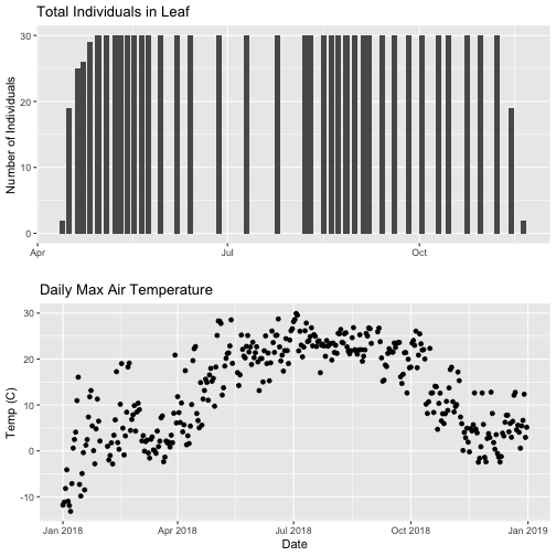
Separate Plots, Same Panel
In this dataset, we have phenology and temperature data from the Smithsonian
Conservation Biology Institute (SCBI) NEON field site. There are a variety of ways
we may want to look at this data, including aggregated at the site level, by
a single plot, or viewing all plots at the same time but in separate plots. In
the Work With NEON's Plant Phenology Data and the
Work with NEON's Single-Aspirated Air Temperature Data tutorials, we created
separate plots of the number of individuals who had leaves at different times
of the year and the temperature in 2018.
However, plot the data next to each other to aid comparisons. The grid.arrange()
function from the gridExtra package can help us do this.
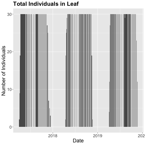
# first, create one plot
phenoPlot <- ggplot(phe_1sp_2018, aes(dateStat, countYes)) +
geom_bar(stat="identity", na.rm = TRUE) +
ggtitle("Total Individuals in Leaf") +
xlab("") + ylab("Number of Individuals")
# create second plot of interest
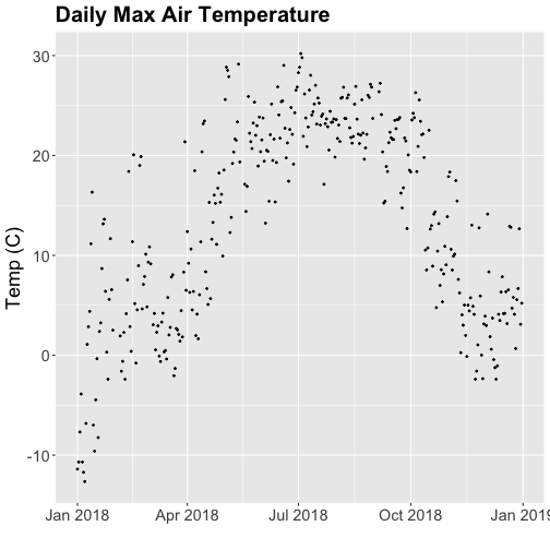
tempPlot_dayMax <- ggplot(temp_day, aes(Date, dayMax)) +
geom_point() +
ggtitle("Daily Max Air Temperature") +
xlab("Date") + ylab("Temp (C)")
# Then arrange the plots - this can be done with >2 plots as well.
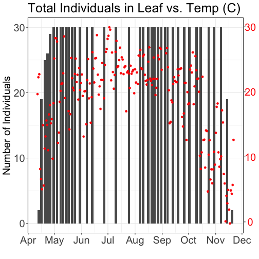
grid.arrange(phenoPlot, tempPlot_dayMax)
Now, we can see both plots in the same window. But, hmmm... the x-axis on both
plots is kinda wonky. We want the same spacing in the scale across the year (e.g.,
July in one should line up with July in the other) plus we want the dates to
display in the same format(e.g. 2016-07 vs. Jul vs Jul 2018).
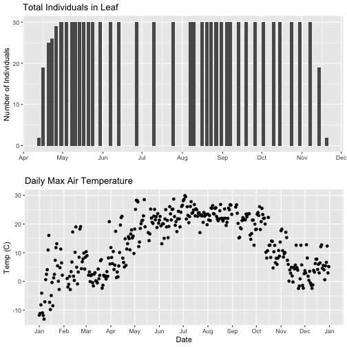
Format Dates in Axis Labels
The date format parameter can be adjusted with scale_x_date. Let's format the x-axis
ticks so they read "month" (%b) in both graphs. We will use the syntax:
scale_x_date(labels=date_format("%b"")
Rather than re-coding the entire plot, we can add the scale_x_date element
to the plot object phenoPlot we just created.
**Data Tip:**
You can type ?strptime into the R
console to find a list of date format conversion specifications (e.g. %b = month).
Type scale_x_date for a list of parameters that allow you to format dates
on the x-axis.
If you are working with a date & time
class (e.g. POSIXct), you can use scale_x_datetime instead of scale_x_date.
But this only solves one of the problems, we still have a different range on the
x-axis which makes it harder to see trends.
Align data sets with different start dates
Now let's work to align the values on the x-axis. We can do this in two ways,
setting the x-axis to have the same date range or 2) by filtering the dataset
itself to only include the overlapping data. Depending on what you are trying to
demonstrate and if you're doing additional analyses and want only the overlapping
data, you may prefer one over the other. Let's try both.
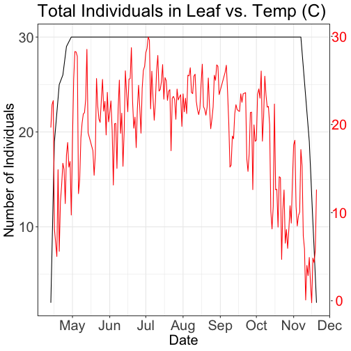
Set range of x-axis
Alternatively, we can set the x-axis range for both plots by adding the limits
parameter to the scale_x_date() function.
# first, lets recreate the full plot and add in the
phenoPlot_setX <- ggplot(phe_1sp_2018, aes(dateStat, countYes)) +
    geom_bar(stat="identity", na.rm = TRUE) +
    ggtitle("Total Individuals in Leaf") +
    xlab("") + ylab("Number of Individuals") +
    scale_x_date(breaks = date_breaks("1 month"),
                  labels = date_format("%b"),
                  limits = as.Date(c('2018-01-01','2018-12-31')))

# create second plot of interest
tempPlot_dayMax_setX <- ggplot(temp_day, aes(Date, dayMax)) +
    geom_point() +
    ggtitle("Daily Max Air Temperature") +
    xlab("Date") + ylab("Temp (C)") +
    scale_x_date(date_breaks = "1 month",
                 labels=date_format("%b"),
                  limits = as.Date(c('2018-01-01','2018-12-31')))

# Plot
grid.arrange(phenoPlot_setX, tempPlot_dayMax_setX)
Now we can really see the pattern over the full year. This emphasizes the point
that during much of the late fall, winter, and early spring none of the trees
have leaves on them (or that data were not collected - this plot would not
distinguish between the two).
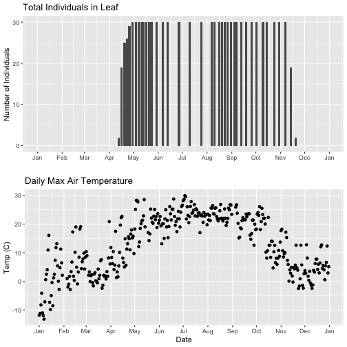
Subset one data set to match other
Alternatively, we can simply filter the dataset with the larger date range so
the we only plot the data from the overlapping dates.
# filter to only having overlapping data
temp_day_filt <- filter(temp_day, Date >= min(phe_1sp_2018$dateStat) &
                         Date <= max(phe_1sp_2018$dateStat))

# Check
range(phe_1sp_2018$date)

## [1] "2018-04-13" "2018-11-20"

range(temp_day_filt$Date)

## [1] "2018-04-13" "2018-11-20"

#plot again
tempPlot_dayMaxFiltered <- ggplot(temp_day_filt, aes(Date, dayMax)) +
    geom_point() +
    scale_x_date(breaks = date_breaks("months"), labels = date_format("%b")) +
    ggtitle("Daily Max Air Temperature") +
    xlab("Date") + ylab("Temp (C)")


grid.arrange(phenoPlot, tempPlot_dayMaxFiltered)
With this plot, we really look at the area of overlap in the plotted data (but
this does cut out the time where the data are collected but not plotted).
Same plot with two Y-axes
What about layering these plots and having two y-axes (right and left) that have
the different scale bars?
Some argue that you should not do this as it can distort what is actually going
on with the data. The author of the ggplot2 package is one of these individuals.
Therefore, you cannot use ggplot() to create a single plot with multiple y-axis
scales. You can read his own discussion of the topic on this
StackOverflow post.
However, individuals have found work arounds for these plots. The code below
is provided as a demonstration of this capability. Note, by showing this code
here, we don't necessarily endorse having plots with two y-axes.
In this tutorial, we explore NEON single-aspirated air temperature data.
We then discuss how to interpret the variables, how to work with date-time and
date formats, and finally how to plot the data.
This tutorial is part of a series on how to work with both discrete and continuous
time series data with NEON plant phenology and temperature data products.
Objectives
After completing this activity, you will be able to:
work with "stacked" NEON Single-Aspirated Air Temperature data.
correctly format date-time data.
use dplyr functions to filter data.
plot time series data in scatter plots using ggplot function.
Things You’ll Need To Complete This Tutorial
You will need a current version of R (4+) and, preferably, RStudio loaded
on your computer to complete this tutorial.
Background information about NEON air temperature data
Air temperature is continuously monitored by NEON by two methods. At terrestrial
sites temperature at the top of the tower is derived from a triple
redundant aspirated air temperature sensor. This is provided as NEON data
product DP1.00003.001. Single Aspirated Air Temperature sensors (SAAT) are
deployed to develop temperature profiles at multiple levels on the tower at NEON
terrestrial sites and on the meteorological stations at NEON aquatic sites. This
is provided as NEON data product DP1.00002.001.
When designing a research project using this data, consult the
Data Product Details Page
for more detailed documentation.
Single-aspirated Air Temperature
Air temperature profiles are ascertained by deploying SAATs at various heights
on NEON tower infrastructure. Air temperature at aquatic sites is measured
using a single SAAT at a standard height of 3m above ground level. Air temperature
for this data product is provided as one- and thirty-minute averages of 1 Hz
observations. Temperature observations are made using platinum resistance
thermometers, which are housed in a fan aspirated shield to reduce radiative
heating. The temperature is measured in Ohms and subsequently converted to degrees
Celsius during data processing. Details on the conversion can be found in the
associated Algorithm Theoretic Basis Document (ATBD; see Product Details page
linked above).
Available data tables
The SAAT data product contains two data tables for each site and month selected,
consisting of the 1-minute and 30-minute averaging intervals. In addition, there
are several metadata files that provide additional useful information.
readme with information on the data product and the download
variables file that defines the terms, data types, and units
citation file with the BibTeX citation for the data downloaded
Access data
There are several ways to access NEON data, directly from the NEON data portal,
access through a data partner (select data products only), writing code to
directly pull data from the NEON API, or, as we'll do here, using the neonUtilities
package which is a wrapper for the API to make working with the data easier.
As of June 2026, NEON requires an API token for data downloads, to reduce bot scraping and improve user support. Tokens can be generated in NEON data portal user accounts - log in to your account or create one, and go to the API Tokens section. For best practices in storing and using tokens, follow the instructions here.’
First, we need to set up our environment with the packages needed for this tutorial
and our API token.
# Install needed package (only uncomment & run if not already installed)

#install.packages("neonUtilities")

#install.packages("ggplot2")

#install.packages("dplyr")

#install.packages("tidyr")


# Load required libraries

library(neonUtilities)

library(ggplot2)

library(dplyr)

library(tidyr)

library(lubridate)

token <- Sys.getenv("NEON_TOKEN")


# set working directory, modify as needed

wd <- "~/data"

setwd(wd)
This tutorial is part of series working with discrete plant phenology data and
(nearly) continuous temperature data. Our overall "research" question is to
explore the correlation between plant phenology and temperature.
Therefore, we will want to work with data that
align with the plant phenology data that we worked with in the first tutorial.
If you are only interested in working with the temperature data, you do not need
to complete the previous tutorial.
Our data of interest will be the temperature data from 2018 from NEON's
Smithsonian Conservation Biology Institute (SCBI) field site located in Virginia
near the northern terminus of the Blue Ridge Mountains.
NEON single aspirated air temperature data are available in two averaging intervals,
1 minute and 30 minute intervals. Which data you want to work with is going to
depend on your research questions. Here, we're going to only download and work
with the 30 minute interval data as we're primarily interest in longer term (daily,
weekly, annual) patterns.
This will download 7.7 MB of data. check.size is set to false (F) to improve flow
of the script but is always a good idea to view the size with true (T) before
downloading a new dataset.
Now that we have the data, let's take a look at the structure and understand
what's in the data. The data (saat) come in as a large list of four items.
What are the individual tables and how should they be used?
data file(s): There will always be one or more dataframes that include the
primary data of the data product you downloaded. Since we downloaded only the 30
minute averaged data we only have one data table SAAT_30min.
readme_xxxxx: The readme file, with the corresponding 5 digits from the data
product number, provides you with important information relevant to the data
product and the specific instance of downloading the data.
sensor_positions_xxxxx: This table contains the spatial coordinates
of each sensor, relative to a reference location.
variables_xxxxx: This table contains all the variables found in the associated
data table(s). This includes full definitions, units, and rounding.
citation_xxxxx: BibTeX citation for the data downloaded.
issueLog_xxxxx: This table contains records of any known issues with the
data product, such as sensor malfunctions.
scienceReviewFlags_xxxxx: This table may or may not be present. It contains
descriptions of adverse events that led to manual flagging of the data, and is
usually more detailed than the issue log. It only contains records relevant to
the sites and dates of data downloaded.
Since we want to work with the individual files, we'll save the elements of the
list as independent objects.
The sensor data undergo a variety of automated quality assurance and quality control
checks. You can read about them in detail in the Quality Flags and Quality Metrics ATBD, in the Documentation section of the product details page.
The expanded data package
includes all of these quality flags, which can allow you to decide if not passing
one of the checks will significantly hamper your research and if you should
therefore remove the data from your analysis. Here, we're using the
basic data package, which only includes the final quality flag (finalQF),
which is aggregated from the full set of quality flags.
A pass of the check is 0, while a fail is 1. Let's see what percentage
of the data we downloaded passed the quality checks.
What should we do with the 23% of the data that are flagged?
This may depend on why it is flagged and what questions you are asking,
and the expanded data package would be useful for determining this.
We'll keep the flagged data for now, to illustrate how errors appear in these
datasets.
What about null (NA) data?
sum(is.na(SAAT_30min$tempSingleMean))/nrow(SAAT_30min)

## [1] 0.1475

mean(SAAT_30min$tempSingleMean)

## [1] NA
22% of the mean temperature values are NA. Note that this is not
additive with the flagged data! Empty data records are flagged, so this
indicates nearly all of the flagged data in our download are empty records.
Why was there no output from the calculation of mean temperature?
The R programming language, by default, won't calculate a mean (and many other
summary statistics) in data that contain NA values. We could override this
using the input parameter na.rm=TRUE in the mean() function, or just
remove the empty values from our analysis.
We can use ggplot to create scatter plots. Which data should we plot, as we have
several options?
tempSingleMean: the mean temperature for the interval
tempSingleMinimum: the minimum temperature during the interval
tempSingleMaximum: the maximum temperature for the interval
Depending on exactly what question you are asking you may prefer to use one over
the other. For many applications, the mean temperature of the 1- or 30-minute
interval will provide the best representation of the data.
Let's plot it. (This is a plot of a large amount of data. It can take 1-2 mins
to process. It is not essential for completing the next steps if this takes too
much of your computer memory.)
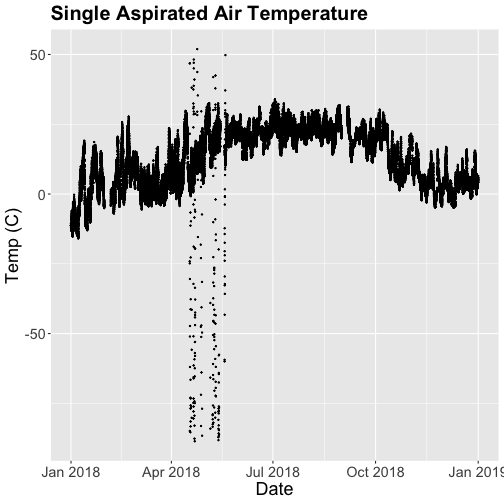
Something odd seems to have happened in late April/May 2018. Since it is unlikely
Virginia experienced -50C during this time, these are probably erroneous sensor
readings and why we should probably remove data that are flagged with those quality
flags.
Right now we are also looking at all the data points in the dataset. However, we may
want to view or aggregate the data differently:
aggregated data: min, mean, or max over a some duration
the number of days since a freezing temperatures
or some other segregation of the data.
Given that in the previous tutorial,
Work With NEON's Plant Phenology Data,
we were working with phenology data collected on a daily scale let's aggregate
to that level.
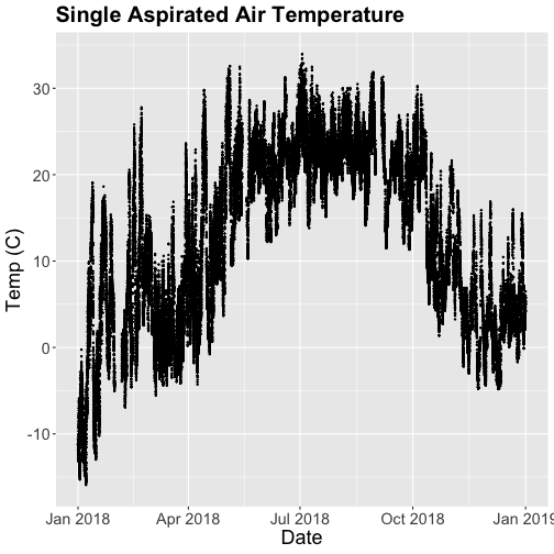
To make this plot better, lets do two things
Remove flagged data
Aggregate to a daily mean.
Subset to remove quality flagged data
We already removed the empty records. Now we'll
subset the data to remove the remaining flagged data.
That looks better! But we're still working with the 30-minute data.
Aggregate data by day
We can use the dplyr package functions to aggregate the data. However, we have to
choose which data we want to aggregate. Again, you might want daily
minimum temps, mean temperature or maximum temps depending on your question.
In the context of phenology, minimum temperatures might be very important if you
are interested in a species that is very frost susceptible. Any days with a
minimum temperature below 0C could dramatically change the phenophase. For other
species or meteorological zones, maximum thresholds may be very important. Or you
might be most interested in the daily mean.
And note that you can combine different input values with different aggregation
functions - for example, you could calculate the minimum of the half-hourly
average temperature, or the average of the half-hourly maximum temperature.
Also keep in mind the removal of NA and flagged data we did above. Always use
caution when aggregating incomplete data - if, for example, the missing data tend
to occur at particular times of day, a daily mean will be biased.
For this tutorial, let's use maximum daily temperature, i.e. the maximum of the
tempSingleMax values for the day.
What do we lose relative to the 30 minute intervals?
ggplot - subset by time
Sometimes we want to scale the x- or y-axis to a particular time subset without
subsetting the entire data_frame. To do this, we can define start and end
times. We can then define these limits in the scale_x_date object as
follows:
scale_x_date(limits=start.end) +
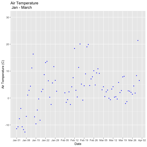
Let's plot just the first three months of the year.
# Define Start and end times for the subset

startTime <- as.Date("2018-01-01")

endTime <- as.Date("2018-03-31")


start.end <- c(startTime,endTime)


tempPlot_dayMax3m <- ggplot(temp_day,
                            aes(startDateTime,
                                dayMax)) +
           geom_point(color="blue", size=0.5) +
           ggtitle("Air Temperature\n Jan - March") +
           xlab("Date") + ylab("Air Temperature (C)")+
           (scale_x_date(limits=start.end,
                date_breaks="1 week",
                date_labels="%b %d"))


tempPlot_dayMax3m

## Warning: Removed 268 rows containing missing values or values outside the scale range (`geom_point()`).
Now we have the temperature data matching our Phenology data from the previous
tutorial, we want to save it to our computer to use in future analyses (or the
next tutorial). This is optional if you are continuing directly to the next tutorial
as you already have the data in R.
Many organisms, including plants, show patterns of change across seasons -
the different stages of this observable change are called phenophases. In this
tutorial we explore how to work with NEON plant phenophase data.
Objectives
After completing this activity, you will be able to:
work with NEON Plant Phenology Observation data.
use dplyr functions to filter data.
plot time series data in a bar plot using ggplot the function.
Things You’ll Need To Complete This Tutorial
You will need a current version of R (4+) and, preferably, RStudio loaded
on your computer to complete this tutorial.
Plants change throughout the year - these are phenophases.
Why do they change?
Explore Phenology Data
The following sections provide a brief overview of the NEON plant phenology
observation data. When designing a research project using this data, you
need to consult the
documents associated with this data product and not rely solely on this summary.
The following description of the NEON Plant Phenology Observation data is modified
from the data product user guide.
NEON Plant Phenology Observation Data
NEON collects plant phenology data and provides it as NEON data product
DP1.10055.001.
The plant phenology observations data product provides in-situ observations of
the phenological status and intensity of tagged plants (or patches) during
discrete observations events.
Sampling occurs at all terrestrial field sites at site and season specific
intervals. During Phase I (dominant species) sampling (pre-2021), three species
with 30 individuals each are sampled. In 2021, Phase II (community) sampling
will begin, with <=20 species with 5 or more individuals sampled will occur.
Status-based Monitoring
NEON employs status-based monitoring, in which the phenological condition of an
individual is reported any time that individual is observed. At every observations
bout, records are generated for every phenophase that is occurring and for every
phenophase not occurring. With this approach, events (such as leaf emergence in
Mediterranean zones, or flowering in many desert species) that may occur
multiple times during a single year, can be captured. Continuous reporting of
phenophase status enables quantification of the duration of phenophases rather
than just their date of onset while allows enabling the explicit quantification
of uncertainty in phenophase transition dates that are introduced by monitoring
in discrete temporal bouts.
Specific products derived from this sampling include the observed phenophase
status (whether or not a phenophase is occurring) and the intensity of
phenophases for individuals in which phenophase status = ‘yes’. Phenophases
reported are derived from the USA National Phenology Network (USA-NPN) categories.
The number of phenophases observed varies by growth form and ranges from 1
phenophase (cactus) to 7 phenophases (semi-evergreen broadleaf).
In this tutorial we will focus only on the state of the phenophase, not the
phenophase intensity data.
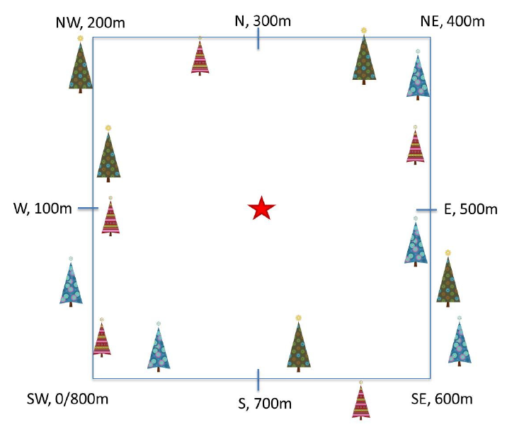
Phenology Transects
Plant phenology observations occur at all terrestrial NEON sites along an 800
meter square loop transect (primary) and within a 200 m x 200 m plot located
within view of a canopy level, tower-mounted, phenology camera.
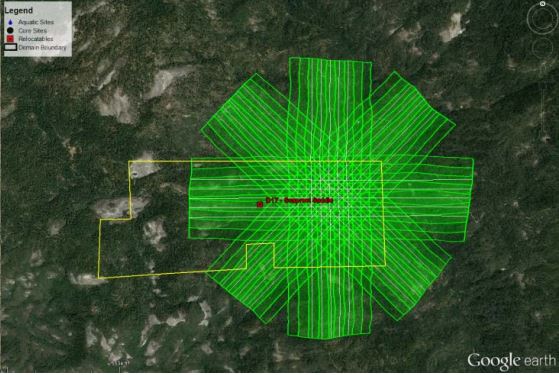
Diagram of a phenology transect layout, with meter layout marked.
Point-level geolocations are recorded at eight reference points along the
perimeter, plot-level geolocation at the plot centroid (star).
Source: National Ecological Observatory Network (NEON)
Timing of Observations
At each site, there are:
~50 observation bouts per year.
no more that 100 sampling points per phenology transect.
no more than 9 sampling points per phenocam plot.
1 annual measurement per year to collect annual size and disease status measurements from
each sampling point.
Available Data Tables
The phenology dataset contains three data tables:
phe_statusintensity: Plant phenophase status and intensity data
phe_perindividual: Geolocation and taxonomic identification for phenology plants
phe_perindividualperyear: Pecorded once per year, essentially the "metadata" about the plant: DBH, height, etc.
There are other files in each download including a readme with information on
the data product and the download; a variables file that defines the
term descriptions, data types, and units; a validation file with data entry
validation and parsing rules; and a citation file giving the BibTeX citation
for the downloaded data.
Set up R environment
This tutorial is designed to have you download data from the NEON
API using the neonUtilities package. As of June 2026, NEON requires an API token
for data downloads, to reduce bot scraping and improve user support. Tokens can
be generated in NEON data portal user accounts - log in to your account or
create one, and go to the API Tokens section. For best practices in storing and
using tokens, follow the instructions here.
Install and load packages, and load your token. This code assumes you have
stored your token as an environment variable, as described at the link above.
If your token is stored in a different way, modify the line of code below as
needed.
# install needed package (only uncomment & run if not already installed)

#install.packages("neonUtilities")

#install.packages("dplyr")

#install.packages("ggplot2")


# load needed packages

library(neonUtilities)

library(neonOS)

library(dplyr)

library(ggplot2)

token <- Sys.getenv("NEON_TOKEN")


# set working directory to ensure R can find the file we wish to import and where

# we want to save our files. Be sure to move the download into your working directory!

wd <- "~/data" # Change this to match your local environment

setwd(wd)
Let's start by loading our data of interest. For this series, we'll work with
data from the NEON Domain 02 sites:
Blandy Farm (BLAN)
Smithsonian Conservation Biology Institute (SCBI)
Smithsonian Environmental Research Center (SERC)
And we'll use data from January 2017 to December 2019. This downloads over 9MB
of data. If this is too large, use a smaller date range. If you opt to do this,
your figures and some output may look different later in the tutorial.
With this information, we can download our data using the neonUtilities package.
phe <- loadByProduct(dpID = "DP1.10055.001",
                     site=c("BLAN","SCBI","SERC"),
										 startdate = "2017-01",
										 enddate="2019-12",
										 release="RELEASE-2026",
										 token=token,
										 check.size = F)


# save dataframes from the downloaded list

ind <- phe$phe_perindividual  #individual information

status <- phe$phe_statusintensity  #status & intensity info
Let's explore the data. Let's get to know what the ind dataframe looks like.
# What are the fieldnames in this dataset?

names(ind)

##  [1] "uid"                         "namedLocation"               "domainID"                    "siteID"
##  [5] "plotID"                      "decimalLatitude"             "decimalLongitude"            "geodeticDatum"
##  [9] "coordinateUncertainty"       "elevation"                   "elevationUncertainty"        "subtypeSpecification"
## [13] "transectMeter"               "directionFromTransect"       "ninetyDegreeDistance"        "sampleLatitude"
## [17] "sampleLongitude"             "sampleCoordinateUncertainty" "sampleElevation"             "sampleElevationUncertainty"
## [21] "date"                        "editedDate"                  "individualID"                "taxonID"
## [25] "scientificName"              "identificationQualifier"     "taxonRank"                   "nativeStatusCode"
## [29] "identificationHistoryID"     "growthForm"                  "vstTag"                      "measuredBy"
## [33] "identifiedBy"                "recordedBy"                  "remarks"                     "dataQF"
## [37] "publicationDate"             "release"

# Unsure of what some of the variables are? Look at the variables table!

View(phe$variables_10055)


# how many rows are in the data?

nrow(ind)

## [1] 791

# look at the first six rows of data.

head(ind)

##                                    uid          namedLocation domainID siteID   plotID decimalLatitude decimalLongitude
## 1 c1949cda-a607-4f9c-b866-3c77c1c47856 BLAN_061.phenology.phe      D02   BLAN BLAN_061        39.05963        -78.07385
## 2 4871339b-5815-43e1-b0ee-2f0491b28be7 BLAN_061.phenology.phe      D02   BLAN BLAN_061        39.05963        -78.07385
## 3 9f170c36-214b-49e9-9571-84475b10c37a BLAN_061.phenology.phe      D02   BLAN BLAN_061        39.05963        -78.07385
## 4 2c8bb258-91f3-444b-85e0-6a589bd5fb6a BLAN_061.phenology.phe      D02   BLAN BLAN_061        39.05963        -78.07385
## 5 76afbf22-34f0-4e73-979a-4daeac316ab3 BLAN_061.phenology.phe      D02   BLAN BLAN_061        39.05963        -78.07385
## 6 fc3cfb08-d6df-4112-ae08-6f2ad3544cd2 BLAN_061.phenology.phe      D02   BLAN BLAN_061        39.05963        -78.07385
##   geodeticDatum coordinateUncertainty elevation elevationUncertainty subtypeSpecification transectMeter
## 1         WGS84                    NA       183                   NA              primary           491
## 2         WGS84                    NA       183                   NA              primary           139
## 3         WGS84                    NA       183                   NA              primary           575
## 4         WGS84                    NA       183                   NA              primary           501
## 5         WGS84                    NA       183                   NA              primary           632
## 6         WGS84                    NA       183                   NA              primary           657
##   directionFromTransect ninetyDegreeDistance sampleLatitude sampleLongitude sampleCoordinateUncertainty sampleElevation
## 1                  Left                  0.5             NA              NA                          NA              NA
## 2                  Left                  2.0             NA              NA                          NA              NA
## 3                 Right                  2.0             NA              NA                          NA              NA
## 4                 Right                  3.0             NA              NA                          NA              NA
## 5                  Left                  3.0             NA              NA                          NA              NA
## 6                  Left                  2.0             NA              NA                          NA              NA
##   sampleElevationUncertainty       date editedDate            individualID taxonID         scientificName
## 1                         NA 2016-04-20 2016-05-09 NEON.PLA.D02.BLAN.06290    RHDA Rhamnus davurica Pall.
## 2                         NA 2017-02-24 2021-07-13 NEON.PLA.D02.BLAN.06231    RHDA Rhamnus davurica Pall.
## 3                         NA 2017-02-24 2021-07-13 NEON.PLA.D02.BLAN.06208    RHDA Rhamnus davurica Pall.
## 4                         NA 2017-02-24 2021-07-13 NEON.PLA.D02.BLAN.06503   SOAL6  Solidago altissima L.
## 5                         NA 2017-02-24 2021-07-13 NEON.PLA.D02.BLAN.06508   SOAL6  Solidago altissima L.
## 6                         NA 2017-02-24 2021-07-13 NEON.PLA.D02.BLAN.06214    RHDA Rhamnus davurica Pall.
##   identificationQualifier taxonRank nativeStatusCode identificationHistoryID          growthForm vstTag
## 1                    <NA>   species                I                    <NA> Deciduous broadleaf      N
## 2                    <NA>   species                I                    <NA> Deciduous broadleaf      N
## 3                    <NA>   species                I                    <NA> Deciduous broadleaf      N
## 4                    <NA>   species                N                    <NA>                Forb      N
## 5                    <NA>   species                N                    <NA>                Forb      N
## 6                    <NA>   species                I                    <NA> Deciduous broadleaf      N
##                     measuredBy          identifiedBy           recordedBy
## 1          jcoloso@neoninc.org  shackley@neoninc.org shackley@neoninc.org
## 2 mastersb@battelleecology.org llemmon@field-ops.org                 <NA>
## 3 mastersb@battelleecology.org llemmon@field-ops.org                 <NA>
## 4 mastersb@battelleecology.org llemmon@field-ops.org                 <NA>
## 5 mastersb@battelleecology.org llemmon@field-ops.org                 <NA>
## 6 mastersb@battelleecology.org llemmon@field-ops.org                 <NA>
##                                                                remarks dataQF  publicationDate      release
## 1                                               Nearly dead shaded out   <NA> 20251222T234455Z RELEASE-2026
## 2                                                                 <NA>   <NA> 20251222T234455Z RELEASE-2026
## 3                                                                 <NA>   <NA> 20251222T234455Z RELEASE-2026
## 4 Dropped 20190717 no individuals present had been small and unhealthy   <NA> 20251222T234455Z RELEASE-2026
## 5                                                                 <NA>   <NA> 20251222T234455Z RELEASE-2026
## 6                                                                 <NA>   <NA> 20251222T234455Z RELEASE-2026

# look at the structure of the dataframe.

str(ind)

## 'data.frame':	791 obs. of  38 variables:
##  $ uid                        : chr  "c1949cda-a607-4f9c-b866-3c77c1c47856" "4871339b-5815-43e1-b0ee-2f0491b28be7" "9f170c36-214b-49e9-9571-84475b10c37a" "2c8bb258-91f3-444b-85e0-6a589bd5fb6a" ...
##  $ namedLocation              : chr  "BLAN_061.phenology.phe" "BLAN_061.phenology.phe" "BLAN_061.phenology.phe" "BLAN_061.phenology.phe" ...
##  $ domainID                   : chr  "D02" "D02" "D02" "D02" ...
##  $ siteID                     : chr  "BLAN" "BLAN" "BLAN" "BLAN" ...
##  $ plotID                     : chr  "BLAN_061" "BLAN_061" "BLAN_061" "BLAN_061" ...
##  $ decimalLatitude            : num  39.1 39.1 39.1 39.1 39.1 ...
##  $ decimalLongitude           : num  -78.1 -78.1 -78.1 -78.1 -78.1 ...
##  $ geodeticDatum              : chr  "WGS84" "WGS84" "WGS84" "WGS84" ...
##  $ coordinateUncertainty      : num  NA NA NA NA NA NA NA NA NA NA ...
##  $ elevation                  : num  183 183 183 183 183 183 183 183 183 183 ...
##  $ elevationUncertainty       : num  NA NA NA NA NA NA NA NA NA NA ...
##  $ subtypeSpecification       : chr  "primary" "primary" "primary" "primary" ...
##  $ transectMeter              : num  491 139 575 501 632 657 336 680 753 38 ...
##  $ directionFromTransect      : chr  "Left" "Left" "Right" "Right" ...
##  $ ninetyDegreeDistance       : num  0.5 2 2 3 3 2 6 5 2 2 ...
##  $ sampleLatitude             : num  NA NA NA NA NA NA NA NA NA NA ...
##  $ sampleLongitude            : num  NA NA NA NA NA NA NA NA NA NA ...
##  $ sampleCoordinateUncertainty: num  NA NA NA NA NA NA NA NA NA NA ...
##  $ sampleElevation            : num  NA NA NA NA NA NA NA NA NA NA ...
##  $ sampleElevationUncertainty : num  NA NA NA NA NA NA NA NA NA NA ...
##  $ date                       : Date, format: "2016-04-20" "2017-02-24" "2017-02-24" "2017-02-24" ...
##  $ editedDate                 : Date, format: "2016-05-09" "2021-07-13" "2021-07-13" "2021-07-13" ...
##  $ individualID               : chr  "NEON.PLA.D02.BLAN.06290" "NEON.PLA.D02.BLAN.06231" "NEON.PLA.D02.BLAN.06208" "NEON.PLA.D02.BLAN.06503" ...
##  $ taxonID                    : chr  "RHDA" "RHDA" "RHDA" "SOAL6" ...
##  $ scientificName             : chr  "Rhamnus davurica Pall." "Rhamnus davurica Pall." "Rhamnus davurica Pall." "Solidago altissima L." ...
##  $ identificationQualifier    : chr  NA NA NA NA ...
##  $ taxonRank                  : chr  "species" "species" "species" "species" ...
##  $ nativeStatusCode           : chr  "I" "I" "I" "N" ...
##  $ identificationHistoryID    : chr  NA NA NA NA ...
##  $ growthForm                 : chr  "Deciduous broadleaf" "Deciduous broadleaf" "Deciduous broadleaf" "Forb" ...
##  $ vstTag                     : chr  "N" "N" "N" "N" ...
##  $ measuredBy                 : chr  "jcoloso@neoninc.org" "mastersb@battelleecology.org" "mastersb@battelleecology.org" "mastersb@battelleecology.org" ...
##  $ identifiedBy               : chr  "shackley@neoninc.org" "llemmon@field-ops.org" "llemmon@field-ops.org" "llemmon@field-ops.org" ...
##  $ recordedBy                 : chr  "shackley@neoninc.org" NA NA NA ...
##  $ remarks                    : chr  "Nearly dead shaded out" NA NA "Dropped 20190717 no individuals present had been small and unhealthy" ...
##  $ dataQF                     : chr  NA NA NA NA ...
##  $ publicationDate            : chr  "20251222T234455Z" "20251222T234455Z" "20251222T234455Z" "20251222T234455Z" ...
##  $ release                    : chr  "RELEASE-2026" "RELEASE-2026" "RELEASE-2026" "RELEASE-2026" ...
Notice that the neonUtilities package read the data type from the variables file
and then automatically converts the data to the correct date type in R.
Retain only the most recent editedDate in each table
Join tables
Check for duplicates
NEON data are quality-controlled on data entry and ingest to the database, but
one of the most common data entry errors is duplicate entry. The neonOS
package contains a function, removeDups(), that uses metadata from the
variables file to check for duplicate records and resolve them if possible. Of
course NEON also uses these tools internally; if you detect duplicates in data
in one Release, they may be resolved in the next Release.
Let's check both tables for duplicates.
ind_noD <- removeDups(ind,
                      variables=phe$variables_10055,
                      table="phe_perindividual")

## No duplicated key values found!

status_noD <- removeDups(status,
                         variables=phe$variables_10055,
                         table="phe_statusintensity")

## 1761 duplicated key values found, representing 3522 non-unique records. Attempting to resolve.

## 833 resolveable duplicates merged into matching records
## 833 resolved records flagged with duplicateRecordQF=1

## 1856 unresolveable duplicates flagged with duplicateRecordQF=2
There are no duplicates in the perindividual table, but there are 3522 duplicate
records (out of 219327 total records) in the statusintensity table. Inspecting
the records, the majority are commissioning tests, when two people recorded each
phenophase to check for agreement. removeDups() has resolved each pair to a
single record when the phenophase data matched, and left as duplicates when the
data didn't match.
Filter to last editedDate
The individual (ind) table contains all instances that any of the location or
taxonomy data of an individual was updated. Therefore there are many rows for
some individuals. We only want the latest editedDate in the ind table.
In this case no rows were removed from the table; NEON staff have already
resolved the data to the most recent editedDate. It is always good to check
for this, but it is more likely to come up in Provisional data.
Prepare to join: Variable overlap between tables
From the initial inspection of the data we can see there is overlap in variable
names between the fields.
There are several fields that overlap between the datasets. Some of these are
expected to be the same and will be what we join on.
However, some of these will have different values in each table. We want to keep
those distinct value and not join on them. Therefore, we rename these
fields before joining:
uid
date
editedDate
measuredBy
recordedBy
samplingProtocolVersion
remarks
dataQF
publicationDate
We'll rename all the variables in the status object to have "Stat" at the end
of the variable name.
Now we can join the two data frames on all the variables with the same name.
We use a left_join() from the dpylr package because we want to match all the
rows from the "left" (status) dataframe to any rows that also occur in the "right"
(individual) dataframe.
Now that we have a clean, joined dataset we can begin to
explore our research question: do plants show patterns of changes in phenophase
across season?
Patterns in phenophase
From our larger dataset (several sites, species, phenophases), let's create a
dataframe with only the data from a single site, species, and phenophase and
call it phe_1sp.
Select site(s) of interest
To do this, we'll first select our site of interest. Note how we set this up
with an object that is our site of interest. This will allow us to more easily change
which site or sites if we want to adapt our code later.
siteOfInterest <- "SCBI"


## using %in% allows one to add a vector if you want more than one site.

## could also do it with == but won't work with vectors


phe_1st <- phe_ind %>%
  filter(siteID %in% siteOfInterest)
Select species of interest
Now we may only want to view a single species or a set of species. Let's first
look at the species that are present in our data. We could do this just by looking
at the taxonID field which give the four letter UDSA plant code for each
species. But if we don't know all the plant codes, we can get a bit fancier and
view both the taxonID and scientificName.
For now, let's choose only the flowering tree Liriodendron tulipifera (LITU).
By writing it this way, we could also add a list of species to the speciesOfInterest
object to select for multiple species.
speciesOfInterest <- "LITU"


phe_1sp <- phe_1st %>%
  filter(taxonID==speciesOfInterest)


# check that it worked

unique(phe_1sp$taxonID)

## [1] "LITU"
Select phenophase of interest
And, perhaps a single phenophase.
# see which phenophases are present

unique(phe_1sp$phenophaseName)

## [1] "Increasing leaf size" "Leaves"               "Colored leaves"       "Open flowers"         "Falling leaves"
## [6] "Breaking leaf buds"

phenophaseOfInterest <- "Leaves"


# subset to just the phenophase of interest

phe_1sp <- phe_1sp %>%
  filter(phenophaseName %in% phenophaseOfInterest)


# check that it worked

unique(phe_1sp$phenophaseName)

## [1] "Leaves"
Select only primary plots
NEON plant phenology observations are collected in two types of plots.
Primary plots: an 800 meter square phenology loop transect
Phenocam plots: a 200 m x 200 m plot located within view of a canopy level,
tower-mounted, phenology camera
In the data, these plots are differentiated by the subtypeSpecification.
Depending on your question you may want to use only one or both of these plot types.
For this activity, we're going to only look at the primary plots.
**Data Tip:** How do I learn this on my own? Read
the Data Product User Guide and use the variables files with the data download
to find the corresponding variables names.
# what plots are present?

unique(phe_1sp$subtypeSpecification)

## [1] "primary"  "phenocam"

# filter

phe_1spPrimary <- phe_1sp %>%
  filter(subtypeSpecification == 'primary')


# check that it worked

unique(phe_1spPrimary$subtypeSpecification)

## [1] "primary"
Total in phenophase of interest
The phenophaseState is recorded as "yes" or "no" that the individual is in that
phenophase. The phenophaseIntensity are categories for how much of the individual
is in that state. For now, we will stick with phenophaseState.
We can now calculate the total number of individuals in that state. We use
n_distinct(indvidualID) to count the individuals (and not the records) in case
there are duplicate records for an individual.
But later on we'll also want to calculate the percent of the observed individuals
in the "leaves" status, therefore, we're also adding in a step here to retain the
sample size so that we can calculate % later.
sampSize <- phe_1spPrimary %>%
  group_by(dateStat) %>%
  summarise(numInd=n_distinct(individualID))


inStat <- phe_1spPrimary %>%
  group_by(dateStat, phenophaseStatus) %>%
  summarise(countYes=n_distinct(individualID))

## `summarise()` has regrouped the output.
## ℹ Summaries were computed grouped by dateStat and phenophaseStatus.
## ℹ Output is grouped by dateStat.
## ℹ Use `summarise(.groups = "drop_last")` to silence this message.
## ℹ Use `summarise(.by = c(dateStat, phenophaseStatus))` for per-operation grouping (`?dplyr::dplyr_by`) instead.

inStat <- full_join(sampSize,
                    inStat,
                    by="dateStat")


# Retain only Yes

inStat_T <- inStat %>%
  filter(phenophaseStatus %in% "yes")


# check that it worked

unique(inStat_T$phenophaseStatus)

## [1] "yes"
The default setting for a ggplot bar plot - geom_bar() - is a histogram
designated by stat="bin". However, in this case, we want to plot count values.
We can use geom_bar(stat="identity") to force ggplot to plot actual values.
# plot number of individuals in leaf

phenoPlot <- ggplot(inStat_T,
                    aes(dateStat, countYes)) +
    geom_bar(stat="identity", na.rm = TRUE)


phenoPlot
# Now let's make the plot look a bit more presentable

phenoPlot <- ggplot(inStat_T,
                    aes(dateStat, countYes)) +
    geom_bar(stat="identity", na.rm = TRUE) +
    ggtitle("Total Individuals in Leaf") +
    xlab("Date") + ylab("Number of Individuals") +
    theme(plot.title = element_text(lineheight=.8,
                                    face="bold",
                                    size = 20)) +
    theme(text = element_text(size=18))


phenoPlot
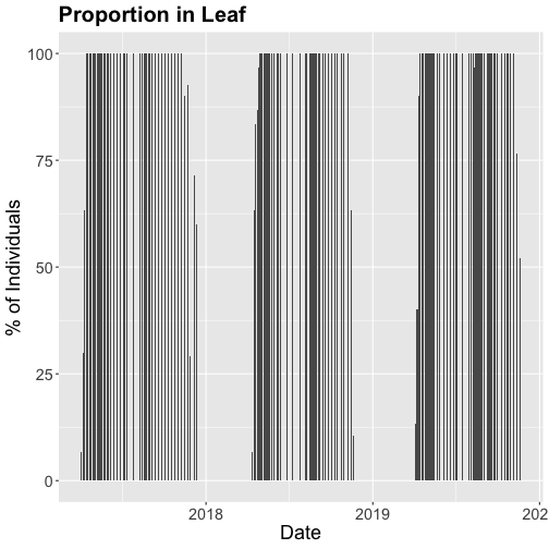
We could also covert this to percentage and plot that.
The plots demonstrate the nice expected pattern of increasing leaf-out, peak,
and drop-off.
Drivers of phenology
Now that we see that there are differences in and shifts in phenophases, what
are the drivers of phenophases?
The NEON phenology measurements track sensitive and easily observed indicators
of biotic responses to meteorological variability by monitoring the timing and duration
of phenological stages in plant communities. Plant phenology is affected by forces
such as temperature, timing and duration of pest infestations and disease outbreaks,
water fluxes, nutrient budgets, carbon dynamics, and food availability and has
feedbacks to trophic interactions, carbon sequestration, community composition
and ecosystem function. (quoted from
Plant Phenology Observations user guide.)
Filter by date
In the next part of this series, we will be exploring temperature as a driver of
phenology. Temperature data are quite large (NEON provides this in 1 minute or 30
minute intervals) so let's trim our phenology date down to only one year so that
we aren't working with as large a dataset.
Let's filter to just 2018 data.
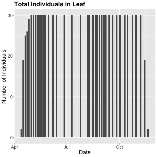
# use filter to select only the date of interest

phe_1sp_2018 <- inStat_T %>%
  filter(dateStat >= "2018-01-01" &
           dateStat <= "2018-12-31")


# did it work?

range(phe_1sp_2018$dateStat)

## [1] "2018-04-13 GMT" "2018-11-20 GMT"
How does that look?
# Now let's make the plot look a bit more presentable

phenoPlot18 <- ggplot(phe_1sp_2018,
                      aes(dateStat, countYes)) +
    geom_bar(stat="identity", na.rm = TRUE) +
    ggtitle("Total Individuals in Leaf") +
    xlab("Date") + ylab("Number of Individuals") +
    theme(plot.title = element_text(lineheight=.8,
                                    face="bold",
                                    size = 20)) +
    theme(text = element_text(size=18))


phenoPlot18
Now that we've filtered down to just the 2018 data from SCBI for LITU in leaf,
we may want to save that subsetted data for another use. To do that you can write
the data frame to a .csv file.
You do not need to follow this step if you are continuing on to the next tutorials
in this series as you already have the data frame in your environment. Of course
if you close R and then come back to it, you will need to re-load this data and
instructions for that are provided in the relevant tutorials.
This is a tutorial in pulling data from the NEON API or Application
Programming Interface. The tutorial uses R and the R package httr, but the core
information about the API is applicable to other languages and approaches.
Objectives
After completing this activity, you will be able to:
Construct API calls to query the NEON API.
Access and understand data and metadata available via the NEON API.
Things You’ll Need To Complete This Tutorial
To complete this tutorial you will need the most current version of R and,
preferably, RStudio loaded on your computer.
If you are unfamiliar with the concept of an API, think of an API as a
‘middle person' that provides a communication path for a software application
to obtain information from a digital data source. APIs are becoming a very
common means of sharing digital information. Many of the apps that you use on
your computer or mobile device to produce maps, charts, reports, and other
useful forms of information pull data from multiple sources using APIs. In
the ecological and environmental sciences, many researchers use APIs to
programmatically pull data into their analyses. (Quoted from the NEON Observatory
Blog story:
API and data availability viewer now live on the NEON data portal.)
What is accessible via the NEON API?
The NEON API includes endpoints for NEON data and metadata, including
spatial data, taxonomic data, and samples (see Endpoints below). This
tutorial explores these sources of information using a specific data
product as a guide. The principles and rule sets described below can
be applied to other data products and metadata.
Specifics are appended to this in order to get the data or metadata you're
looking for, but all calls to an API will include the base URL. For the NEON
API, this is http://data.neonscience.org/api/v0 --
not clickable, because the base URL by itself will take you nowhere!
Your first thought is probably to use the /data endpoint. And we'll get
there. But notice above that the API call for the /data endpoint includes
the site and month of data to download. You don't want to have to guess sites
and months at random - first, you need to see which sites and months have
available data for the product you're interested in. That can be done either
through the /sites or the /products endpoint; here we'll use
/products.
Note: Checking for data availability can sometimes be skipped for the
streaming sensor data products. In general, they are available continuously,
and you could theoretically query a site and month of interest and expect
there to be data by default. However, there can be interruptions to sensor
data, in particular at aquatic sites, so checking availability first is the
most reliable approach.
Use the products endpoint to query for Woody vegetation data. The target is
the data product identifier, noted above, DP1.10098.001:
# Load the necessary libraries
library(httr)
library(jsonlite)

# Request data using the GET function & the API call
req <- GET("http://data.neonscience.org/api/v0/products/DP1.10098.001")
req

## Response [https://data.neonscience.org/api/v0/products/DP1.10098.001]
##   Date: 2021-06-16 01:03
##   Status: 200
##   Content-Type: application/json;charset=UTF-8
##   Size: 70.1 kB
The object returned from GET() has many layers of information. Entering the
name of the object gives you some basic information about what you accessed.
Status: 200 indicates this was a successful query; the status field can be
a useful place to look if something goes wrong. These are HTTP status codes,
you can google them to find out what a given value indicates.
The Content-Type parameter tells us we've accessed a json file. The easiest
way to translate this to something more manageable in R is to use the
fromJSON() function in the jsonlite package. It will convert the json into
a nested list, flattening the nesting where possible.
# Make the data readable by jsonlite
req.text <- content(req, as="text")

# Flatten json into a nested list
avail <- jsonlite::fromJSON(req.text,
                            simplifyDataFrame=T,
                            flatten=T)
A lot of the content here is basic information about the data product.
You can see all of it by running the line print(avail), but
this will result in a very long printout in your console. Instead, try viewing
list items individually. Here, we highlight a couple of interesting examples:
# View description of data product
avail$data$productDescription

## [1] "Structure measurements, including height, crown diameter, and stem diameter, as well as mapped position of individual woody plants"

# View data product abstract
avail$data$productAbstract

## [1] "This data product contains the quality-controlled, native sampling resolution data from in-situ measurements of live and standing dead woody individuals and shrub groups, from all terrestrial NEON sites with qualifying woody vegetation. The exact measurements collected per individual depend on growth form, and these measurements are focused on enabling biomass and productivity estimation, estimation of shrub volume and biomass, and calibration / validation of multiple NEON airborne remote-sensing data products. In general, comparatively large individuals that are visible to remote-sensing instruments are mapped, tagged and measured, and other smaller individuals are tagged and measured but not mapped. Smaller individuals may be subsampled according to a nested subplot approach in order to standardize the per plot sampling effort. Structure and mapping data are reported per individual per plot; sampling metadata, such as per growth form sampling area, are reported per plot. For additional details, see the user guide, protocols, and science design listed in the Documentation section in this data product's details webpage.\n\nLatency:\nThe expected time from data and/or sample collection in the field to data publication is as follows, for each of the data tables (in days) in the downloaded data package. See the Data Product User Guide for more information.\n\nvst_apparentindividual:  90\n\nvst_mappingandtagging:  90\n\nvst_perplotperyear:  300\n\nvst_shrubgroup:  90"
You may notice that some of this information is also accessible on the NEON
data portal. The portal uses the same data sources as the API, and in many
cases the portal is using the API on the back end, and simply adding a more
user-friendly display to the data.
We want to find which sites and months have available data. That is in the
siteCodes section. Let's look at what information is presented for each
site:
# Look at the first list element for siteCode
avail$data$siteCodes$siteCode[[1]]

## [1] "ABBY"

# And at the first list element for availableMonths
avail$data$siteCodes$availableMonths[[1]]

##  [1] "2015-07" "2015-08" "2016-08" "2016-09" "2016-10" "2016-11" "2017-03" "2017-04" "2017-07" "2017-08"
## [11] "2017-09" "2018-07" "2018-08" "2018-09" "2018-10" "2018-11" "2019-07" "2019-09" "2019-10" "2019-11"
Here we can see the list of months with data for the site ABBY, which is
the Abby Road forest in Washington state.
The section $data$siteCodes$availableDataUrls provides the exact API
calls we need in order to query the data for each available site and month.
# Get complete list of available data URLs
wood.urls <- unlist(avail$data$siteCodes$availableDataUrls)

# Total number of URLs
length(wood.urls)

## [1] 535

# Show first 10 URLs available
wood.urls[1:10]

##  [1] "https://data.neonscience.org/api/v0/data/DP1.10098.001/ABBY/2015-07"
##  [2] "https://data.neonscience.org/api/v0/data/DP1.10098.001/ABBY/2015-08"
##  [3] "https://data.neonscience.org/api/v0/data/DP1.10098.001/ABBY/2016-08"
##  [4] "https://data.neonscience.org/api/v0/data/DP1.10098.001/ABBY/2016-09"
##  [5] "https://data.neonscience.org/api/v0/data/DP1.10098.001/ABBY/2016-10"
##  [6] "https://data.neonscience.org/api/v0/data/DP1.10098.001/ABBY/2016-11"
##  [7] "https://data.neonscience.org/api/v0/data/DP1.10098.001/ABBY/2017-03"
##  [8] "https://data.neonscience.org/api/v0/data/DP1.10098.001/ABBY/2017-04"
##  [9] "https://data.neonscience.org/api/v0/data/DP1.10098.001/ABBY/2017-07"
## [10] "https://data.neonscience.org/api/v0/data/DP1.10098.001/ABBY/2017-08"
These URLs are the API calls we can use to find out what files are available
for each month where there are data. They are pre-constructed calls to the
/data endpoint of the NEON API.
Let's look at the woody plant data from the Rocky Mountain National Park
(RMNP) site from October 2019. We can do this by using the GET() function
on the relevant URL, which we can extract using the grep() function.
Note that if you want data from more than one site/month you need to iterate
this code, GET() fails if you give it more than one URL at a time.
# Get available data for RMNP Oct 2019
woody <- GET(wood.urls[grep("RMNP/2019-10", wood.urls)])
woody.files <- jsonlite::fromJSON(content(woody, as="text"))

# See what files are available for this site and month
woody.files$data$files$name

## [1] "NEON.D10.RMNP.DP1.10098.001.EML.20191010-20191017.20210123T023002Z.xml"
## [2] "NEON.D10.RMNP.DP1.10098.001.2019-10.basic.20210114T173951Z.zip"
## [3] "NEON.D10.RMNP.DP1.10098.001.vst_apparentindividual.2019-10.basic.20210114T173951Z.csv"
## [4] "NEON.D10.RMNP.DP1.10098.001.variables.20210114T173951Z.csv"
## [5] "NEON.D10.RMNP.DP0.10098.001.categoricalCodes.20210114T173951Z.csv"
## [6] "NEON.D10.RMNP.DP1.10098.001.readme.20210123T023002Z.txt"
## [7] "NEON.D10.RMNP.DP1.10098.001.vst_perplotperyear.2019-10.basic.20210114T173951Z.csv"
## [8] "NEON.D10.RMNP.DP1.10098.001.vst_mappingandtagging.basic.20210114T173951Z.csv"
## [9] "NEON.D10.RMNP.DP0.10098.001.validation.20210114T173951Z.csv"
If you've downloaded NEON data before via the data portal or the
neonUtilities package, this should look very familiar. The format
for most of the file names is:
NEON.[domain number].[site code].[data product ID].[file-specific name].
[year and month of data].[basic or expanded data package].
[date of file creation]
Some files omit the year and month, and/or the data package, since they're
not specific to a particular measurement interval, such as the data product
readme and variables files. The date of file creation uses the
ISO6801 format, for example 20210114T173951Z, and can be used to determine
whether data have been updated since the last time you downloaded.
Available files in our query for October 2019 at Rocky Mountain are all of the
following (leaving off the initial NEON.D10.RMNP.DP1.10098.001):
~.vst_perplotperyear.2019-10.basic.20210114T173951Z.csv: data table of
measurements conducted at the plot level every year
~.vst_apparentindividual.2019-10.basic.20210114T173951Z.csv: data table
containing measurements and observations conducted on woody individuals
~.vst_mappingandtagging.basic.20210114T173951Z.csv: data table
containing mapping data for each measured woody individual. Note year and
month are not in file name; these data are collected once per individual
and provided with every month of data downloaded
~.categoricalCodes.20210114T173951Z.csv: definitions of the values in
categorical variables
~.readme.20210123T023002Z.txt: readme for the data product (not specific
to dates or location)
~.EML.20191010-20191017.20210123T023002Z.xml: Ecological Metadata
Language (EML) file, describing the data product
~.validation.20210114T173951Z.csv: validation file for the data product,
lists input data and data entry validation rules
~.variables.20210114T173951Z.csv: variables file for the data product,
lists data fields in downloaded tables
~.2019-10.basic.20210114T173951Z.zip: zip of all files in the basic
package. Pre-packaged zips are planned to be removed; may not appear in
response to your query
This data product doesn't have an expanded package, so we only see the
basic package data files, and only one copy of each of the metadata files.
Let's get the data table for the mapping and tagging data. The list of files
doesn't return in the same order every time, so we shouldn't use the position
in the list to select the file name we want. Plus, we want code we can re-use
when getting data from other sites and other months. So we select file urls
based on the data table name in the file names.
Note that if there were an expanded package, the code above would return
two URLs. In that case you would need to specify the package as well in
selecting the URL.
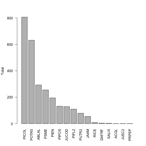
Now we have the data and can access it in R. Just to show that the file we
pulled has actual data in it, let's make a quick graphic of the species
present and their abundances:
# Get counts by species
countBySp <- table(vst.maptag$taxonID)

# Reorder so list is ordered most to least abundance
countBySp <- countBySp[order(countBySp, decreasing=T)]

# Plot abundances
barplot(countBySp, names.arg=names(countBySp),
        ylab="Total", las=2)
This shows us that the two most abundant species are designated with the
taxon codes PICOL and POTR5. We can look back at the data table, check the
scientificName field corresponding to these values, and see that these
are lodgepole pine and quaking aspen, as we might expect in the eastern
foothills of the Rocky mountains.
Let's say we're interested in how NEON defines quaking aspen, and
what taxon authority it uses for its definition. We can use the
/taxonomy endpoint of the API to do that.
Taxonomy
NEON maintains accepted taxonomies for many of the taxonomic identification
data we collect. NEON taxonomies are available for query via the API; they
are also provided via an interactive user interface, the Taxon Viewer.
NEON taxonomy data provides the reference information for how NEON
validates taxa; an identification must appear in the taxonomy lists
in order to be accepted into the NEON database. Additions to the lists
are reviewed regularly. The taxonomy lists also provide the author
of the scientific name, and the reference text used.
The taxonomy endpoint of the API has query options that are a bit more
complicated than what was described in the "Anatomy of an API Call"
section above. As described above, each endpoint has a single type of
target - a data product number, a named location name, etc. For taxonomic
data, there are multiple query options, and some of them can be used in
combination. Instead of entering a single target, we specify the query
type, and then the query parameter to search for. For example, a query
for taxa in the Pinaceae family:
The available types of queries are listed in the taxonomy section
of the API web page. Briefly, they are:
taxonTypeCode: Which of the taxonomies maintained by NEON are you
looking for? BIRD, FISH, PLANT, etc. Cannot be used in combination
with the taxonomic rank queries.
each of the major taxonomic ranks from genus through kingdom
scientificname: Genus + specific epithet (+ authority). Search is
by exact match only, see final example below.
verbose: Do you want the short (false) or long (true) response
offset: Skip this number of items at the start of the list.
limit: Result set will be truncated at this length.
For the first example, let's query for the loon family, Gaviidae, in the
bird taxonomy. Note that query parameters are case-sensitive.
And look at the $data element of the results, which contains:
The full taxonomy of each taxon
The short taxon code used by NEON (taxonID/acceptedTaxonID)
The author of the scientific name (scientificNameAuthorship)
The vernacular name, if applicable
The reference text used (nameAccordingToID)
The terms used for each field are matched to Darwin Core (dwc) and
the Global Biodiversity Information Facility (gbif) terms, where
possible, and the matches are indicated in the column headers.
loon.list$data

##   taxonTypeCode taxonID acceptedTaxonID dwc:scientificName dwc:scientificNameAuthorship dwc:taxonRank
## 1          BIRD    ARLO            ARLO      Gavia arctica                   (Linnaeus)       species
## 2          BIRD    COLO            COLO        Gavia immer                   (Brunnich)       species
## 3          BIRD    PALO            PALO     Gavia pacifica                   (Lawrence)       species
## 4          BIRD    RTLO            RTLO     Gavia stellata                (Pontoppidan)       species
## 5          BIRD    YBLO            YBLO      Gavia adamsii                 (G. R. Gray)       species
##   dwc:vernacularName    dwc:nameAccordingToID dwc:kingdom dwc:phylum dwc:class   dwc:order dwc:family
## 1        Arctic Loon doi: 10.1642/AUK-15-73.1    Animalia   Chordata      Aves Gaviiformes   Gaviidae
## 2        Common Loon doi: 10.1642/AUK-15-73.1    Animalia   Chordata      Aves Gaviiformes   Gaviidae
## 3       Pacific Loon doi: 10.1642/AUK-15-73.1    Animalia   Chordata      Aves Gaviiformes   Gaviidae
## 4  Red-throated Loon doi: 10.1642/AUK-15-73.1    Animalia   Chordata      Aves Gaviiformes   Gaviidae
## 5 Yellow-billed Loon doi: 10.1642/AUK-15-73.1    Animalia   Chordata      Aves Gaviiformes   Gaviidae
##   dwc:genus gbif:subspecies gbif:variety
## 1     Gavia              NA           NA
## 2     Gavia              NA           NA
## 3     Gavia              NA           NA
## 4     Gavia              NA           NA
## 5     Gavia              NA           NA
To get the entire list for a particular taxonomic type, use the
taxonTypeCode query. Be cautious with this query, the PLANT taxonomic
list has several hundred thousand entries.
For an example, let's look up the small mammal taxonomic list, which
is one of the shorter ones, and use the verbose=true option to see
a more extensive list of taxon data, including many taxon ranks that
aren't populated for these taxa. For space here, we'll display only
the first 10 taxa:
mam.req <- GET("http://data.neonscience.org/api/v0/taxonomy/?taxonTypeCode=SMALL_MAMMAL&verbose=true")
mam.list <- jsonlite::fromJSON(content(mam.req, as="text"))
mam.list$data[1:10,]

##    taxonTypeCode taxonID acceptedTaxonID               dwc:scientificName dwc:scientificNameAuthorship
## 1   SMALL_MAMMAL    AMHA            AMHA        Ammospermophilus harrisii          Audubon and Bachman
## 2   SMALL_MAMMAL    AMIN            AMIN       Ammospermophilus interpres                      Merriam
## 3   SMALL_MAMMAL    AMLE            AMLE        Ammospermophilus leucurus                      Merriam
## 4   SMALL_MAMMAL    AMLT            AMLT Ammospermophilus leucurus tersus                      Goldman
## 5   SMALL_MAMMAL    AMNE            AMNE         Ammospermophilus nelsoni                      Merriam
## 6   SMALL_MAMMAL    AMSP            AMSP             Ammospermophilus sp.                         <NA>
## 7   SMALL_MAMMAL    APRN            APRN            Aplodontia rufa nigra                       Taylor
## 8   SMALL_MAMMAL    APRU            APRU                  Aplodontia rufa                   Rafinesque
## 9   SMALL_MAMMAL    ARAL            ARAL                Arborimus albipes                      Merriam
## 10  SMALL_MAMMAL    ARLO            ARLO            Arborimus longicaudus                         True
##    dwc:taxonRank            dwc:vernacularName taxonProtocolCategory dwc:nameAccordingToID
## 1        species     Harriss Antelope Squirrel         opportunistic  isbn: 978 0801882210
## 2        species       Texas Antelope Squirrel         opportunistic  isbn: 978 0801882210
## 3        species Whitetailed Antelope Squirrel         opportunistic  isbn: 978 0801882210
## 4     subspecies                          <NA>         opportunistic  isbn: 978 0801882210
## 5        species     Nelsons Antelope Squirrel         opportunistic  isbn: 978 0801882210
## 6          genus                          <NA>         opportunistic  isbn: 978 0801882210
## 7     subspecies                          <NA>            non-target  isbn: 978 0801882210
## 8        species                      Sewellel            non-target  isbn: 978 0801882210
## 9        species              Whitefooted Vole                target  isbn: 978 0801882210
## 10       species                 Red Tree Vole                target  isbn: 978 0801882210
##                                                                                                                                                 dwc:nameAccordingToTitle
## 1  Wilson D. E. and D. M. Reeder. 2005. Mammal Species of the World; A Taxonomic and Geographic Reference. Third edition. Johns Hopkins University Press; Baltimore, MD.
## 2  Wilson D. E. and D. M. Reeder. 2005. Mammal Species of the World; A Taxonomic and Geographic Reference. Third edition. Johns Hopkins University Press; Baltimore, MD.
## 3  Wilson D. E. and D. M. Reeder. 2005. Mammal Species of the World; A Taxonomic and Geographic Reference. Third edition. Johns Hopkins University Press; Baltimore, MD.
## 4  Wilson D. E. and D. M. Reeder. 2005. Mammal Species of the World; A Taxonomic and Geographic Reference. Third edition. Johns Hopkins University Press; Baltimore, MD.
## 5  Wilson D. E. and D. M. Reeder. 2005. Mammal Species of the World; A Taxonomic and Geographic Reference. Third edition. Johns Hopkins University Press; Baltimore, MD.
## 6  Wilson D. E. and D. M. Reeder. 2005. Mammal Species of the World; A Taxonomic and Geographic Reference. Third edition. Johns Hopkins University Press; Baltimore, MD.
## 7  Wilson D. E. and D. M. Reeder. 2005. Mammal Species of the World; A Taxonomic and Geographic Reference. Third edition. Johns Hopkins University Press; Baltimore, MD.
## 8  Wilson D. E. and D. M. Reeder. 2005. Mammal Species of the World; A Taxonomic and Geographic Reference. Third edition. Johns Hopkins University Press; Baltimore, MD.
## 9  Wilson D. E. and D. M. Reeder. 2005. Mammal Species of the World; A Taxonomic and Geographic Reference. Third edition. Johns Hopkins University Press; Baltimore, MD.
## 10 Wilson D. E. and D. M. Reeder. 2005. Mammal Species of the World; A Taxonomic and Geographic Reference. Third edition. Johns Hopkins University Press; Baltimore, MD.
##    dwc:kingdom gbif:subkingdom gbif:infrakingdom gbif:superdivision gbif:division gbif:subdivision
## 1     Animalia              NA                NA                 NA            NA               NA
## 2     Animalia              NA                NA                 NA            NA               NA
## 3     Animalia              NA                NA                 NA            NA               NA
## 4     Animalia              NA                NA                 NA            NA               NA
## 5     Animalia              NA                NA                 NA            NA               NA
## 6     Animalia              NA                NA                 NA            NA               NA
## 7     Animalia              NA                NA                 NA            NA               NA
## 8     Animalia              NA                NA                 NA            NA               NA
## 9     Animalia              NA                NA                 NA            NA               NA
## 10    Animalia              NA                NA                 NA            NA               NA
##    gbif:infradivision gbif:parvdivision gbif:superphylum dwc:phylum gbif:subphylum gbif:infraphylum
## 1                  NA                NA               NA   Chordata             NA               NA
## 2                  NA                NA               NA   Chordata             NA               NA
## 3                  NA                NA               NA   Chordata             NA               NA
## 4                  NA                NA               NA   Chordata             NA               NA
## 5                  NA                NA               NA   Chordata             NA               NA
## 6                  NA                NA               NA   Chordata             NA               NA
## 7                  NA                NA               NA   Chordata             NA               NA
## 8                  NA                NA               NA   Chordata             NA               NA
## 9                  NA                NA               NA   Chordata             NA               NA
## 10                 NA                NA               NA   Chordata             NA               NA
##    gbif:superclass dwc:class gbif:subclass gbif:infraclass gbif:superorder dwc:order gbif:suborder
## 1               NA  Mammalia            NA              NA              NA  Rodentia            NA
## 2               NA  Mammalia            NA              NA              NA  Rodentia            NA
## 3               NA  Mammalia            NA              NA              NA  Rodentia            NA
## 4               NA  Mammalia            NA              NA              NA  Rodentia            NA
## 5               NA  Mammalia            NA              NA              NA  Rodentia            NA
## 6               NA  Mammalia            NA              NA              NA  Rodentia            NA
## 7               NA  Mammalia            NA              NA              NA  Rodentia            NA
## 8               NA  Mammalia            NA              NA              NA  Rodentia            NA
## 9               NA  Mammalia            NA              NA              NA  Rodentia            NA
## 10              NA  Mammalia            NA              NA              NA  Rodentia            NA
##    gbif:infraorder gbif:section gbif:subsection gbif:superfamily    dwc:family gbif:subfamily gbif:tribe
## 1               NA           NA              NA               NA     Sciuridae        Xerinae  Marmotini
## 2               NA           NA              NA               NA     Sciuridae        Xerinae  Marmotini
## 3               NA           NA              NA               NA     Sciuridae        Xerinae  Marmotini
## 4               NA           NA              NA               NA     Sciuridae        Xerinae  Marmotini
## 5               NA           NA              NA               NA     Sciuridae        Xerinae  Marmotini
## 6               NA           NA              NA               NA     Sciuridae        Xerinae  Marmotini
## 7               NA           NA              NA               NA Aplodontiidae           <NA>       <NA>
## 8               NA           NA              NA               NA Aplodontiidae           <NA>       <NA>
## 9               NA           NA              NA               NA    Cricetidae    Arvicolinae       <NA>
## 10              NA           NA              NA               NA    Cricetidae    Arvicolinae       <NA>
##    gbif:subtribe        dwc:genus dwc:subgenus gbif:subspecies gbif:variety gbif:subvariety gbif:form
## 1             NA Ammospermophilus         <NA>              NA           NA              NA        NA
## 2             NA Ammospermophilus         <NA>              NA           NA              NA        NA
## 3             NA Ammospermophilus         <NA>              NA           NA              NA        NA
## 4             NA Ammospermophilus         <NA>              NA           NA              NA        NA
## 5             NA Ammospermophilus         <NA>              NA           NA              NA        NA
## 6             NA Ammospermophilus         <NA>              NA           NA              NA        NA
## 7             NA       Aplodontia         <NA>              NA           NA              NA        NA
## 8             NA       Aplodontia         <NA>              NA           NA              NA        NA
## 9             NA        Arborimus         <NA>              NA           NA              NA        NA
## 10            NA        Arborimus         <NA>              NA           NA              NA        NA
##    gbif:subform speciesGroup dwc:specificEpithet dwc:infraspecificEpithet
## 1            NA         <NA>            harrisii                     <NA>
## 2            NA         <NA>           interpres                     <NA>
## 3            NA         <NA>            leucurus                     <NA>
## 4            NA         <NA>            leucurus                   tersus
## 5            NA         <NA>             nelsoni                     <NA>
## 6            NA         <NA>                 sp.                     <NA>
## 7            NA         <NA>                rufa                    nigra
## 8            NA         <NA>                rufa                     <NA>
## 9            NA         <NA>             albipes                     <NA>
## 10           NA         <NA>         longicaudus                     <NA>
Now let's go back to our question about quaking aspen. To get
information about a single taxon, use the scientificname
query. This query will not do a fuzzy match, so you need to query
the exact name of the taxon in the NEON taxonomy. Because of this,
the query will be most useful in cases like the current one, where
you already have NEON data in hand and are looking for more
information about a specific taxon. Querying on scientificname
is unlikely to be an efficient way to figure out if NEON recognizes
a particular taxon.
In addition, scientific names contain spaces, which are not
allowed in a URL. The spaces need to be replaced with the URL
encoding replacement, %20.
Looking up the POTR5 data in the woody vegetation product, we
see that the scientific name is Populus tremuloides Michx.
This means we need to search for Populus%20tremuloides%20Michx.
to get the exact match.
This shows us the definition for Populus tremuloides Michx. does
not include a subspecies or variety, and the authority for the
taxon information (nameAccordingToID) is the USDA PLANTS
database. This means NEON taxonomic definitions are aligned with
the USDA, and is true for the large majority of plants in the
NEON taxon system.
Spatial data
How to get spatial data and what to do with it depends on which type of
data you're working with.
Instrumentation data (both aquatic and terrestrial)
The sensor_positions files, which are included in the list of available files,
contain spatial coordinates for each sensor in the data. See the final section
of the Geolocation tutorial for guidance in using these files.
Observational data - Aquatic
Latitude, longitude, elevation, and associated uncertainties are included in
data downloads. Most products also include an "additional coordinate uncertainty"
that should be added to the provided uncertainty. Additional spatial data, such
as northing and easting, can be downloaded from the API.
Observational data - Terrestrial
Latitude, longitude, elevation, and associated uncertainties are included in
data downloads. These are the coordinates and uncertainty of the sampling plot;
for many protocols it is possible to calculate a more precise location.
Instructions for doing this are in the respective data product user guides, and
code is in the geoNEON package on GitHub.
Querying a single named location
Let's look at a specific sampling location in the woody vegetation structure
data we downloaded above. To do this, look for the field called namedLocation,
which is present in all observational data products, both aquatic and
terrestrial. This field matches the exact name of the location in the NEON
database.
Here we see the first six entries in the namedLocation column, which tells us
the names of the Terrestrial Observation plots where the woody plant surveys
were conducted.
We can query the locations endpoint of the API for the first named location,
RMNP_043.basePlot.vst.
req.loc <- GET("http://data.neonscience.org/api/v0/locations/RMNP_043.basePlot.vst")
vst.RMNP_043 <- jsonlite::fromJSON(content(req.loc, as="text"))
vst.RMNP_043

## $data
## $data$locationName
## [1] "RMNP_043.basePlot.vst"
##
## $data$locationDescription
## [1] "Plot \"RMNP_043\" at site \"RMNP\""
##
## $data$locationType
## [1] "OS Plot - vst"
##
## $data$domainCode
## [1] "D10"
##
## $data$siteCode
## [1] "RMNP"
##
## $data$locationDecimalLatitude
## [1] 40.27683
##
## $data$locationDecimalLongitude
## [1] -105.5454
##
## $data$locationElevation
## [1] 2740.39
##
## $data$locationUtmEasting
## [1] 453634.6
##
## $data$locationUtmNorthing
## [1] 4458626
##
## $data$locationUtmHemisphere
## [1] "N"
##
## $data$locationUtmZone
## [1] 13
##
## $data$alphaOrientation
## [1] 0
##
## $data$betaOrientation
## [1] 0
##
## $data$gammaOrientation
## [1] 0
##
## $data$xOffset
## [1] 0
##
## $data$yOffset
## [1] 0
##
## $data$zOffset
## [1] 0
##
## $data$offsetLocation
## NULL
##
## $data$locationProperties
##                             locationPropertyName locationPropertyValue
## 1                    Value for Coordinate source            GeoXH 6000
## 2               Value for Coordinate uncertainty                  0.09
## 3                              Value for Country          unitedStates
## 4                               Value for County               Larimer
## 5                Value for Elevation uncertainty                   0.1
## 6                   Value for Filtered positions                   300
## 7                       Value for Geodetic datum                 WGS84
## 8     Value for Horizontal dilution of precision                     1
## 9                    Value for Maximum elevation               2743.43
## 10                   Value for Minimum elevation               2738.52
## 11 Value for National Land Cover Database (2001)       evergreenForest
## 12                     Value for Plot dimensions             40m x 40m
## 13                             Value for Plot ID              RMNP_043
## 14                           Value for Plot size                  1600
## 15                        Value for Plot subtype              basePlot
## 16                           Value for Plot type                 tower
## 17    Value for Positional dilution of precision                   1.8
## 18            Value for Reference Point Position                    41
## 19                        Value for Slope aspect                     0
## 20                      Value for Slope gradient                     0
## 21                     Value for Soil type order              Alfisols
## 22                      Value for State province                    CO
## 23                            Value for UTM Zone                   13N
##
## $data$locationParent
## [1] "RMNP"
##
## $data$locationParentUrl
## [1] "https://data.neonscience.org/api/v0/locations/RMNP"
##
## $data$locationChildren
##  [1] "RMNP_043.basePlot.vst.41" "RMNP_043.basePlot.vst.43" "RMNP_043.basePlot.vst.49"
##  [4] "RMNP_043.basePlot.vst.51" "RMNP_043.basePlot.vst.59" "RMNP_043.basePlot.vst.57"
##  [7] "RMNP_043.basePlot.vst.25" "RMNP_043.basePlot.vst.21" "RMNP_043.basePlot.vst.23"
## [10] "RMNP_043.basePlot.vst.33" "RMNP_043.basePlot.vst.31" "RMNP_043.basePlot.vst.39"
## [13] "RMNP_043.basePlot.vst.61"
##
## $data$locationChildrenUrls
##  [1] "https://data.neonscience.org/api/v0/locations/RMNP_043.basePlot.vst.41"
##  [2] "https://data.neonscience.org/api/v0/locations/RMNP_043.basePlot.vst.43"
##  [3] "https://data.neonscience.org/api/v0/locations/RMNP_043.basePlot.vst.49"
##  [4] "https://data.neonscience.org/api/v0/locations/RMNP_043.basePlot.vst.51"
##  [5] "https://data.neonscience.org/api/v0/locations/RMNP_043.basePlot.vst.59"
##  [6] "https://data.neonscience.org/api/v0/locations/RMNP_043.basePlot.vst.57"
##  [7] "https://data.neonscience.org/api/v0/locations/RMNP_043.basePlot.vst.25"
##  [8] "https://data.neonscience.org/api/v0/locations/RMNP_043.basePlot.vst.21"
##  [9] "https://data.neonscience.org/api/v0/locations/RMNP_043.basePlot.vst.23"
## [10] "https://data.neonscience.org/api/v0/locations/RMNP_043.basePlot.vst.33"
## [11] "https://data.neonscience.org/api/v0/locations/RMNP_043.basePlot.vst.31"
## [12] "https://data.neonscience.org/api/v0/locations/RMNP_043.basePlot.vst.39"
## [13] "https://data.neonscience.org/api/v0/locations/RMNP_043.basePlot.vst.61"
Note spatial information under $data$[nameOfCoordinate] and under
$data$locationProperties. These coordinates represent the centroid of
plot RMNP_043, and should match the coordinates for the plot in the
vst_perplotperyear data table. In rare cases, spatial data may be
updated, and if this has happened more recently than the data table
was published, there may be a small mismatch in the coordinates. In
those cases, the data accessed via the API will be the most up to date.
Also note $data$locationChildren: these are the
point and subplot locations within plot RMNP_043. And
$data$locationChildrenUrls provides pre-constructed API calls for
querying those child locations. Let's look up the location data for
point 31 in plot RMNP_043.
req.child.loc <- GET(grep("31",
                          vst.RMNP_043$data$locationChildrenUrls,
                          value=T))
vst.RMNP_043.31 <- jsonlite::fromJSON(content(req.child.loc, as="text"))
vst.RMNP_043.31

## $data
## $data$locationName
## [1] "RMNP_043.basePlot.vst.31"
##
## $data$locationDescription
## [1] "31"
##
## $data$locationType
## [1] "Point"
##
## $data$domainCode
## [1] "D10"
##
## $data$siteCode
## [1] "RMNP"
##
## $data$locationDecimalLatitude
## [1] 40.27674
##
## $data$locationDecimalLongitude
## [1] -105.5455
##
## $data$locationElevation
## [1] 2741.56
##
## $data$locationUtmEasting
## [1] 453623.7
##
## $data$locationUtmNorthing
## [1] 4458616
##
## $data$locationUtmHemisphere
## [1] "N"
##
## $data$locationUtmZone
## [1] 13
##
## $data$alphaOrientation
## [1] 0
##
## $data$betaOrientation
## [1] 0
##
## $data$gammaOrientation
## [1] 0
##
## $data$xOffset
## [1] 0
##
## $data$yOffset
## [1] 0
##
## $data$zOffset
## [1] 0
##
## $data$offsetLocation
## NULL
##
## $data$locationProperties
##                            locationPropertyName locationPropertyValue
## 1                   Value for Coordinate source            GeoXH 6000
## 2              Value for Coordinate uncertainty                  0.16
## 3               Value for Elevation uncertainty                  0.28
## 4                      Value for Geodetic datum                 WGS84
## 5 Value for National Land Cover Database (2001)       evergreenForest
## 6                            Value for Point ID                    31
## 7                            Value for UTM Zone                   13N
##
## $data$locationParent
## [1] "RMNP_043.basePlot.vst"
##
## $data$locationParentUrl
## [1] "https://data.neonscience.org/api/v0/locations/RMNP_043.basePlot.vst"
##
## $data$locationChildren
## list()
##
## $data$locationChildrenUrls
## list()
Looking at the easting and northing coordinates, we can see that point
31 is about 10 meters away from the plot centroid in both directions.
Point 31 has no child locations.
For the records with pointID=31 in the vst.maptag table we
downloaded, these coordinates are the reference location that could be
used together with the stemDistance and stemAzimuth fields to
calculate the precise locations of individual trees. For detailed
instructions in how to do this, see the data product user guide.
Alternatively, the geoNEON package contains functions to make this
calculation for you, including accessing the location data from the
API. See below for details and links to tutorials.
R Packages
NEON provides two customized R packages that can carry out many of the
operations described above, in addition to other data transformations.
neonUtilities
The neonUtilities package contains functions that download data
via the API, and that merge the individual files for each site and
month in a single continuous file for each type of data table in the
download.
For a guide to using neonUtilities to download and stack data files,
check out the Download and Explore tutorial.
geoNEON
The geoNEON package contains functions that access spatial data
via the API, and that calculate precise locations for terrestrial
observational data. As in the case of woody vegetation structure,
terrestrial observational data products are published with
spatial data at the plot level, but more precise sampling locations
are usually possible to calculate.
For a guide to using geoNEON to calculate sampling locations,
check out the Geolocation tutorial.
In this exercise we will analyze several NEON Level-3 lidar rasters (DSM, DTM, and CHM) and assess the uncertainty between data collected over the same area on different days.
Learning Objectives
After completing this tutorial, you will be able to:
Read in several L3 Lidar raster files
Difference the tif files
Create histograms of the DSM, DTM, and CHM differences
Remove vegetated areas of DSM & DTMs using the CHM
Compare difference in DSM and DTMs over vegetated and ground pixels
In 2016 the NEON AOP flew the PRIN site in D11 on a poor weather day to ensure coverage of the site. The following day, the weather improved and the site was flown again to collect clear-weather spectrometer data. Having collections only one day apart provides an opportunity to assess LiDAR uncertainty because we should expect that nothing has changed between the two collections. In this exercise we will analyze several NEON Level 3 lidar rasters to assess the uncertainty.
Set up system
First, we'll set up our system and import the required Python packages.
import os
import neonutilities as nu
import rasterio as rio
from rasterio.plot import show, show_hist
import numpy as np
from math import floor
import matplotlib.pyplot as plt
from mpl_toolkits.axes_grid1 import make_axes_locatable
import dotenv
Download DEM and CHM data
As of June 2026, NEON requires an API token for data downloads, to reduce bot scraping and improve user support. Tokens can be generated in NEON data portal user accounts - log in to your account or create one, and go to the API Tokens section. For best practices in storing and using tokens, follow the instructions here. Once you've set up your token as an environment variable, you can load it using the python-dotenv package as follows, optionally specifying the path to the .env file in load_dotenv().
Use the neonutilities package, imported as nu to download the CHM and DEM data, for a single tile. You will need to type y to proceed with the download.
# Download the CHM Data to the ./data folder
nu.by_tile_aop(dpid="DP3.30015.001",
               site="PRIN",
               year=2016,
               easting=607000,
               northing=3696000,
               savepath=os.path.expanduser("~/Downloads"),
               token=token)
Provisional NEON data are not included. To download provisional data, use input parameter include_provisional=True.


Continuing will download 3 NEON data files totaling approximately 1.8 MB. Do you want to proceed? (y/n)  y


Downloading 3 NEON data files totaling approximately 1.8 MB

100%|█████████████████████████████████████████████████████████████████████████████████████████████████████████████████| 3/3 [00:01<00:00,  2.56it/s]
# Download the DEM (DSM & DTM) Data to the ./data folder
nu.by_tile_aop(dpid="DP3.30024.001",
               site="PRIN",
               year=2016,
               easting=607000,
               northing=3696000,
               savepath=os.path.expanduser("~/Downloads"),
               token=token)
Provisional NEON data are not included. To download provisional data, use input parameter include_provisional=True.


Continuing will download 5 NEON data files totaling approximately 11.3 MB. Do you want to proceed? (y/n)  y


Downloading 5 NEON data files totaling approximately 11.3 MB

100%|█████████████████████████████████████████████████████████████████████████████████████████████████████████████████| 5/5 [00:02<00:00,  2.24it/s]
Read in Lidar raster data files
This next function displays all the files that were downloaded, ending in .tif. A number of other metadata files are downloaded as well, including shapefiles and kml files that show the boundary of the files. We can ignore those for now, but feel free to explore those on your own. They can be helpful for looking at the extent (boundaries) of the data without having to read in the actual data files.
def list_files(directory):
    for root, dirs, files in os.walk(directory):
        for file in files:
            if file.endswith('.tif'):
                print(os.path.join(root, file).replace(os.path.expanduser('~/Downloads/'),'..'))

# Replace 'your_directory_path' with the path to the directory you want to search
chm_dir = os.path.expanduser("~/Downloads/DP3.30015.001")
dem_dir = os.path.expanduser("~/Downloads/DP3.30024.001")
list_files(chm_dir)
list_files(dem_dir)
# Display the DSMs from the 1st and 2nd collections:
fig, (ax1, ax2) = plt.subplots(1, 2, figsize=(12,5))
show(dsm1_dataset, ax=ax1); ax1.ticklabel_format(style='plain'); ax1.set_title('2016_PRIN_1 DSM')
show(dsm2_dataset, ax=ax2); ax2.ticklabel_format(style='plain'); ax2.set_title('2016_PRIN_2 DSM');
# Display the DTMs from the 1st and 2nd collections:
fig, (ax1, ax2) = plt.subplots(1, 2, figsize=(12,5))
show(dtm1_dataset, ax=ax1); ax1.ticklabel_format(style='plain'); ax1.set_title('2016_PRIN_1 DTM')
show(dtm2_dataset, ax=ax2); ax2.ticklabel_format(style='plain'); ax2.set_title('2016_PRIN_2 DTM');
Since we want to know what the changed between the two days, we will create an array containing the pixel differences across the two arrays. To do this let's subtract the two DSMs. First let's extract the data from the datasets as follows:
Let's get some summary statistics for this DSM difference array.
diff_dsm_array_mean = np.mean(diff_dsm_array)
diff_dsm_array_std = np.std(diff_dsm_array)
print('Mean difference in DSMs: ',round(diff_dsm_array_mean,3),'m')
print('Standard deviation of difference in DSMs: ',round(diff_dsm_array_std,3),'m')
Mean difference in DSMs:  0.019 m
Standard deviation of difference in DSMs:  0.743 m
The mean is close to zero (0.019 m), indicating there was very little systematic bias between the two days. However, we notice that the standard deviation of the data is quite high at 0.743 meters. Generally we expect NEON LiDAR data to have an error below 0.15 meters! Let's take a look at a histogram of the DSM difference. We use the flatten function on the 2D diff_dsm_array to convert it into a 1D array which allows the hist() function to run faster.
plt.figure()
plt.hist(diff_dsm_array.flatten(),100)
plt.title('Histogram of PRIN DSM Difference')
plt.xlabel('Height Difference(m)'); plt.ylabel('Frequency')
plt.show()
The histogram has long tails, obscuring the distribution near the center. To constrain the x-limits of the histogram we will use the mean and standard deviation just calculated. Since the data appears to be normally distributed, we can constrain the histogram to 95% of the data by including 2 standard deviations above and below the mean.
plt.figure()
plt.hist(diff_dsm_array.flatten(),100,range=[diff_dsm_array_mean-2*diff_dsm_array_std, diff_dsm_array_mean+2*diff_dsm_array_std]);
plt.title('Histogram of PRIN DSM Difference')
plt.xlabel('Height Difference(m)'); plt.ylabel('Frequency')
plt.show()
The histogram shows a wide variation in DSM differences, with those at the 95% limit at around +/- 1.5 m. Let's take a look at the spatial distribution of the errors by plotting a map of the difference between the two DSMs. Here we'll also use the vmin and vmax variables in the plot function to constrain the limits of the colorbar to 95% of the observations.
# define the min and max histogram values
dsm_diff_vmin = diff_dsm_array_mean-diff_dsm_array_std; #print(dsm_diff_vmin)
dsm_diff_vmax = diff_dsm_array_mean+diff_dsm_array_std; #print(dsm_diff_vmax)

# get the extent (bounds) from dsm1_dataset
left, bottom, right, top = dsm1_dataset.bounds
ext = [left, right, bottom, top]

# Plot, with some formatting to make it look nice
fig, ax = plt.subplots(1, 1, figsize=(5,6))
dsm_diff_map = show(diff_dsm_array,vmin=dsm_diff_vmin, vmax=dsm_diff_vmax, extent = ext, ax = ax, cmap='RdBu')
im = dsm_diff_map.get_images()[0]
divider = make_axes_locatable(ax)
cax = divider.append_axes('right', size='5%', pad=0.05)
fig.colorbar(im, cax=cax, orientation='vertical')
ax.ticklabel_format(style='plain'); # don't use scientific notation on the y-axis
ax.set_title('DSM Difference Map');
Here we can see that there is a mean offset somewhere around 0.02, and it looks like there are higher differences in the forested areas.
It seems that there is a spatial pattern in the distribution of errors. Now let's take a look at the statistics (mean, standard deviation), histogram and map for the difference in DTMs.
The overall magnitude of differences are smaller than in the DSM but the same spatial pattern of the error is evident.
Now, we'll plot the Canopy Height Model (CHM) of the same area. In the CHM, the tree heights above ground are represented, with all ground pixels having zero elevation. This time we'll use a colorbar which shows the ground as light green and the highest vegetation as dark green.
# Display the CHMs from the 1st and 2nd collections:
fig, (ax1, ax2) = plt.subplots(1, 2, figsize=(12,5))
show(chm1_dataset, ax=ax1); ax1.ticklabel_format(style='plain'); ax1.set_title('2016_PRIN_1 CHM')
show(chm2_dataset, ax=ax2); ax2.ticklabel_format(style='plain'); ax2.set_title('2016_PRIN_2 CHM');
From the CHM, it appears the spatial distribution of error patterns follow the location of vegetation.
Now let's isolate only the pixels in the difference DSM that correspond to vegetation location, calculate the mean and standard deviation and plot the associated histogram. Before displaying the histogram, we'll remove the no data values from the difference DSM and the non-zero pixels from the CHM. To keep the number of elements the same in each vector to allow element-wise logical operations in Python, we have to remove the difference DSM no data elements from the CHM array as well.
chm1_data = chm1_dataset.read(1)
diff_dsm_array_veg_mean = np.nanmean(diff_dsm_array[chm1_data!=0.0])
diff_dsm_array_veg_std = np.nanstd(diff_dsm_array[chm1_data!=0.0])
print('Mean difference in DSMs on veg points: ',round(diff_dsm_array_veg_mean,3),'m')
print('Standard deviations of difference in DSMs on veg points: ',round(diff_dsm_array_veg_std,3),'m')
Mean difference in DSMs on veg points:  0.072 m
Standard deviations of difference in DSMs on veg points:  1.405 m
plt.figure();
diff_dsm_array_nodata_removed = diff_dsm_array[~np.isnan(diff_dsm_array)]
chm_dsm_nodata_removed = chm1_data[~np.isnan(diff_dsm_array)]

dsm_diff_veg_vmin = diff_dsm_array_veg_mean-2*diff_dsm_array_veg_std
dsm_diff_veg_vmax = diff_dsm_array_veg_mean+2*diff_dsm_array_veg_std

plt.hist(diff_dsm_array_nodata_removed[chm_dsm_nodata_removed!=0.0],100,range=[dsm_diff_veg_vmin, dsm_diff_veg_vmax])
plt.title('Histogram of PRIN DSM Difference in Vegetated Areas')
plt.xlabel('Height Difference(m)'); plt.ylabel('Frequency');
The results show a similar mean difference of near zero, but an extremely high standard deviation of 1.381 m! Since the DSM represents the top of the tree canopy, this provides the level of uncertainty we can expect in the canopy height in forests characteristic of the PRIN site using NEON LiDAR data.
Next we'll calculate the statistics and plot the histogram of the DTM vegetated areas.
diff_dtm_array_veg_mean = np.nanmean(diff_dtm_array[chm1_data!=0.0])
diff_dtm_array_veg_std = np.nanstd(diff_dtm_array[chm1_data!=0.0])
print('Mean difference in DTMs on vegetated pixels: ',round(diff_dtm_array_veg_mean,3),'m')
print('Standard deviations of difference in DTMs on vegetated pixels: ',round(diff_dtm_array_veg_std,3),'m')
Mean difference in DTMs on vegetated pixels:  0.023 m
Standard deviations of difference in DTMs on vegetated pixels:  0.163 m
The mean difference is almost zero (0.023 m), and the variation in less than the DSM variation (0.163 m).
dtm_diff_veg_vmin = diff_dtm_array_veg_mean-2*diff_dtm_array_veg_std
dtm_diff_veg_vmax = diff_dtm_array_veg_mean+2*diff_dtm_array_veg_std

diff_dtm_array_nodata_removed = diff_dtm_array[~np.isnan(diff_dtm_array)]
chm_dtm_nodata_removed = chm1_data[~np.isnan(diff_dtm_array)]
plt.hist((diff_dtm_array_nodata_removed[chm_dtm_nodata_removed!=0.0]),100,range=[dtm_diff_veg_vmin, dtm_diff_veg_vmax]);
plt.title('Histogram of PRIN DTM Difference in Vegetated Pixels');
plt.xlabel('Height Difference (m)'); plt.ylabel('Frequency');
Although the variation is reduced, it is still larger than expected for LiDAR. This is because under vegetation there may not be much laser energy reaching the ground, and the points that do reach the ground may return with lower signal. The sparsity of points leads to surface interpolation over larger distances which can miss variations in the topography. Since the distribution of LIDAR points and their position varied for each day, this resulted in different terrain representations and a uncertianty in the ground surface. This shows that the accuracy of LiDAR DTMs is reduced when vegetation is present.
Finally, let's look at the DTM difference on only the ground points (where CHM = 0).
diff_dtm_array_ground_mean = np.nanmean(diff_dtm_array[chm1_data==0.0])
diff_dtm_array_ground_std = np.nanstd(diff_dtm_array[chm1_data==0.0])
print('Mean difference in DTMs on ground points: ',round(diff_dtm_array_ground_mean,3),'m')
print('Standard deviations of difference in DTMs on ground points: ',round(diff_dtm_array_ground_std,3),'m')
Mean difference in DTMs on ground points:  0.011 m
Standard deviations of difference in DTMs on ground points:  0.069 m
dtm_diff_gnd_vmin = diff_dtm_array_ground_mean-2*diff_dtm_array_ground_std
dtm_diff_gnd_vmax = diff_dtm_array_ground_mean+2*diff_dtm_array_ground_std

plt.hist((diff_dtm_array_nodata_removed[chm_dtm_nodata_removed==0.0]),100,range=[dtm_diff_gnd_vmin, dtm_diff_gnd_vmax])
plt.title('Histogram of PRIN DTM Differences over Ground Pixels')
plt.xlabel('Height Difference(m)'); plt.ylabel('Frequency');
In the open ground, we are able to see the error characteristics we expect with a mean difference of 0.011 m and a variation of ~0.07 m.
This shows that the uncertainty we expect in the NEON LiDAR system (~0.15 m) is only valid in bare, open, hard surfaces. We cannot expect the accuracy of the LiDAR to reach this level when vegetation is present. Quantifying the top of the canopy is particularly difficult and can lead to uncertainty in excess of 1 m for any given pixel.
Challenge: Repeat this uncertainty analysis on another NEON site
There are a number of other instances where AOP has flown repeat flights in short proximity (within a few days, to a few months apart). Try repeating this analysis for one of these sites, listed below:
2017 SERC
2019 CHEQ
2020 CPER
2024 KONZ
Repeat this analysis for a site that was flown twice in the same year, but with different lidar sensors (payloads).
In this tutorial, we demonstrate how to remove parts of a raster based on pixel values using a mask we create. A mask raster layer contains pixel values of either 1 or 0 to where 1 represents pixels that will be used in the analysis and 0 are pixels that are assigned a value of nan (not a number). This can be useful in a number of scenarios, when you are interested in only a certain portion of the data, or need to remove poor-quality data, for example.
Learning Objectives
After completing this tutorial, you will be able to:
User rasterio to read in NEON lidar aspect and vegetation indices geotiff files
Plot a raster tile and histogram of the data values
Create a mask based on values from the aspect and ndvi data
For this lesson, we will work with Aspect and NDVI data collected at NEON's Lower Teakettle (TEAK) site in California. This data is downloaded in the first part of the tutorial, using the Python neonutilities package.
import os
import dotenv
import copy
import neonutilities as nu
import numpy as np
import numpy.ma as ma
import rasterio as rio
from rasterio.plot import show, show_hist
import requests
import zipfile
import matplotlib.pyplot as plt
from matplotlib import colors
import matplotlib.patches as mpatches
%matplotlib inline
Download Lidar Aspect and Vegetation Indices from TEAK
To start, download the NEON Lidar Aspect and Spectrometer Vegetation Indices (including the NDVI) which are provided in geotiff (.tif) format. Use the neonutilitiesby_tile_aop function below to download a single tile.
As of June 2026, NEON requires an API token for data downloads, to reduce bot scraping and improve user support. Tokens can be generated in NEON data portal user accounts - log in to your account or create one, and go to the API Tokens section. For best practices in storing and using tokens, follow the instructions here. Once you've set up your token as an environment variable, you can load it using the python-dotenv package as follows, optionally specifying the path to the .env file in load_dotenv().
# download the Slope and Aspect data to the C:/data directory - change this if desired
nu.by_tile_aop(dpid='DP3.30025.001',
               site='TEAK',
               year=2021,
               easting=320000,
               northing=4092000,
               token=token,
               savepath=r'C:\data')
Provisional NEON data are not included. To download provisional data, use input parameter include_provisional=True.


Continuing will download 3 NEON data files totaling approximately 6.9 MB. Do you want to proceed? (y/n)  y


Downloading 3 NEON data files totaling approximately 6.9 MB

100%|█████████████████████████████████████████████████████████████████████████████████████████████████████████████████| 3/3 [00:01<00:00,  2.88it/s]
# download the Vegetation Indices data
nu.by_tile_aop(dpid='DP3.30026.001',
               site='TEAK',
               year=2021,
               easting=320000,
               northing=4092000,
               token=token,
               savepath=r'C:\data')
Provisional NEON data are not included. To download provisional data, use input parameter include_provisional=True.


Continuing will download 2 NEON data files totaling approximately 86.5 MB. Do you want to proceed? (y/n)  y


Downloading 2 NEON data files totaling approximately 86.5 MB

100%|█████████████████████████████████████████████████████████████████████████████████████████████████████████████████| 2/2 [00:03<00:00,  1.78s/it]
Display the Slope/Aspect and Vegetation Indices datasets that you downloaded:
aspect_dir = os.path.expanduser(r"C:\data\DP3.30025.001")
veg_idx_dir = os.path.expanduser(r"C:\data\DP3.30026.001")

for root, dirs, files in os.walk(aspect_dir):
    for file in files:
        if file.endswith('Aspect.tif'):
            aspect_file = os.path.join(root, file)
            print(aspect_file)

for root, dirs, files in os.walk(veg_idx_dir):
    for file in files:
        if file.endswith('VegetationIndices.zip'):
            veg_file = os.path.join(root, file)
            print(veg_file)
We can use zipfile to unzip the VegetationIndices folder in order to read the NDVI file (which is included in the zipped folder).
with zipfile.ZipFile(veg_file,"r") as zip_ref:
    zip_ref.extractall(r"C:\data\DP3.30026.001\neon-aop-products\2021\FullSite\D17\2021_TEAK_5\L3\Spectrometer\VegIndices")
aspect_reclass = aspect_data.copy()

# classify North and South as 1 & 2
aspect_reclass[np.where(((aspect_data>=0) & (aspect_data<=45)) | (aspect_data>=315))] = 1 #North - Class 1
aspect_reclass[np.where((aspect_data>=135) & (aspect_data<=225))] = 2 #South - Class 2
# West and East are unclassified (nan)
aspect_reclass[np.where(((aspect_data>45) & (aspect_data<135)) | ((aspect_data>225) & (aspect_data<315)))] = np.nan
Plot the classified aspect map to highlight the north and south facing slopes.
# Plot classified aspect (N-S) array
fig, ax = plt.subplots(1, 1, figsize=(6,6))
cmap_NS = colors.ListedColormap(['blue','white','red'])
plt.imshow(aspect_reclass,extent=ext,cmap=cmap_NS)
plt.title('TEAK North & South Facing Slopes')
ax=plt.gca(); ax.ticklabel_format(useOffset=False, style='plain') #do not use scientific notation
rotatexlabels = plt.setp(ax.get_xticklabels(),rotation=90) #rotate x tick labels 90 degrees

# Create custom legend to label N & S
white_box = mpatches.Patch(facecolor='white',label='East, West, or NaN')
blue_box = mpatches.Patch(facecolor='blue', label='North')
red_box = mpatches.Patch(facecolor='red', label='South')
ax.legend(handles=[white_box,blue_box,red_box],handlelength=0.7,bbox_to_anchor=(1.05, 0.45),
          loc='lower left', borderaxespad=0.);
Mask Data by Aspect and NDVI
Now that we have imported and converted the classified aspect and NDVI rasters to arrays, we can use information from these to find create a new raster consisting of pixels are North facing and have an NDVI > 0.4.
#Mask out pixels that are north facing:
# first make a copy of the ndvi array so we can further select a subset
ndvi_gtpt4 = ndvi_data.copy()
ndvi_gtpt4[ndvi_data<0.4]=np.nan

fig, ax = plt.subplots(1, 1, figsize=(6,6))
plt.imshow(ndvi_gtpt4,extent=ext)
plt.colorbar(); plt.set_cmap('RdYlGn');
plt.title('TEAK NDVI > 0.4')
ax=plt.gca(); ax.ticklabel_format(useOffset=False, style='plain') #do not use scientific notation
rotatexlabels = plt.setp(ax.get_xticklabels(),rotation=90) #rotate x tick labels 90 degrees
#Now include additional requirement that slope is North-facing (i.e. aspectNS_array = 1)
ndvi_gtpt4_north = ndvi_gtpt4.copy()
ndvi_gtpt4_north[aspect_reclass != 1] = np.nan

fig, ax = plt.subplots(1, 1, figsize=(6,6))
plt.imshow(ndvi_gtpt4_north,extent=ext)
plt.colorbar(); plt.set_cmap('RdYlGn');
plt.title('TEAK, North Facing & NDVI > 0.4')
ax=plt.gca(); ax.ticklabel_format(useOffset=False, style='plain') #do not use scientific notation
rotatexlabels = plt.setp(ax.get_xticklabels(),rotation=90) #rotate x tick labels 90 degrees
It looks like there aren't that many parts of the North facing slopes where the NDVI > 0.4. Can you think of why this might be?
Hint: consider both ecological reasons and how the flight acquisition might affect NDVI.
Let's also look at where NDVI > 0.4 on south facing slopes.
#Now include additional requirement that slope is Sorth-facing (i.e. aspect_reclass = 2)
ndvi_gtpt4_south = ndvi_gtpt4.copy()
ndvi_gtpt4_south[aspect_reclass != 2] = np.nan

fig, ax = plt.subplots(1, 1, figsize=(6,6))
plt.imshow(ndvi_gtpt4_south,extent=ext)
plt.colorbar(); plt.set_cmap('RdYlGn');
plt.title('TEAK, South Facing & NDVI > 0.4')
ax=plt.gca(); ax.ticklabel_format(useOffset=False, style='plain') #do not use scientific notation
rotatexlabels = plt.setp(ax.get_xticklabels(),rotation=90) #rotate x tick labels 90 degrees
Export Masked Raster to Geotiff
We can also use rasterio to write out the geotiff file. In this case, we will just copy over the metadata from the NDVI raster so that the projection information and everything else is correct. You could create your own metadata dictionary and change the coordinate system, etc. if you chose, but we will keep it simple for this example.
out_meta = ndvi_dataset.meta.copy()
with rio.open('teak_ndvi_gtpt4_south.tif', 'w', **out_meta) as dst:
    dst.write(ndvi_gtpt4_south, 1)
For peace of mind, let's read back in this raster that we generated and confirm that the contents are identical to the array that we used to generate it. We can do this visually, by plotting it, and also with an equality test.
# use np.array_equal to check that the contents of the file we read back in is the same as the original array
np.array_equal(new_dataset.read(1),ndvi_gtpt4_south,equal_nan=True)
This tutorial covers how to create a hillshade from a terrain raster in Python, and demonstrates a few options for visualizing lidar-derived Digital Elevation Models.
Learning Objectives
After completing this tutorial, you will be able to:
Understand how to read in and visualize Lidar elevation models (DTM, DSM) in Python
Plot a contour map of the DTM
Create a hillshade from the DTM
Calculate and plot Canopy Height along with hillshade and elevation
For this lesson, we will read in Digital Terrain Model (DTM) data collected at NEON's Lower Teakettle (TEAK) site in California. This data is downloaded in the first part of the tutorial, using the Python neonutilities package.
Additional Resources
NEON'S Airborne Observation Platform provides Algorithm Theoretical Basis Documents (ATBDs) for all of their data products. Please refer to the ATBDs below for a more in-depth understanding of how the Lidar-derived rasters are generated.
import dotenv
import os
import numpy as np
import neonutilities as nu
import rasterio as rio
from rasterio.plot import show
import matplotlib.pyplot as plt
As of June 2026, NEON requires an API token for data downloads, to reduce bot scraping and improve user support. Tokens can be generated in NEON data portal user accounts - log in to your account or create one, and go to the API Tokens section. For best practices in storing and using tokens, follow the instructions here. Once you've set up your token as an environment variable, you can load it using the python-dotenv package as follows, optionally specifying the path to the .env file in load_dotenv().
To start, we will download the NEON Elevation Models (DTM and DSM) which are provided in geotiff (.tif) format. Use the download_url function below to download the data directly from the cloud storage location.
For more information on these data products, refer to the NEON Data Portal page, linked here: Elevation - LiDAR.
# download the DSM and DTM data to the C:/data directory - change this if desired
nu.by_tile_aop(dpid='DP3.30024.001',
               site='TEAK',
               year=2021,
               easting=320000,
               northing=4092000,
               token=token,
               savepath=r'C:\data')
Provisional NEON data are not included. To download provisional data, use input parameter include_provisional=True.


Continuing will download 3 NEON data files totaling approximately 6.7 MB. Do you want to proceed? (y/n)  y


Downloading 3 NEON data files totaling approximately 6.7 MB

100%|█████████████████████████████████████████████████████████████████████████████████████████████████████████████████| 3/3 [00:01<00:00,  2.97it/s]
Display the DSM and DTM files that have been downloaded:
dem_dir = os.path.expanduser(r"C:\data\DP3.30024.001")

for root, dirs, files in os.walk(dem_dir):
    for file in files:
        if file.endswith('DTM.tif'):
            dtm_file = os.path.join(root, file)
            print(os.path.join(root, file).replace(os.path.expanduser('~/Downloads/'),'..'))
        if file.endswith('DSM.tif'):
            dsm_file = os.path.join(root, file)
            print(os.path.join(root, file).replace(os.path.expanduser('~/Downloads/'),'..'))
Hillshade is used to visualize the hypothetical illumination value (from 0-255) of each pixel on a surface given a specified light source. To calculate hillshade, we need the zenith (altitude) and azimuth of the illumination source, as well as the slope and aspect of the terrain. The formula for hillshade is:
Now that we have a function to generate hillshade, we need to read in the DTM raster using rasterio and then calculate hillshade using the hillshade function. We can then plot both.
# Use hillshade function on the DTM data array
hs_data = hillshade(dtm_data,225,45)
Canopy Height can be simply calculated by subtracting the Digital Terrain Model from the Digital Surface Model. While NEON's CHM is calculated using a slightly more sophisticated "pit-free" algorithm (see the ATBD linked at the top of this tutorial), in this example, we'll calculate the CHM with the simple difference formula. First, read in the DSM data set, which we previously downloaded into the data folder.
In this tutorial, we will calculate the biomass for a section of the SJER site. We will be using the Ecosystem structure, or Canopy Height Model (CHM), derived from discrete lidar, as well as training data derived from NEON Vegetation structure data. This tutorial will calculate Biomass for individual trees in the forest.
Learning Objectives
After completing this tutorial, you will be able to:
Learn how to apply a guassian smoothing kernel for high-frequency spatial filtering
Apply a watershed segmentation algorithm for delineating tree crowns
Calculate biomass predictor variables from a CHM
Setup training data for Biomass predictions
Apply a Random Forest machine learning approach to calculate biomass
In this tutorial, we will calculate the biomass for a section of the SJER site. We will be using the Canopy Height Model discrete LiDAR data product as well as NEON field data on vegetation data. This tutorial will calculate biomass for individual trees in the forest.
Calculating biomass using this method consists of four primary steps:
Delineate individual tree crowns using watershed segmentation
Calculate predictor variables for all individual trees
Collect training data
Apply a Random Forest regression model to estimate biomass from the predictor variables
In this tutorial we use a Random Forest (RF) machine learning algorithm for relating the predictor variables to biomass (part 4). The predictor variables were selected following suggestions by Gleason et al. (2012) and biomass estimates were determined from the stem diameter measurements (diameter at breast height, or DBH) from NEON's vegetation structure data product, following relationships given in Jenkins et al. (2003).
Get Started
First, import the Python packages required to run various parts of the script:
import os, sys, dotenv
from osgeo import gdal, osr
import matplotlib.pyplot as plt
import neonutilities as nu
import numpy as np
import pandas as pd
import rasterio as rio
from rasterio.plot import show, show_hist
from scipy import ndimage as ndi
Next, we will add libraries from scikit-learn which will help with the watershed delination, determination of predictor variables and random forest algorithm
#Import biomass specific libraries
from skimage.segmentation import watershed
from skimage.feature import peak_local_max
from skimage.measure import regionprops
from sklearn.ensemble import RandomForestRegressor
We also need to specify the directory where we will find and save the data needed for this tutorial. You may need to change this line to follow a different working directory structure, or to suit your local machine. I have decided to save my data in the following directory:
data_path = "C:\data"
Define functions
Now we will define a few functions that allow us to pull metrics from the CHM data and get predictor variables.
crown_geometric_volume_pct: function to get the tree height and crown volume percentiles
def crown_geometric_volume_pct(tree_data,min_tree_height,pct):
    p = np.percentile(tree_data, pct)
    tree_data_pct = [v if v < p else p for v in tree_data]
    crown_geometric_volume_pct = np.sum(tree_data_pct - min_tree_height)
    return crown_geometric_volume_pct, p
get_predictors: function to get the predictor variables from the CHM data
As of June 2026, NEON requires an API token for data downloads, to reduce bot scraping and improve user support. Tokens can be generated in NEON data portal user accounts - log in to your account or create one, and go to the API Tokens section. For best practices in storing and using tokens, follow the instructions here. Once you've set up your token as an environment variable, you can load it using the python-dotenv package as follows, optionally specifying the path to the .env file in load_dotenv().
# download the CHM data to the C:/data directory - change this if desired
nu.by_tile_aop(dpid='DP3.30015.001',
               site='SJER',
               year=2018,
               easting=256000,
               northing=4106000,
               token=token,
               savepath=r'C:\data')
Provisional NEON data are not included. To download provisional data, use input parameter include_provisional=True.


Continuing will download 2 NEON data files totaling approximately 551.9 KB. Do you want to proceed? (y/n)  y


Downloading 2 NEON data files totaling approximately 551.9 KB

100%|█████████████████████████████████████████████████████████████████████████████████████████████████████████████████████████| 2/2 [00:00<00:00,  2.64it/s]
chm_dir = os.path.expanduser(r"C:\data\DP3.30015.001\neon-aop-products\2018")

for root, dirs, files in os.walk(chm_dir):
    for file in files:
        if file.endswith('.tif'):
            chm_file = os.path.join(root, file)
            print(chm_file)
With everything set up, we can now start working with our data by define the file path to our CHM file. Note that you will need to change this and subsequent filepaths according to your local machine.
When we output the results, we will want to include the same file information as the input, so we will gather the file name information.
Now we will read in the CHM data using rasterio ...
chm_dataset = rio.open(chm_file)
..., and plot it.
show(chm_dataset);
It looks like SJER primarily has low vegetation with scattered taller trees.
Read in the CHM as an array, as well as other relevant info we'll use later on:
with rio.open(chm_file) as src:
    # Read CHM values and keep ground/no-data as 0 for downstream segmentation steps
    chm_array = src.read(1, masked=True).filled(0).astype(np.float32)
    chm_profile = src.profile.copy()
    chm_bounds = src.bounds
    extent = (chm_bounds.left, chm_bounds.right, chm_bounds.bottom, chm_bounds.top)
    chm_name = os.path.basename(chm_file)
Create Filtered CHM
Now we will use a Gaussian smoothing kernal (convolution) across the data set to remove spurious high vegetation points. This will help ensure we are finding the treetops properly before running the watershed segmentation algorithm.
For different forest types it may be necessary to change the input parameters. Information on the function can be found in the SciPy documentation.
Of most importance are the second and fifth inputs. The second input defines the standard deviation of the Gaussian smoothing kernal. Too large a value will apply too much smoothing, too small and some spurious high points may be left behind. The fifth, the truncate value, controls after how many standard deviations the Gaussian kernal will get cut off (since it theoretically goes to infinity).
#Smooth the CHM using a gaussian filter to remove spurious points
chm_array_smooth = ndi.gaussian_filter(chm_array,2,mode='constant',cval=0,truncate=2.0)
chm_array_smooth[chm_array==0] = 0
Now save a copy of filtered CHM. We will later use this in our code, so we'll output it into our data directory.
# Save the smoothed CHM using rasterio
output_raster(
    os.path.join(data_path, 'chm_filter.tif'),
    chm_array_smooth,
    chm_profile,
    dtype="float32",
    nodata=0
    )
Determine local maximums
Now we will run an algorithm to determine local maximums within the image. Setting indices to False returns a raster of the maximum points, as opposed to a list of coordinates. The footprint parameter is an area where only a single peak can be found. This should be approximately the size of the smallest tree. Information on more sophisticated methods to define the window can be found in Chen (2006).
# Calculate local maximum points for filtered and unfiltered CHM
footprint = np.ones((5, 5), dtype=bool)

# Unfiltered maxima
local_max_coords_unfiltered = peak_local_max(
    chm_array,
    footprint=footprint,
    exclude_border=False
    )
local_maxi_unfiltered = np.zeros_like(chm_array, dtype=bool)
if local_max_coords_unfiltered.size > 0:
    local_maxi_unfiltered[tuple(local_max_coords_unfiltered.T)] = True

# Filtered maxima (used downstream for segmentation)
local_max_coords = peak_local_max(
    chm_array_smooth,
    footprint=footprint,
    exclude_border=False
    )
local_maxi = np.zeros_like(chm_array_smooth, dtype=bool)
if local_max_coords.size > 0:
    local_maxi[tuple(local_max_coords.T)] = True
Our new object local_maxi is an array of boolean values where each pixel is identified as either being the local maximum (True) or not being the local maximum (False).
This is helpful, but it can be difficult to visualize boolean values. We can convert this boolean array to an numeric format to use this function. Booleans convert easily to integers with values of False=0 and True=1 using the .astype(int) method.
Next we can plot the raster of local maximums by coercing the boolean array into an array of integers inline. The following figure shows the difference in finding local maximums for a filtered vs. non-filtered CHM.
We will save the graphics (.png) in an outputs folder sister to our working directory and data outputs (.tif) to our data directory.
Looking at the overlap between the tree crowns and the local maxima from each method, you can see that filtering improves the results.
# Zoomed CHM section with unfiltered vs filtered local maxima overlay
from mpl_toolkits.axes_grid1 import make_axes_locatable

n_rows, n_cols = chm_array_smooth.shape

# Define a small window around the center of the tile
win_rows = min(250, n_rows)
win_cols = min(250, n_cols)
r0 = max(0, (n_rows // 2) - (win_rows // 2))
c0 = max(0, (n_cols // 2) - (win_cols // 2))
r1 = min(n_rows, r0 + win_rows)
c1 = min(n_cols, c0 + win_cols)

chm_zoom = chm_array_smooth[r0:r1, c0:c1]
local_zoom_filtered = local_maxi[r0:r1, c0:c1]
local_zoom_unfiltered = local_maxi_unfiltered[r0:r1, c0:c1]

# Use rasterio transform to get the true map extent for this zoom window
transform = chm_profile["transform"]
left, top = rio.transform.xy(transform, r0, c0, offset='ul')
right, bottom = rio.transform.xy(transform, r1 - 1, c1 - 1, offset='lr')
zoom_extent = (left, right, bottom, top)

# Convert local maxima row/col indices to map x/y for plotting
peak_rows_filtered, peak_cols_filtered = np.where(local_zoom_filtered)
peak_x_filtered, peak_y_filtered = rio.transform.xy(
    transform,
    peak_rows_filtered + r0,
    peak_cols_filtered + c0,
    offset='center'
    )

peak_rows_unfiltered, peak_cols_unfiltered = np.where(local_zoom_unfiltered)
peak_x_unfiltered, peak_y_unfiltered = rio.transform.xy(
    transform,
    peak_rows_unfiltered + r0,
    peak_cols_unfiltered + c0,
    offset='center'
    )

fig, ax = plt.subplots(figsize=(8, 8))
im = ax.imshow(chm_zoom, cmap='terrain', extent=zoom_extent, origin='upper')

if len(peak_x_unfiltered) > 0:
    ax.scatter(
        peak_x_unfiltered, peak_y_unfiltered, s=18, marker='x', c='yellow',
        linewidths=0.7, label='Unfiltered maxima'
        )
if len(peak_x_filtered) > 0:
    ax.scatter(
        peak_x_filtered, peak_y_filtered, s=14, c='red', edgecolors='black',
        linewidths=0.3, label='Filtered maxima'
        )

ax.set_title('Zoomed CHM: Unfiltered vs Filtered Local Maxima')
ax.set_xlabel('Easting (m)')
ax.set_ylabel('Northing (m)')
ax.legend(loc='upper right')

# Create a colorbar axis matched to the plot's y-axis height
divider = make_axes_locatable(ax)
cax = divider.append_axes('right', size='4%', pad=0.08)
fig.colorbar(im, cax=cax, label='Canopy height (m)')

plt.tight_layout()
#Identify all the maximum points
markers = ndi.label(local_maxi)[0]
Next, create a mask layer of all of the vegetation points so that the watershed segmentation will only occur on the trees and not extend into the surrounding ground points. Since 0 represent ground points in the CHM, setting the mask to 1 where the CHM is not zero will define the mask
#Create a CHM mask so the segmentation will only occur on the trees
chm_mask = chm_array_smooth
chm_mask[chm_array_smooth != 0] = 1
Watershed segmentation
As in a river system, a watershed is divided by a ridge that divides areas. Here our watershed are the individual tree canopies and the ridge is the delineation between each one.
The visualization above shows the first two stages of watershed segmentation: 1. smoothing the CHM with detected tree top markers (red x's), and 2) the vegetation mask, showing only areas with trees included. The third and final step showing the resulting segments are shown after performing the watershed segmentation, in the next cell.
Now collect several properties of the individual trees that will be used as predictor variables.
#Get the properties of each segment
tree_properties = regionprops(labels,chm_array)
Now we will get the predictor variables to match the (soon to be loaded) training data using the get_predictors function defined above. The first column is the segment ID, and the rest are the predictor variables, namely the tree area (pixels), major_axis_length, maximum height, minimum height, height percentiles (p50, p60, p70), and crown geometric volume percentiles (full and percentiles 50, 60, and 70).
predictors_chm = np.array([get_predictors(tree, chm_array, labels) for tree in tree_properties])
X = predictors_chm[:,1:]
tree_ids = predictors_chm[:,0]
np.shape(predictors_chm)
(2749, 12)
We now read the training data directly from GitHub. The CSV contains 12 columns: biomass (the target variable), followed by 11 predictor variables: area, major_axis_length, max_height, min_height, p50, p60, p70, full_crown, crown50, crown60, and crown70. Field-validated tree diameter (DBH) values are used to compute biomass using the formulas from Jenkins et al. (2003), while the remaining predictors were derived from the CHM by manually delineating tree crowns.
# Read training data from download path
training_data_csv = r'C:\NEON-Data-Skills\tutorials\Python\AOP\Lidar\lidar-applications\lidar-biomass\calc-biomass_py_files\SJER_Biomass_Training.csv'

# Alternatively, read training data directly from GitHub (raw CSV)
# training_data_csv = ('https://raw.githubusercontent.com/NEONScience/NEON-Data-Skills/'
#                      'main/tutorials/Python/AOP/Lidar/lidar-applications/'
#                      'lidar-biomass/calc-biomass_py_files/SJER_Biomass_Training.csv')

training_df = pd.read_csv(training_data_csv)

# Build per-column rounding: 0 dp for integer columns, 1 dp for float columns
decimals = {c: (0 if training_df[c].dtype == np.int64 else 1) for c in training_df.columns}

# Preview the data
print('Shape:', training_df.shape)
print()
print('First 5 rows:')
display(training_df.head().round(decimals))
print()
print('Summary statistics:')
display(training_df.describe().round(1))

# Extract numpy arrays for the model
biomass = training_df['biomass'].values
biomass_predictors = training_df.drop(columns=['biomass']).values
Shape: (42, 12)

First 5 rows:
biomass
area
major_axis_length
max_height
min_height
p50
p60
p70
full_crown
crown50
crown60
crown70
0
14.2
23
5.6
9
5.4
8.2
8.4
8.5
54.1
48.7
50.5
51.5
1
7643.4
47
10.9
12
6.7
10.4
10.7
10.8
159.0
146.0
151.0
154.0
2
889.0
16
12.4
11
7.0
9.8
10.1
10.2
39.5
34.8
37.0
37.3
3
456.9
26
10.3
11
5.8
8.6
9.0
9.2
68.6
55.5
60.8
62.6
4
296.7
5
11.8
11
8.3
10.6
10.7
10.8
9.4
8.4
8.6
8.7
Summary statistics:
biomass
area
major_axis_length
max_height
min_height
p50
p60
p70
full_crown
crown50
crown60
crown70
count
42.0
42.0
42.0
42.0
42.0
42.0
42.0
42.0
42.0
42.0
42.0
42.0
mean
2644.0
33.5
8.4
9.2
5.1
7.5
7.8
8.0
99.9
85.6
90.1
93.2
std
4851.6
29.3
3.4
3.6
1.8
2.7
2.8
2.9
129.5
113.3
118.5
122.2
min
14.2
3.0
3.6
5.0
2.1
2.8
2.9
3.3
1.4
0.3
0.5
0.8
25%
240.1
15.2
6.1
7.0
4.0
5.7
5.8
6.0
26.2
23.5
24.0
24.7
50%
659.4
23.0
7.5
8.5
5.0
7.0
7.2
7.3
47.4
38.2
41.0
42.3
75%
2791.3
41.2
10.7
11.0
5.7
8.6
9.0
9.2
88.4
72.2
78.4
82.8
max
25968.4
118.0
18.2
21.0
11.8
15.5
16.0
16.5
627.0
553.0
574.0
591.0
Let's inspect the training data by making some pairwise plots.
# Inspect pairwise relationships among training-data columns
column_names = training_df.columns.tolist()

# Summary table
summary = training_df.describe().round(1)
print('Column summary (min, max, mean, std):')
for name in column_names:
    mn = summary.loc['min', name]
    mx = summary.loc['max', name]
    mu = summary.loc['mean', name]
    sd = summary.loc['std', name]
    print(f'{name:>16s}: min={mn:10.1f}, max={mx:10.1f}, mean={mu:10.1f}, std={sd:10.1f}')

# Plot 1: correlation heatmap (all columns)
corr = training_df.corr(numeric_only=True)
fig, ax = plt.subplots(figsize=(10, 8))
im = ax.imshow(corr, cmap='coolwarm', vmin=-1, vmax=1)
ax.set_xticks(np.arange(len(corr.columns)))
ax.set_yticks(np.arange(len(corr.columns)))
ax.set_xticklabels(corr.columns, rotation=45, ha='right')
ax.set_yticklabels(corr.columns)
ax.set_title('Training Data Correlation Matrix')
plt.colorbar(im, ax=ax, label='Pearson r')
plt.tight_layout()

# Plot 2: scatter matrix style plot (key variables)
plot_columns = [
    'area', 'major_axis_length', 'max_height', 'p70',
    'full_crown', 'crown70', 'biomass'
    ]
plot_df = training_df[plot_columns]

n = len(plot_columns)
fig, axes = plt.subplots(n, n, figsize=(2.2 * n, 2.2 * n), squeeze=False)
for i in range(n):
    for j in range(n):
        ax = axes[i, j]
        if i == j:
            ax.hist(plot_df.iloc[:, j], bins=20, color='gray', alpha=0.8)
        else:
            ax.scatter(plot_df.iloc[:, j], plot_df.iloc[:, i], s=10, alpha=0.6, color='tab:blue')

        if i == n - 1:
            ax.set_xlabel(plot_columns[j], fontsize=8, rotation=45)
        else:
            ax.set_xticklabels([])
        if j == 0:
            ax.set_ylabel(plot_columns[i], fontsize=8)
        else:
            ax.set_yticklabels([])

fig.suptitle('Pairwise Relationships Among Key Training Variables', y=1.02)
plt.tight_layout()
We can then define parameters of the Random Forest classifier and fit the predictor variables from the training data to the Biomass estimates.
#Define parameters for the Random Forest Regressor
max_depth = 30

#Define regressor settings
regr_rf = RandomForestRegressor(max_depth=max_depth, random_state=2)

#Fit the biomass to regressor variables
regr_rf.fit(biomass_predictors,biomass)
We will now apply the Random Forest model to the predictor variables to estimate biomass
#Apply the model to the predictors
estimated_biomass = regr_rf.predict(X)
To output a raster, pre-allocate (copy) an array from the labels raster, then cycle through the segments and assign the biomass estimate to each individual tree segment.
#Set an out raster with the same size as the labels
biomass_map =  np.array((labels),dtype=float)
#Assign the appropriate biomass to the labels
biomass_map[biomass_map==0] = np.nan
for tree_id, biomass_of_tree_id in zip(tree_ids, estimated_biomass):
    biomass_map[biomass_map == tree_id] = biomass_of_tree_id
Calculate Biomass
Collect some of the biomass statistics and then plot the results and save an output geotiff.
#Get biomass stats for plotting
mean_biomass = np.mean(estimated_biomass)
std_biomass = np.std(estimated_biomass)
min_biomass = np.min(estimated_biomass)
sum_biomass = np.sum(estimated_biomass)

print('Sum of above ground biomass (AGB) is',round(sum_biomass,1),'kg')

# Plot the biomass
plt.figure(5)
plt.imshow(
    biomass_map,
    cmap='winter',
    extent=extent,
    origin='upper',
    vmin=min_biomass + std_biomass,
    vmax=mean_biomass + std_biomass * 3
    )
plt.title('Biomass (kg)')
plt.colorbar(label='Biomass (kg)')

# Save the biomass figure; use the same name as the original file, but replace CHM with Biomass
plt.savefig(os.path.join(data_path,chm_name.replace('CHM.tif','Biomass.png')),
            dpi=300,orientation='landscape',
            bbox_inches='tight',
            pad_inches=0.1)

# Write biomass geotiff with rasterio
output_raster(
    os.path.join(data_path, chm_name.replace('CHM.tif','Biomass.tif')),
    biomass_map,
    chm_profile,
    dtype="float32",
    nodata=np.nan
    )
Sum of above ground biomass (AGB) is 10515682.7 kg
This tutorial teaches how to open a NEON AOP HDF5 file with a function,
batch processing several HDF5 files, relative comparison between several
NIS observations of the same target from different view angles, error checking.
Objectives
After completing this tutorial, you will be able to:
Open NEON AOP HDF5 files using a function
Batch process several HDF5 files
Complete relative comparisons between several imaging spectrometer observations of the same target from different view angles
Error check the data.
Install Python Packages
numpy
csv
gdal
matplotlib.pyplot
h5py
time
Download Data
To complete this tutorial, you will use data available from the NEON 2017 Data
Institute teaching dataset available for download.
This tutorial will use the files contained in the 'F07A' Directory in this ShareFile Directory. You will want to download the entire directory as a single ZIP file, then extract that file into a location where you store your data.
Caution: This dataset includes all the data for the 2017 Data Institute,
including hyperspectral and lidar datasets and is therefore a large file (12 GB).
Ensure that you have sufficient space on your
hard drive before you begin the download. If not, download to an external
hard drive and make sure to correct for the change in file path when working
through the tutorial.
The NEON AOP has flown several special flight plans called BRDF
(bi-directional reflectance distribution function) flights. These flights were
designed to quantify the the effect of observing targets from a variety of
different look-angles, and with varying surface roughness. This allows an
assessment of the sensitivity of the NEON imaging spectrometer (NIS) results to these paraemters. THe BRDF
flight plan takes the form of a star pattern with repeating overlapping flight
lines in each direction. In the center of the pattern is an area where nearly
all the flight lines overlap. This area allows us to retrieve a reflectance
curve of the same targat from the many different flight lines to visualize
how then change for each acquisition. The following figure displays a BRDF
flight plan as well as the number of flightlines (samples) which are
overlapping.
Top: Flight lines from a bi-directional reflectance distribution
function flight at ORNL. Bottom: A graphical representation of the number of
samples in each area of the sampling.
Source: National Ecological Observatory Network (NEON)
To date (June 2017), the NEON AOP has flown a BRDF flight at SJER and SOAP (D17) and
ORNL (D07). We will work with the ORNL BRDF flight and retrieve reflectance
curves from up to 18 lines and compare them to visualize the differences in the
resulting curves. To reduce the file size, each of the BRDF flight lines have
been reduced to a rectangular area covering where all lines are overlapping,
additionally several of the ancillary rasters normally included have been
removed in order to reduce file size.
We'll start off by again adding necessary libraries and our NEON AOP HDF5 reader
function.
import h5py
import csv
import numpy as np
import os
import gdal
import matplotlib.pyplot as plt
import sys
from math import floor
import time
import warnings
warnings.filterwarnings('ignore')

def h5refl2array(h5_filename):
    hdf5_file = h5py.File(h5_filename,'r')

    #Get the site name
    file_attrs_string = str(list(hdf5_file.items()))
    file_attrs_string_split = file_attrs_string.split("'")
    sitename = file_attrs_string_split[1]
    refl = hdf5_file[sitename]['Reflectance']
    reflArray = refl['Reflectance_Data']
    refl_shape = reflArray.shape
    wavelengths = refl['Metadata']['Spectral_Data']['Wavelength']
    #Create dictionary containing relevant metadata information
    metadata = {}
    metadata['shape'] = reflArray.shape
    metadata['mapInfo'] = refl['Metadata']['Coordinate_System']['Map_Info']
    #Extract no data value & set no data value to NaN\n",
    metadata['scaleFactor'] = float(reflArray.attrs['Scale_Factor'])
    metadata['noDataVal'] = float(reflArray.attrs['Data_Ignore_Value'])
    metadata['bad_band_window1'] = (refl.attrs['Band_Window_1_Nanometers'])
    metadata['bad_band_window2'] = (refl.attrs['Band_Window_2_Nanometers'])
    metadata['projection'] = refl['Metadata']['Coordinate_System']['Proj4'].value
    metadata['EPSG'] = int(refl['Metadata']['Coordinate_System']['EPSG Code'].value)
    mapInfo = refl['Metadata']['Coordinate_System']['Map_Info'].value
    mapInfo_string = str(mapInfo); #print('Map Info:',mapInfo_string)\n",
    mapInfo_split = mapInfo_string.split(",")
    #Extract the resolution & convert to floating decimal number
    metadata['res'] = {}
    metadata['res']['pixelWidth'] = mapInfo_split[5]
    metadata['res']['pixelHeight'] = mapInfo_split[6]
    #Extract the upper left-hand corner coordinates from mapInfo\n",
    xMin = float(mapInfo_split[3]) #convert from string to floating point number\n",
    yMax = float(mapInfo_split[4])
    #Calculate the xMax and yMin values from the dimensions\n",
    xMax = xMin + (refl_shape[1]*float(metadata['res']['pixelWidth'])) #xMax = left edge + (# of columns * resolution)\n",
    yMin = yMax - (refl_shape[0]*float(metadata['res']['pixelHeight'])) #yMin = top edge - (# of rows * resolution)\n",
    metadata['extent'] = (xMin,xMax,yMin,yMax),
    metadata['ext_dict'] = {}
    metadata['ext_dict']['xMin'] = xMin
    metadata['ext_dict']['xMax'] = xMax
    metadata['ext_dict']['yMin'] = yMin
    metadata['ext_dict']['yMax'] = yMax
    hdf5_file.close
    return reflArray, metadata, wavelengths

print('Starting BRDF Analysis')
Starting BRDF Analysis
First we will define the extents of the rectangular array containing the section from each BRDF flightline.
Next we will define the coordinates of the target of interest. These can be set as any coordinate pait that falls within the rectangle above, therefore the coordaintes must be in UTM Zone 16 N.
x_coord = 740600
y_coord = 3982000
To prevent the function of failing, we will first check to ensure the coordinates are within the rectangular bounding box. If they are not, we throw an error message and exit from the script.
if BRDF_rectangle[0,0] <= x_coord <= BRDF_rectangle[1,0] and BRDF_rectangle[1,1] <= y_coord <= BRDF_rectangle[0,1]:
    print('Point in bounding area')
    y_index = floor(x_coord - BRDF_rectangle[0,0])
    x_index = floor(BRDF_rectangle[0,1] - y_coord)
else:
    print('Point not in bounding area, exiting')
    raise Exception('exit')
Point in bounding area
Now we will define the location of the all the subset NEON AOP h5 files from the BRDF flight
## You will need to update this filepath for your local data directory
h5_directory = "/Users/olearyd/Git/data/F07A/"
Now we will grab all files / folders within the defined directory and then cycle through them and retain only the h5files
files = os.listdir(h5_directory)
h5_files = [i for i in files if i.endswith('.h5')]
Now we will print the h5 files to make sure they have been included and set up a figure for plotting all of the reflectance curves
Now we will begin cycling through all of the h5 files and retrieving the information we need also print the file that is currently being processed
Inside the for loop we will
read in the reflectance data and the associated metadata, but construct the file name from the generated file list
Determine the indexes of the water vapor bands (bad band windows) in order to mask out all of the bad bands
Read in the reflectance dataset using the NEON AOP H5 reader function
Check the first value the first value of the reflectance curve (actually any value). If it is equivalent to the NO DATA value, then coordainte chosen did not intersect a pixel for the flight line. We will just continue and move to the next line.
Apply NaN values to the areas contianing the bad bands
Split the contents of the file name so we can get the line number for labelling in the plot.
Plot the curve
for file in h5_files:

    print('Working on ' + file)

    [reflArray,metadata,wavelengths] = h5refl2array(h5_directory+file)
    bad_band_window1 = (metadata['bad_band_window1'])
    bad_band_window2 = (metadata['bad_band_window2'])

    index_bad_window1 = [i for i, x in enumerate(wavelengths) if x > bad_band_window1[0] and x < bad_band_window1[1]]
    index_bad_window2 = [i for i, x in enumerate(wavelengths) if x > bad_band_window2[0] and x < bad_band_window2[1]]

    index_bad_windows = index_bad_window1+index_bad_window2
    reflectance_curve = np.asarray(reflArray[y_index,x_index,:], dtype=np.float32)
    if reflectance_curve[0] == metadata['noDataVal']:
        continue
    reflectance_curve[index_bad_windows] = np.nan
    filename_split = (file).split("_")
    ax.plot(wavelengths,reflectance_curve/metadata['scaleFactor'],label = filename_split[5]+' Reflectance')
Working on NEON_D07_F07A_DP1_20160611_162007_reflectance_modify.h5
Working on NEON_D07_F07A_DP1_20160611_172430_reflectance_modify.h5
Working on NEON_D07_F07A_DP1_20160611_170118_reflectance_modify.h5
Working on NEON_D07_F07A_DP1_20160611_164259_reflectance_modify.h5
Working on NEON_D07_F07A_DP1_20160611_171403_reflectance_modify.h5
Working on NEON_D07_F07A_DP1_20160611_160846_reflectance_modify.h5
Working on NEON_D07_F07A_DP1_20160611_170922_reflectance_modify.h5
Working on NEON_D07_F07A_DP1_20160611_162514_reflectance_modify.h5
Working on NEON_D07_F07A_DP1_20160611_160444_reflectance_modify.h5
Working on NEON_D07_F07A_DP1_20160611_170538_reflectance_modify.h5
Working on NEON_D07_F07A_DP1_20160611_171852_reflectance_modify.h5
Working on NEON_D07_F07A_DP1_20160611_163945_reflectance_modify.h5
Working on NEON_D07_F07A_DP1_20160611_163424_reflectance_modify.h5
Working on NEON_D07_F07A_DP1_20160611_165240_reflectance_modify.h5
Working on NEON_D07_F07A_DP1_20160611_161228_reflectance_modify.h5
Working on NEON_D07_F07A_DP1_20160611_162951_reflectance_modify.h5
Working on NEON_D07_F07A_DP1_20160611_161532_reflectance_modify.h5
Working on NEON_D07_F07A_DP1_20160611_165711_reflectance_modify.h5
Working on NEON_D07_F07A_DP1_20160611_164809_reflectance_modify.h5
This plots the reflectance curves from all lines onto the same plot. Now, we will add the appropriate legend and plot labels, display and save the plot with the coordaintes in the file name so we can repeat the position of the target
It is possible that the figure above does not display properly, which is why we use the fig.save() method above to store the resulting figure as its own PNG file in the same directory as this Jupyter Notebook file.
The result is a plot with all the curves in which we can visualize the difference in the observations simply by chaging the flight direction with repect to the ground target.
Experiment with changing the coordinates to analyze different targets within the rectangle.
In this tutorial we will learn how to retrieve reflectance curves from a pre-specified coordinate in a NEON AOP HDF5 file, retrieve bad band window indexes and mask portions of a reflectance curve, plot reflectance curves, and gain an understanding of some sources of uncertainty in Neon Imaging Spectrometer (NIS) data.
Objectives
After completing this tutorial, you will be able to:
Retrieve reflectance curves from a pre-specified coordinate in a NEON AOP HDF5 file
Retrieve bad band window indexes and mask these invalid portions of the reflectance curves
Plot reflectance curves on a graph and save the file
Explain some sources of uncertainty in NEON Image Spectrometry data
Install Python Packages
gdal
h5py
requests
Download Data
To complete this tutorial, you will use data from the NEON 2017 Data Institute. You can read in and download all the required data for this lesson as follows, and as described later on.
In this tutorial we will be examining the accuracy of the Neon Imaging Spectrometer (NIS) against targets with known reflectance values. The targets consist of two 10 x 10 m tarps which have been specially designed to have 3% reflectance (black tarp) and
48% reflectance (white tarp) across all of the wavelengths collected by the NIS (see images below). During the Sept. 12 2016 flight over the Chequamegon-Nicolet National Forest (CHEQ), an area in D05 which is part of NEON's Steigerwaldt (STEI) site, these tarps were deployed in a gravel pit. During the airborne overflight, observations were also taken over the tarps with an Analytical Spectral Device (ASD), which is a hand-held field spectrometer. The ASD measurements provide a validation source against the airborne measurements.
The validation tarps, 3% reflectance (black tarp) and 48% reflectance (white tarp), laid out in the field. Source: National Ecological Observatory Network (NEON)
To test the accuracy, we will plot reflectance curves from the ASD measurments over the spectral tarps as well as reflectance curves from the NIS over the associated flight line. We can then carry out absolute and relative comparisons. The major error sources in the NIS can be generally categorized into the following components:
Calibration of the sensor
Quality of ortho-rectification
Accuracy of radiative transfer code and subsequent ATCOR interpolation
Selection of atmospheric input parameters
Terrain relief
Terrain cover
Note that ATCOR (the atmospheric correction software used by AOP) specifies the accuracy of reflectance retrievals to be between 3 and 5% of total reflectance. The tarps are located in a flat area, therefore, influences by terrain relief should be minimal. We will have to keep the remining errors in mind as we analyze the data.
Get Started
We'll start by importing all of the necessary packages to run the Python script.
Define a function to read the hdf5 reflectance files and associated metadata into Python:
def h5refl2array(h5_filename):
    hdf5_file = h5py.File(h5_filename,'r')

    #Get the site name
    file_attrs_string = str(list(hdf5_file.items()))
    file_attrs_string_split = file_attrs_string.split("'")
    sitename = file_attrs_string_split[1]
    refl = hdf5_file[sitename]['Reflectance']
    reflArray = refl['Reflectance_Data']
    refl_shape = reflArray.shape
    wavelengths = refl['Metadata']['Spectral_Data']['Wavelength']
    #Create dictionary containing relevant metadata information
    metadata = {}
    metadata['shape'] = reflArray.shape
    metadata['mapInfo'] = refl['Metadata']['Coordinate_System']['Map_Info']
    #Extract no data value & set no data value to NaN\n",
    metadata['scaleFactor'] = float(reflArray.attrs['Scale_Factor'])
    metadata['noDataVal'] = float(reflArray.attrs['Data_Ignore_Value'])
    metadata['bad_band_window1'] = (refl.attrs['Band_Window_1_Nanometers'])
    metadata['bad_band_window2'] = (refl.attrs['Band_Window_2_Nanometers'])
    metadata['projection'] = refl['Metadata']['Coordinate_System']['Proj4'][()]
    metadata['EPSG'] = int(refl['Metadata']['Coordinate_System']['EPSG Code'][()])
    mapInfo = refl['Metadata']['Coordinate_System']['Map_Info'][()]
    mapInfo_string = str(mapInfo); #print('Map Info:',mapInfo_string)\n",
    mapInfo_split = mapInfo_string.split(",")
    #Extract the resolution & convert to floating decimal number
    metadata['res'] = {}
    metadata['res']['pixelWidth'] = mapInfo_split[5]
    metadata['res']['pixelHeight'] = mapInfo_split[6]
    #Extract the upper left-hand corner coordinates from mapInfo\n",
    xMin = float(mapInfo_split[3]) #convert from string to floating point number\n",
    yMax = float(mapInfo_split[4])
    #Calculate the xMax and yMin values from the dimensions\n",
    xMax = xMin + (refl_shape[1]*float(metadata['res']['pixelWidth'])) #xMax = left edge + (# of columns * resolution)\n",
    yMin = yMax - (refl_shape[0]*float(metadata['res']['pixelHeight'])) #yMin = top edge - (# of rows * resolution)\n",
    metadata['extent'] = (xMin,xMax,yMin,yMax),
    metadata['ext_dict'] = {}
    metadata['ext_dict']['xMin'] = xMin
    metadata['ext_dict']['xMax'] = xMax
    metadata['ext_dict']['yMin'] = yMin
    metadata['ext_dict']['yMax'] = yMax
    hdf5_file.close
    return reflArray, metadata, wavelengths
Set up the directory where you are storing the data for this lesson. The variable h5_filename is the flightline which covers the tarps. Save the h5 file which you downloaded (see the Download Data instructions at the beginning of the tutorial) to your working directory. For this lesson we've set up a subfolder './data' in the current working directory to save all the data. You can save it elsewhere, but just need to update your code to point to the correct directory.
## You will need to change these filepaths according to how you've set up your directory
## As you can see here, I saved the files downloaded above into a sub-directory named "./data"
h5_filename = r'./data/NEON_D05_CHEQ_DP1_20160912_160540_reflectance.h5'
Define a function that will read in the contents of a url and write it out to a file:
We can now set the path to these files. The files read into the variables tarp_48_filename and tarp_03_filename contain the field validated spectra for the white and black tarp respectively, organized by wavelength and reflectance.
We want to pull the spectra from the airborne data from the center of the tarp to minimize any errors introduced by infiltrating light in adjacent pixels, or through errors in ortho-rectification (source 2). We have pre-determined the coordinates for the center of each tarp which are as follows:
48% reflectance tarp UTMx: 727487, UTMy: 5078970
3% reflectance tarp UTMx: 727497, UTMy: 5078970
The validation tarps, 3% reflectance (black tarp) and 48% reflectance (white tarp), laid out in the field.
Source: National Ecological Observatory Network (NEON)
Within the reflectance curves there are areas with noisy data due to atmospheric windows in the water absorption bands. For this exercise we do not want to plot these areas as they obscure details in the plots due to their anomolous values. The metadata associated with these band locations is contained in the metadata gathered by our function. We will pull out these areas as 'bad band windows' and determine which indexes in the reflectance curves encompass these bad bands.
bad_band_window1 = (metadata['bad_band_window1'])
bad_band_window2 = (metadata['bad_band_window2'])

index_bad_window1 = [i for i, x in enumerate(wavelengths) if x > bad_band_window1[0] and x < bad_band_window1[1]]
index_bad_window2 = [i for i, x in enumerate(wavelengths) if x > bad_band_window2[0] and x < bad_band_window2[1]]

# join the lists of indexes into a single variable
index_bad_windows = index_bad_window1 + index_bad_window2
The reflectance data is saved in files which are 'tab delimited.' We will use a numpy function np.genfromtxt to read in the tarp reflectance data observed with the ASD using the tab ('\t') delimiter.
The next step is to determine which pixel in the reflectance data belongs to the center of each tarp. To do this, we will subtract the tarp center pixel location from the upper left corner pixels specified in the map info of the H5 file. This information is saved in the metadata dictionary output from our function that reads NEON AOP HDF5 files. The difference between these coordinates gives us the x and y index of the reflectance curve.
Next, we will plot both the curve from the airborne data taken at the center of the tarps as well as the curves obtained from the ASD data to provide a visualization of their consistency for both tarps. Once generated, we will also save the figure to a pre-determined location.
This produces plots showing the results of the ASD and airborne measurements over the 48% tarp. Visually, the comparison between the two appears to be fairly good. However, over the 3% tarp we appear to be over-estimating the reflectance. Large absolute differences could be associated with ATCOR input parameters (source 4). For example, the user must input the local visibility, which is related to aerosol optical thickness (AOT). We don't measure this at every site, therefore input a standard parameter for all sites.
Given the 3% reflectance tarp has much lower overall reflectance, it may be more informative to determine what the absolute difference between the two curves are and plot that as well.
From this we are able to see that the 48% tarp actually has larger absolute differences than the 3% tarp. The 48% tarp performs poorly at the shortest and longest wavelenghths as well as near the edges of the bad band windows. This is related to difficulty in calibrating the sensor in these sensitive areas.
Let's now determine the result of the percent difference, which is the metric used by ATCOR to report accuracy. We can do this by calculating the ratio of the absolute difference between curves to the total reflectance
From these plots we can see that even though the absolute error on the 48% tarp was larger, the relative error on the 48% tarp is generally much smaller. The 3% tarp can have errors exceeding 50% for most of the tarp. This indicates that targets with low reflectance values may have higher relative errors.