This tutorial covers how create and format Markdown files.
Learning Objectives
At the end of this activity, you will be able to:
Create a Markdown (.md) file using a text editor.
Use basic markdown syntax to format a document including: headers, bold and italics.
What is the .md Format?
Markdown is a human readable syntax for formatting text documents. Markdown can
be used to produce nicely formatted documents including pdfs, web pages and more.
In fact, this web page that you are reading right now is generated from a markdown document!
In this tutorial, we will create a markdown file that documents both who you are
and also the project that you might want to work on at the NEON Data Institute.
Markdown Formatting
Markdown is simple plain text, that is styled using symbols, including:
#: a header element
**: bold text
*: italic text
`: code blocks
Let's review some basic markdown syntax.
Plain Text
Plain text will appear as text in a Markdown document. You can format that
text in different ways.
For example, if we want to highlight a function or some code within a plain text
paragraph, we can use one backtick on each side of the text ( ), like this:
Here is some code. This is the backtick, or grave; not an apostrophe (on most
US keyboards it is on the same key as the tilde).
To add emphasis to other text you can use bold or italics.
Have a look at the markdown below:
  The use of the highlight ( `text` ) will be reserved for denoting code.
To add emphasis to other text use **bold** or *italics*.
Notice that this sentence uses a code highlight "``", bold and italics.
As a rendered markdown chunk, it looks like this:
The use of the highlight ( text ) will be reserve for denoting code when
used in text. To add emphasis to other text use bold or italics.
Horizontal Lines (rules)
Create a rule:
***
Below is the rule rendered:
Section Headings
You can create a heading using the pound (#) sign. For the headers to render
properly there must be a space between the # and the header text.
Heading one is 1 pound sign, heading two is 2 pound signs, etc as follows:
Data Tip:
There are many free Markdown editors out there! The
atom.io
editor is a powerful text editor package by GitHub, that also has a Markdown
renderer allowing you to see what your Markdown looks like as you are working.
Activity: Create A Markdown Document
Now that you are familiar with the Markdown syntax, use it to create
a brief biography that:
Introduces yourself to the other participants.
Documents the project that you have in mind for the Data Institute.
Add Your Bio
First, create a .md file using the text editor of your preference. Name the
file with the naming convention:
LastName-FirstName.md
Save the file to the participants/2017-RemoteSensing/pre-institute2-git directory in your
local DI-NEON-participants repo (the copy on your computer).
Add a brief bio using headers, bold and italic formatting as makes sense.
In the bio, please provide basic information including:
Your Name
Domain of interest
One goal for the course
Add a Capstone Project Description
Next, add a revised Capstone Project idea to the Markdown document using the
heading ## Capstone Project. Be sure to specify in the document the types of
data that you think you may require to complete your project.
NOTE: The Data Institute repository is a public repository visible to anyone
with internet access. If you prefer to not share your bio information publicly,
please submit your Markdown document using a pseudonym for your name. You may also
want to use a pseudonym for your GitHub account. HINT: cartoon character names work well.
Please email us with the pseudonym so that we can connect the submitted document to you.
Got questions? No problem. Leave your question in the comment box below.
It's likely some of your colleagues have the same question, too! And also
likely someone else knows the answer.
This tutorial covers how to clone a github.com repo to your computer so
that you can work locally on files within the repo.
## Learning Objectives
At the end of this activity, you will be able to:
Be able to use the git clone command to create a local version of a GitHub
repository on your computer.
Additional Resources
Diagram of Git Commands
-- this diagram includes more commands than we will cover in this series but
includes all that we use for our standard workflow.
In the previous tutorial, we used the github.com interface to fork the central NEON repo.
By forking the NEON repo, we created a copy of it in our github.com account.
When you fork a repository on the github.com website, you are creating a
duplicate copy of it in your github.com account. This is useful as a backup
of the material. It also allows you to edit the material without modifying
the original repository.
Source: National Ecological Observatory Network (NEON)
Now we will learn how to create a local version of our forked repo on our
laptop, so that we can efficiently add to and edit repo content.
When you clone a repository to your local computer, you are creating a
copy of that same repo locally on your computer. This
allows you to edit files on your computer. And, of course, it is also yet another
backup of the material!
Source: National Ecological Observatory Network (NEON)
Copy Repo URL
Start from the github.com interface:
Navigate to the repo that you want to clone (copy) to your computer --
this should be YOUR-USER-NAME/DI-NEON-participants.
Click on the Clone or Download dropdown button and copy the URL of the repo.
The clone or download drop down allows you to copy the URL that
you will need to clone a repository. Download allows you to download a .zip file
containing all of the files in the repo.
Source: National Ecological Observatory Network (NEON).
Then on your local computer:
Your computer should already be setup with Git and a bash shell interface.
If not, please refer to the Institute setup materials before continuing.
Open bash on your computer and navigate to the local GitHub directory that
you created using the Set-up Materials.
To do this, at the command prompt, type:
$ cd ~/Documents/GitHub
Note: If you have stored your GitHub directory in a location that is different
i.e. it is not /Documents/GitHub, be sure to adjust the above code to
represent the actual path to the GitHub directory on your computer.
Now use git clone to clone, or create a copy of, the entire repo in the
GitHub directory on your computer.
# clone the forked repo to our computer
$ git clone https://github.com/neon/DI-NEON-participants.git
**Data Tip:**
Are you a Windows user and are having a hard time copying the URL into shell?
You can copy and paste in the shell environment **after** you
have the feature turned on. Right click on your bash shell window (at the top)
and select "properties". Make sure "quick edit" is checked. You should now be
able to copy and paste within the bash environment.
The output shows you what is being cloned to your computer.
Note: The output numbers that you see on your computer, representing the total file
size, etc, may differ from the example provided above.
View the New Repo
Next, let's make sure the repository is created on your
computer in the location where you think it is.
At the command line, type ls to list the contents of the current
directory.
# view directory contents
$ ls
Next, navigate to your copy of the data institute repo using cd or change
directory:
# navigate to the NEON participants repository
$ cd DI-NEON-participants

# view repository contents
$ ls

404.md			_includes		code
ISSUE_TEMPLATE.md	_layouts		images
README.md		_posts			index.md
_config.yml		_site			institute-materials
_data			assets			org
Alternatively, we can view the local repo DI-NEON-participants in a finder (Mac)
or Windows Explorer (Windows) window. Simply open your Documents in a window and
navigate to the new local repo.
Using either method, we can see that the file structure of our cloned repo
exactly mirrors the file structure of our forked GitHub repo.
**Thought Question:**
Is the cloned version of this repo that you just created on your laptop, a
direct copy of the NEON central repo -OR- of your forked version of the NEON
central repo?
Summary Workflow -- Create a Local Repo
In the github.com interface:
Copy URL of the repo you want to work on locally
In shell:
git clone URLhere
Note: that you can copy the URL of your repository directly from GitHub.
Got questions? No problem. Leave your question in the comment box below.
It's likely some of your colleagues have the same question, too! And also
likely someone else knows the answer.
In this tutorial, we will fork, or create a copy in your github.com account,
an existing GitHub repository. We will also explore the github.com interface.
## Learning Objectives
At the end of this activity, you will be able to:
Create a GitHub account.
Know how to navigate to and between GitHub repositories.
Create your own fork, or copy, a GitHub repository.
Explain the relationship between your forked repository and the master
repository it was created from.
Additional Resources
Diagram of Git Commands
-- this diagram includes more commands than we will
learn in this series but includes all that we use for our standard workflow.
If you do not already have a GitHub account, go to GitHub and sign up for
your free account. Pick a username that you like! This username is what your
colleagues will see as you work with them in GitHub and Git.
Take a minute to setup your account. If you want to make your account more
recognizable, be sure to add a profile picture to your account!
If you already have a GitHub account, simply sign in.
**Data Tip:** Are you a student? Sign up for the
Student Developer Pack
and get the Git Personal account free (with unlimited private repos and other
discounts/options; normally $7/month).
Navigate GitHub
Repositories, AKA Repos
Let's first discuss the repository or "repo". (The cool kids say repo, so we will
jump on the git cool kid bandwagon) and use "repo" from here on in. According to
the GitHub glossary:
A repository is the most basic element of GitHub. They're easiest to imagine
as a project's folder. A repository contains all of the project files (including
documentation), and stores each file's revision history. Repositories can have
multiple collaborators and can be either public or private.
Once you have found the Data Institute participants repo, take 5 minutes
to explore it.
Git Repo Names
First, get to know the repository naming convention. Repository names all take
the format:
OrganizationName/RepositoryName
So the full name of our repository is:
NEONScience/DI-NEON-participants
Header Tabs
At the top of the page you'll notice a series of tabs. Please focus
on the following 3 for now:
Code: Click here to view structure & contents of the repo.
Issues: Submit discussion topics, or problems that you are having with
the content in the repo, here.
Pull Requests: Submit changes to the repo for review /
acceptance. We will explore pull requests more in the
Git 06 tutorial.
Screenshot of the NEON Data Institute central repository (note,
there has been a slight change in the repo name).
The github.com search bar is at the top of the page. Notice there are 6
"tabs" below the repo name including: Code, Issues, Pull Request, Pulse,
Graphics and Settings. NOTE: Because you are not an administrator for this
repo, you will not see the "Settings" tab in your browser.
Source: National Ecological Observatory Network (NEON)
Other Text Links
A bit further down the page, you'll notice a few other links:
commits: a commit is a saved and documented change to the content
or structure of the repo. The commit history contains all changes that
have been made to that repo. We will discuss commits more in
Git 05: Git Add Changes -- Commits .
Fork a Repository
Next, let's discuss the concept of a fork on the github.com site. A fork is a
copy of the repo that you create in your account. You can fork any repo at
any time by clicking the fork button in the upper right hand corner on github.com.
Click on the "Fork" button to fork any repo. Source:
GitHub Guides.
When we fork a repo in github.com, we are telling Git to create an
exact copy of the repo that we're forking in our own github.com account.
Once the repo is in our own account, we can edit it as we now own that fork.
Note that a fork is just a copy of the repo on github.com.
Source: National Ecological Observatory Network (NEON)
## Activity: Fork the NEON Data Institute Participants Repo
Create your own fork of the DI-NEON-participants now.
**Data Tip:** You can change the name of a forked
repo and it will still be connected to the central repo from which it was forked.
For now, leave it the same.
Check Out Your Data Institute Fork
Now, check out your new fork. Its name should be:
YOUR-USER-NAME/DI-NEON-participants.
It can get confusing sometimes moving between a central repo:
A good way to figure out which repo you are viewing is to look at the name of the
repo. Does it contain your username? Or your colleagues'? Or NEON's?
Your Fork vs the Central Repo
Your fork is an exact copy, or completely in sync with, the NEON central repo.
You could confirm this by comparing your fork to the NEON central repository using
the pull request option. We will learn about pull requests in
Git06: Sync GitHub Repos with Pull Requests.
For now, take our word for it.
The fork will remain in sync with the NEON central repo until:
You begin to make changes to your forked copy of the repo.
The central repository is changed or updated by a collaborator.
If you make changes to your forked repo, the changes will not be added to the
NEON central repo until you sync your fork with the NEON central repo.
Summary Workflow -- Fork a GitHub Repository
On the github.com website:
Navigate to desired repo that you want to fork.
Click Fork button.
Have questions? No problem. Leave your question in the comment box below.
It's likely some of your colleagues have the same question, too! And also
likely someone else knows the answer.
A version control system maintains a record of changes to code and other content.
It also allows us to revert changes to a previous point in time.
Many of us have used the "append a date" to a file name version
of version control at some point in our lives. Source: "Piled Higher and
Deeper" by Jorge Cham www.phdcomics.com
Types of Version control
There are many forms of version control. Some not as good:
Save a document with a new date (we’ve all done it, but it isn’t efficient)
Google Docs "history" function (not bad for some documents, but limited in scope).
Some better:
Mercurial
Subversion
Git - which we’ll be learning much more about in this series.
**Thought Question:** Do you currently implement
any form of version control in your work?
More Resources:
Visit the version control Wikipedia list of version control platforms.
Version control facilitates two important aspects of many scientific workflows:
The ability to save and review or revert to previous versions.
The ability to collaborate on a single project.
This means that you don’t have to worry about a collaborator (or your future self)
overwriting something important. It also allows two people working on the same
document to efficiently combine ideas and changes.
**Thought Questions:** Think of a specific time when
you weren’t using version control that it would have been useful.
Why would version control have been helpful to your project & work flow?
What were the consequences of not having a version control system in place?
How Version Control Systems Works
Simple Version Control Model
A version control system keeps track of what has changed in one or more files
over time. The way this tracking occurs, is slightly different between various
version control tools including git, mercurial and svn. However the
principle is the same.
Version control systems begin with a base version of a document. They then
save the committed changes that you make. You can think of version control
as a tape: if you rewind the tape and start at the base document, then you can
play back each change and end up with your latest version.
A version control system saves changes to a document, sequentially,
as you add and commit them to the system.
Source: Software Carpentry
Once you think of changes as separate from the document itself, you can then
think about “playing back” different sets of changes onto the base document.
You can then retrieve, or revert to, different versions of the document.
The benefit of version control when you are in a collaborative environment is that
two users can make independent changes to the same document.
Different versions of the same document can be saved within a
version control system.
Source: Software Carpentry
If there aren’t conflicts between the users changes (a conflict is an area
where both users modified the same part of the same document in different
ways) you can review two sets of changes on the same base document.
Two sets of changes to the same base document can be reviewed
together, within a version control system if there are no conflicts (areas
where both users modified the same part of the same document in different ways).
Changes submitted by both users can then be merged together.
Source: Software Carpentry
A version control system is a tool that keeps track of these changes for us.
Each version of a file can be viewed and reverted to at any time. That way if you
add something that you end up not liking or delete something that you need, you
can simply go back to a previous version.
Git & GitHub - A Distributed Version Control Model
GitHub uses a distributed version control model. This means that there can be
many copies (or forks in GitHub world) of the repository.
One advantage of a distributed version control system is that there
are many copies of the repository. Thus, if any server or computer dies, any of
the client repositories can be copied and used to restore the data! Every clone
(or fork) is a full backup of all the data.
Source: Pro Git by Scott Chacon & Ben Straub
Have a look at the graphic below. Notice that in the example, there is a "central"
version of our repository. Joe, Sue and Eve are all working together to update
the central repository. Because they are using a distributed system, each user (Joe,
Sue and Eve) has their own copy of the repository and can contribute to the central
copy of the repository at any time.
Distributed version control models allow many users to
contribute to the same central document.
Source: Better Explained
Create A Working Copy of a Git Repo - Fork
There are many different Git and GitHub workflows. In the NEON Data Institute,
we will use a distributed workflow with a Central Repository. This allows
us all (all of the Institute participants) to work independently. We can then
contribute our changes to update the Central (NEON) Repository. Our collaborative workflow goes
like this:
You will create a copy of this repository (known as a fork) in your own GitHub account.
You will then clone (copy) the repository to your local computer. You
will do your work locally on your laptop.
When you are ready to submit your changes to the NEON repository, you will:
Sync your local copy of the repository with NEON's central
repository so you have the most up to date version, and then,
Push the changes you made to your local copy (or fork) of the repository to
NEON's main repository.
Each participant in the institute will be contributing to the NEON central
repository using the same workflow! Pretty cool stuff.
The NEON central repository is the final working version of our
project. You can fork or create a copy of this repository
into your github.com account. You can then copy or clone your
fork, to your local computer where you can make edits. When you are done
working, you can push or transfer those edits back to your local fork. When
you are read to update the NEON central repository, you submit a pull
request. We will walk through the steps of this workflow over the
next few lessons.
Source: National Ecological Observatory Network (NEON)
Let's get some terms straight before we go any further.
Central repository - the central repository is what all participants will
add to. It is the "final working version" of the project.
Your forked repository - is a "personal” working copy of the
central repository stored in your GitHub account. This is called a fork.
When you are happy with your work, you update your repo from the central repo,
then you can update your changes to the central NEON repository.
Your local repository - this is a local version of your fork on your
own computer. You will most often do all of your work locally on your computer.
**Data Tip:** Other Workflows -- There are many other
git workflows.
Read more about other workflows.
This resource mentions Bitbucket, another web-based hosting service like GitHub.
Additional Resources:
Further documentation for and how-to-use direction for Git, is provided by the
Git Pro version 2 book by Scott Chacon and Ben Straub ,
available in print or online. If you enjoy learning from videos, the site hosts
several.
This tutorial builds upon
the previous tutorial,
to work with shapefile attributes in R and explores how to plot multiple
shapefiles using base R graphics. It then covers
how to create a custom legend with colors and symbols that match your plot.
Learning Objectives
After completing this tutorial, you will be able to:
Plot multiple shapefiles using base R graphics.
Apply custom symbology to spatial objects in a plot in R.
Customize a baseplot legend in R.
Things You’ll Need To Complete This Tutorial
You will need the most current version of R and preferably RStudio loaded
on your computer to complete this tutorial.
R Script & Challenge Code: NEON data lessons often contain challenges that reinforce
learned skills. If available, the code for challenge solutions is found in the
downloadable R script of the entire lesson, available in the footer of each lesson page.
Load the Data
To work with vector data in R, we can use the rgdal library. The raster
package also allows us to explore metadata using similar commands for both
raster and vector files.
We will import three shapefiles. The first is our AOI or area of
interest boundary polygon that we worked with in
Open and Plot Shapefiles in R.
The second is a shapefile containing the location of roads and trails within the
field site. The third is a file containing the Harvard Forest Fisher tower
location. These latter two we worked with in the
Explore Shapefile Attributes & Plot Shapefile Objects by Attribute Value in R tutorial.
# load packages
# rgdal: for vector work; sp package should always load with rgdal.
library(rgdal)
# raster: for metadata/attributes- vectors or rasters
library(raster)

# set working directory to data folder
# setwd("pathToDirHere")

# Import a polygon shapefile
aoiBoundary_HARV <- readOGR("NEON-DS-Site-Layout-Files/HARV",
                            "HarClip_UTMZ18", stringsAsFactors = T)

## OGR data source with driver: ESRI Shapefile
## Source: "/Users/olearyd/Git/data/NEON-DS-Site-Layout-Files/HARV", layer: "HarClip_UTMZ18"
## with 1 features
## It has 1 fields
## Integer64 fields read as strings:  id

# Import a line shapefile
lines_HARV <- readOGR( "NEON-DS-Site-Layout-Files/HARV", "HARV_roads", stringsAsFactors = T)

## OGR data source with driver: ESRI Shapefile
## Source: "/Users/olearyd/Git/data/NEON-DS-Site-Layout-Files/HARV", layer: "HARV_roads"
## with 13 features
## It has 15 fields

# Import a point shapefile
point_HARV <- readOGR("NEON-DS-Site-Layout-Files/HARV",
                      "HARVtower_UTM18N", stringsAsFactors = T)

## OGR data source with driver: ESRI Shapefile
## Source: "/Users/olearyd/Git/data/NEON-DS-Site-Layout-Files/HARV", layer: "HARVtower_UTM18N"
## with 1 features
## It has 14 fields
Plot Data
In the
Explore Shapefile Attributes & Plot Shapefile Objects by Attribute Value in R tutorial
we created a plot where we customized the width of each line in a spatial object
according to a factor level or category. To do this, we create a vector of
colors containing a color value for EACH feature in our spatial object grouped
by factor level or category.
# view the factor levels
levels(lines_HARV$TYPE)

## [1] "boardwalk"  "footpath"   "stone wall" "woods road"

# create vector of line width values
lineWidth <- c(2,4,3,8)[lines_HARV$TYPE]
# view vector
lineWidth

##  [1] 8 4 4 3 3 3 3 3 3 2 8 8 8

# create a color palette of 4 colors - one for each factor level
roadPalette <- c("blue","green","grey","purple")
roadPalette

## [1] "blue"   "green"  "grey"   "purple"

# create a vector of colors - one for each feature in our vector object
# according to its attribute value
roadColors <- c("blue","green","grey","purple")[lines_HARV$TYPE]
roadColors

##  [1] "purple" "green"  "green"  "grey"   "grey"   "grey"   "grey"
##  [8] "grey"   "grey"   "blue"   "purple" "purple" "purple"

# create vector of line width values
lineWidth <- c(2,4,3,8)[lines_HARV$TYPE]
# view vector
lineWidth

##  [1] 8 4 4 3 3 3 3 3 3 2 8 8 8

# in this case, boardwalk (the first level) is the widest.
plot(lines_HARV,
     col=roadColors,
     main="NEON Harvard Forest Field Site\n Roads & Trails \nLine Width Varies by Type Attribute Value",
     lwd=lineWidth)
**Data Tip:** Given we have a factor with 4 levels,
we can create a vector of numbers, each of which specifies the thickness of each
feature in our `SpatialLinesDataFrame` by factor level (category): `c(6,4,1,2)[lines_HARV$TYPE]`
Add Plot Legend
In the
the previous tutorial,
we also learned how to add a basic legend to our plot.
bottomright: We specify the location of our legend by using a default
keyword. We could also use top, topright, etc.
levels(objectName$attributeName): Label the legend elements using the
categories of levels in an attribute (e.g., levels(lines_HARV$TYPE) means use
the levels boardwalk, footpath, etc).
fill=: apply unique colors to the boxes in our legend. palette() is
the default set of colors that R applies to all plots.
Let's add a legend to our plot.
plot(lines_HARV,
     col=roadColors,
     main="NEON Harvard Forest Field Site\n Roads & Trails\n Default Legend")

# we can use the color object that we created above to color the legend objects
roadPalette

## [1] "blue"   "green"  "grey"   "purple"

# add a legend to our map
legend("bottomright",
       legend=levels(lines_HARV$TYPE),
       fill=roadPalette,
       bty="n", # turn off the legend border
       cex=.8) # decrease the font / legend size
However, what if we want to create a more complex plot with many shapefiles
and unique symbols that need to be represented clearly in a legend?
Plot Multiple Vector Layers
Now, let's create a plot that combines our tower location (point_HARV),
site boundary (aoiBoundary_HARV) and roads (lines_HARV) spatial objects. We
will need to build a custom legend as well.
To begin, create a plot with the site boundary as the first layer. Then layer
the tower location and road data on top using add=TRUE.
# Plot multiple shapefiles
plot(aoiBoundary_HARV,
     col = "grey93",
     border="grey",
     main="NEON Harvard Forest Field Site")

plot(lines_HARV,
     col=roadColors,
     add = TRUE)

plot(point_HARV,
     add  = TRUE,
     pch = 19,
     col = "purple")
# assign plot to an object for easy modification!
plot_HARV<- recordPlot()
Customize Your Legend
Next, let's build a custom legend using the symbology (the colors and symbols)
that we used to create the plot above. To do this, we will need to build three
things:
A list of all "labels" (the text used to describe each element in the legend
to use in the legend.
A list of colors used to color each feature in our plot.
A list of symbols to use in the plot. NOTE: we have a combination of points,
lines and polygons in our plot. So we will need to customize our symbols!
Let's create objects for the labels, colors and symbols so we can easily reuse
them. We will start with the labels.
# create a list of all labels
labels <- c("Tower", "AOI", levels(lines_HARV$TYPE))
labels

## [1] "Tower"      "AOI"        "boardwalk"  "footpath"   "stone wall"
## [6] "woods road"

# render plot
plot_HARV

# add a legend to our map
legend("bottomright",
       legend=labels,
       bty="n", # turn off the legend border
       cex=.8) # decrease the font / legend size
Now we have a legend with the labels identified. Let's add colors to each legend
element next. We can use the vectors of colors that we created earlier to do this.
# we have a list of colors that we used above - we can use it in the legend
roadPalette

## [1] "blue"   "green"  "grey"   "purple"

# create a list of colors to use
plotColors <- c("purple", "grey", roadPalette)
plotColors

## [1] "purple" "grey"   "blue"   "green"  "grey"   "purple"

# render plot
plot_HARV

# add a legend to our map
legend("bottomright",
       legend=labels,
       fill=plotColors,
       bty="n", # turn off the legend border
       cex=.8) # decrease the font / legend size
Great, now we have a legend! However, this legend uses boxes to symbolize each
element in the plot. It might be better if the lines were symbolized as a line
and the points were symbolized as a point symbol. We can customize this using
pch= in our legend: 16 is a point symbol, 15 is a box.
**Data Tip:** To view a short list of `pch` symbols,
type `?pch` into the R console.
# create a list of pch values
# these are the symbols that will be used for each legend value
# ?pch will provide more information on values
plotSym <- c(16,15,15,15,15,15)
plotSym

## [1] 16 15 15 15 15 15

# Plot multiple shapefiles
plot_HARV

# to create a custom legend, we need to fake it
legend("bottomright",
       legend=labels,
       pch=plotSym,
       bty="n",
       col=plotColors,
       cex=.8)
Now we've added a point symbol to represent our point element in the plot. However
it might be more useful to use line symbols in our legend
rather than squares to represent the line data. We can create line symbols,
using lty = (). We have a total of 6 elements in our legend:
A Tower Location
An Area of Interest (AOI)
and 4 Road types (levels)
The lty list designates, in order, which of those elements should be
designated as a line (1) and which should be designated as a symbol (NA).
Our object will thus look like lty = c(NA,NA,1,1,1,1). This tells R to only use a
line element for the 3-6 elements in our legend.
Once we do this, we still need to modify our pch element. Each line element
(3-6) should be represented by a NA value - this tells R to not use a
symbol, but to instead use a line.
# create line object
lineLegend = c(NA,NA,1,1,1,1)
lineLegend

## [1] NA NA  1  1  1  1

plotSym <- c(16,15,NA,NA,NA,NA)
plotSym

## [1] 16 15 NA NA NA NA

# plot multiple shapefiles
plot_HARV

# build a custom legend
legend("bottomright",
       legend=labels,
       lty = lineLegend,
       pch=plotSym,
       bty="n",
       col=plotColors,
       cex=.8)
### Challenge: Plot Polygon by Attribute
Using the NEON-DS-Site-Layout-Files/HARV/PlotLocations_HARV.shp shapefile,
create a map of study plot locations, with each point colored by the soil type
(soilTypeOr). How many different soil types are there at this particular field
site? Overlay this layer on top of the lines_HARV layer (the roads). Create a
custom legend that applies line symbols to lines and point symbols to the points.
Modify the plot above. Tell R to plot each point, using a different
symbol of pch value. HINT: to do this, create a vector object of symbols by
factor level using the syntax described above for line width:
c(15,17)[lines_HARV$soilTypeOr]. Overlay this on top of the AOI Boundary.
Create a custom legend.
In this tutorial, we will cover the R knitr package that is used to convert
R Markdown into a rendered document (HTML, PDF, etc).
Learning Objectives
At the end of this activity, you will:
Be able to produce (‘knit’) an HTML file from a R Markdown file.
Know how to modify chunk options to change the output in your HTML file.
Things You’ll Need To Complete This Tutorial
You will need the most current version of R and, preferably, RStudio loaded on
your computer to complete this tutorial.
Install R Packages
knitr:install.packages("knitr")
rmarkdown:install.packages("rmarkdown")
Share & Publish Results Directly from Your Code!
The knitr package allow us to:
Publish & share preliminary results with collaborators.
Create professional reports that document our workflow and results directly
from our code, reducing the risk of accidental copy and paste or transcription errors.
Document our workflow to facilitate reproducibility.
Efficiently change code outputs (figures, files) given changes in the data, methods, etc.
Publish from Rmd files with knitr
To complete this tutorial you need:
The R knitr package to complete this tutorial. If you need help installing
packages, visit
the R packages tutorial.
An R Markdown document that contains a YAML header, code chunks and markdown
segments. If you don't have an .Rmd file, visit
the R Markdown tutorial to create one.
**When To Knit**: Knitting is a useful exercise
throughout your scientific workflow. It allows you to see what your outputs
look like and also to test that your code runs without errors.
The time required to knit depends on the length and complexity of the script
and the size of your data.
How to Knit
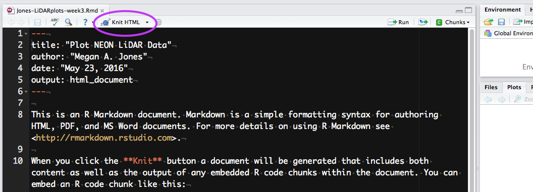
Location of the knit button in RStudio in Version 0.99.486.
Source: National Ecological Observatory Network (NEON)
To knit in RStudio, click the knit pull down button. You want to use the knit HTML for this lesson.
When you click the Knit HTML button, a window will open in your console
titled R Markdown. This
pane shows the knitting progress. The output (HTML in this case) file will
automatically be saved in the current working directory. If there is an error
in the code, an error message will appear with a line number in the R Console
to help you diagnose the problem.
**Data Tip:** You can run `knitr` from the command prompt
using: `render(“input.Rmd”, “all”)`.
Activity: Knit Script
Knit the .Rmd file that you built in
the last tutorial.
What does it look like?
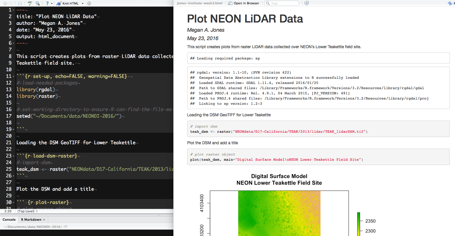
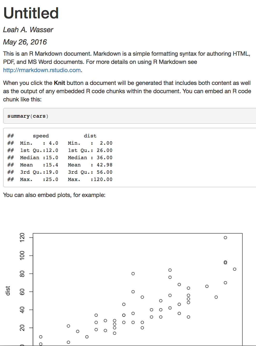
View the Output
R Markdown (left) and the resultant HTML (right) after knitting.
Source: National Ecological Observatory Network (NEON)
When knitting is complete, the new HTML file produced will automatically open.
Notice that information from the YAML header (title, author, date) is printed
at the top of the HTML document. Then the HTML shows the text, code, and
results of the code that you included in the RMD document.
Data Institute Participants: Complete Week 2 Assignment
Be sure to carefully check your knitr output to make sure it is rendering the
way you think it should!
When you are complete, submit your .Rmd and .html files to the
NEON Institute participants GitHub repository
(NEONScience/DI-NEON-participants).
The files will have automatically saved to your R working directory, you will
need to transfer the files to the /participants/pre-institute3-rmd/
directory and submitted via a pull request.
You will need to have the rmarkdown and knitr
packages installed on your computer prior to completing this tutorial. Refer to
the setup materials to get these installed.
Learning Objectives
At the end of this activity, you will:
Know how to create an R Markdown file in RStudio.
Be able to write a script with text and R code chunks.
Create an R Markdown document ready to be ‘knit’ into an HTML document to
share your code and results.
Things You’ll Need To Complete This Tutorial
You will need the most current version of R and, preferably, RStudio loaded on
your computer to complete this tutorial.
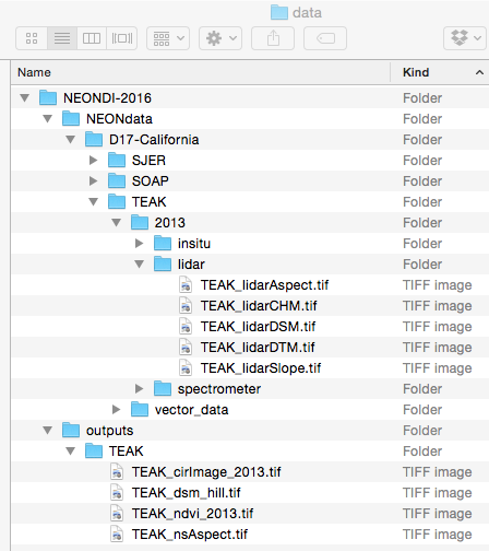
You will want to create a data directory for all the Data Institute teaching
datasets. We suggest the pathway be ~/Documents/data/NEONDI-2016 or
the equivalent for your operating system. Once you've downloaded and unzipped
the dataset, move it to this directory.
The data directory with the teaching data subset. This is the suggested organization for all Data Institute teaching data subsets.
Source: National Ecological Observatory Network (NEON)
Our goal in this series is to document our workflow. We can do this by
Creating an R Markdown (RMD) file in R studio and
Rendering that RMD file to HTML using knitr.
Watch this 6:38 minute video below to learn more about how you can convert an R Markdown
file to HTML (or other formats) using knitr in RStudio.
The text size in the video is small so you may want to watch the video in
full screen mode.
Now that you have a sense of how R Markdown can be used in RStudio, you are
ready to create your own RMD document. Do the following:
Create a new R Markdown file and choose HTML as the desired output format.
Enter a Title (Explore NEON LiDAR Data) and Author Name (your name). Then click OK.
Save the file using the following format: LastName-institute-week3.rmd
NOTE: The document title is not the same as the file name.
Hit the knit button in RStudio (as is done in the video above). What happens?
Location of the knit button in RStudio in Version 0.99.486.
Source: National Ecological Observatory Network (NEON)
If everything went well, you should have an HTML format (web page) output
after you hit the knit button. Note that this HTML output is built from a
combination of code and documentation that was written using markdown syntax.
Next, we'll break down the structure of an R Markdown file.
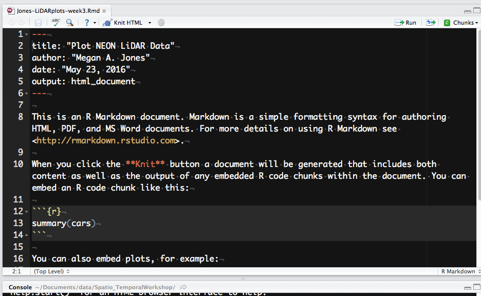
Understand Structure of an R Markdown file
Screenshot of a new R Markdown document in RStudio. Notice the different
parts of the document.
Source: National Ecological Observatory Network (NEON)
**Data Tip:** Screenshots on this page are
from RStudio with appearance preferences set to `Twilight` with `Monaco` font. You
can change the appearance of your RStudio by **Tools** > **Options**
(or **Global Options** depending on the operating system). For more, see the
Customizing RStudio page.
Let's next review the structure of an R Markdown (.Rmd) file. There are three
main content types:
Header: the text at the top of the document, written in YAML format.
Markdown sections: text that describes your workflow written using markdown syntax.
Code chunks: Chunks of R code that can be run and also can be rendered
using knitr to an output document.
Next let's explore each section type.
Header -- YAML block
An R Markdown file always starts with header written using
YAML syntax.
There are four default elements in the RStudio generated YAML header:
title: the title of your document. Note, this is not the same as the file name.
author: who wrote the document.
date: by default this is the date that the file is created.
output: what format will the output be in. We will use HTML.
A YAML header may be structured differently depending upon how your are using it.
Learn more on the
R Markdown documentation page.
## Activity: R Markdown YAML
Customize the header of your `.Rmd` file as follows:
Title: Provide a title that fits the code that will be in your RMD.
Author: Add your name here.
Output: Leave the default output setting: html_document.
We will be rendering an HTML file.
R Markdown Text/Markdown Blocks
An RMD document contains a mixture of code chunks and markdown blocks where
you can describe aspects of your processing workflow. The markdown blocks use the
same markdown syntax that we learned last week in week 2 materials. In these blocks
you might describe the data that you are using, how it's being processed and
and what the outputs are. You may even add some information that interprets
the outputs.
When you render your document to HTML, this markdown will appear as text on the
output HTML document.
Look closely at the pre-populated markdown and R code chunks in your RMD file.
Does any of the markdown syntax look familiar?
Are any words in bold?
Are any words in italics?
Are any words highlighted as code?
If you are unsure, the answers are at the bottom of this page.
## Activity: R Markdown Text
Remove the template markdown and code chunks added to the RMD file by RStudio.
(Be sure to keep the YAML header!)
At the very top of your RMD document - after the YAML header, add
the bio and short research description that you wrote last week in markdown syntax to
the RMD file.
Between your profile and the research descriptions, add a header that says
About My Project (or something similar).
Add a new header stating R Markdown Activity and text below that explaining
that this page demonstrates using some of the NEON Teakettle LiDAR data products
in R. The wording of this text should clearly describe the code and outputs that
you will be adding the page.
**Data Tip**: You can add code output or an R object
name to markdown segments of an RMD. For more, view this
R Markdown documentation.
Code chunks
Code chunks are where your R code goes. All code chunks start and end with
``` – three backticks or graves. On
your keyboard, the backticks can be found on the same key as the tilde.
Graves are not the same as an apostrophe!
The initial line of a code chunk must appear as:
 ```{r chunk-name-with-no-spaces}
# code goes here
 ```
The r part of the chunk header identifies this chunk as an R code chunk and is
mandatory. Next to the {r, there is a chunk name. This name is not required
for basic knitting however, it is good practice to give each chunk a unique
name as it is required for more advanced knitting approaches.
Activity: Add Code Chunks to Your R Markdown File
Continue working on your document. Below the last section that you've just added,
create a code chunk that loads the packages required to work with raster data
in R.
In R scripts, setting the working directory is normally done once near the beginning of your script. In R Markdown files, knit code chunks behave a little differently, and a warning appears upon kitting a chunk that sets a working directory.
```{r code-setwd}

   # set working directory to ensure R can find the file we wish to import.
   # This will depend on your local environment.
   setwd("~/Documents/data/NEONDI-2016/")

```
You changed the working directory to ~/Documents/data/NEONDI-2016/ (probably via setwd()). It will be restored to [directory path of current .rmd file]. See the Note section in ?knitr::knit ?knitr::knit
That's a bad sign if you want to set the working directory in one code chunk, and read or write data in another code chunk. To allow for a working data directory that is different from your Rmd file's current directory, you can store the directory path in a string variable.
```{r code-setwd-stringvariable}

	# set working directory as a string variable for use in other code chunks.
	# This will depend on your local environment.
	wd <- "~/Documents/data/NEONDI-2016/"
	setwd(wd)

 ```
The setwd(wd) line could be at the start of a lengthier code chunk that reads
from and writes to data files. Alternatively, since the variable will be kept in
this document's R environment, it can be used with paste() or paste0() when you
need to refer to a filepath. Proceed to the next step for an example of this.
(For further instruction on setting the working directory, see the NEON Data Skills tutorial
Set A Working Directory in R.)
Let's add another chunk that loads the TEAK_lidarDSM raster file.
```{r load-dsm-raster }
   # check for the working directory
   getwd()
   # In this new chunk, the working directory has reverted to default upon kitting.
   # Combining the working directory string variable and
   # additional path to the file, import a DSM file.
   teak_dsm <- raster(paste0(wd, "NEONdata/D17-California/TEAK/2013/lidar/TEAK_lidarDSM.tif"))

 ```
Now run the code in this chunk.
You can run code chunks:
Line-by-line: with cursor on current line, Ctrl + Enter (Windows/Linux) or
Command + Enter (Mac OS X).
By chunk: You can run the entire chunk (or multiple chunks) by
clicking on the "Run" button in the upper right corner of the RStudio script
panel and choosing the appropriate option (Run Current Chunk, Run Next Chunk).
Keyboard shortcuts are available for these options.
Code chunk options
You can also add arguments or options to each code chunk. These arguments allow
you to customize how or if you want code to be
processed or appear on the output HTML document. Code chunk arguments are added on
the first line of a code
chunk after the name, within the curly brackets.
The example below, is a code chunk that will not be "run", or evaluated, by R.
The code within the chunk will appear on the output document, however there
will be no outputs from the code.
```{r intro-option, eval=FALSE}
# the code here will not be processed by R
# but it will appear on your output document
1+2
 ```
We use eval=FALSE often when the chunk is exporting an file that we don't
need to re-export but we want to document the code used to export the file.
Three common code chunk options are:
eval = FALSE: Do not evaluate (or run) this code chunk when
knitting the RMD document. The code in this chunk will still render in our knitted
HTML output, however it will not be evaluated or run by R.
echo = FALSE: Hide the code in the output. The code is
evaluated when the RMD file is knit, however only the output is rendered on the
output document.
results = hide: The code chunk will be evaluated but the results of the code
will not be rendered on the output document. This is useful if you are viewing the
structure of a large object (e.g. outputs of a large data.frame).
Add a new code chunk that plots the TEAK_lidarDSM raster object that you imported above.
Experiment with plot colors and be sure to add a plot title.
Run the code chunk that you just added to your RMD document in R (e.g. run in console, not
knitting). Does it create a plot with a title?
In another new code chunk, import and plot another raster file from the NEON data subset
that you downloaded. The TEAK_lidarCHM is a good raster to plot.
Finally, create histograms for both rasters that you've imported into R.
Be sure to document your steps as you go using both code comments and
markdown syntax in between the code chunks.
For help opening and plotting raster data in R, see the NEON Data Skills tutorial
Plot Raster Data in R.
We will knit this document to HTML in the next tutorial.
Now continue on to the next tutorial
to learn how to knit this document into a HTML file.
## Answers to the Default Text Markdown Syntax Questions
Are any words in bold? - Yes, “Knit” on line 10
Are any words in italics? - No
Are any words highlighted as code? - Yes, “echo = FALSE” on line 22
This tutorial we will work with the knitr and rmarkdown packages within
RStudio to learn how to effectively and efficiently document and publish our
workflows online.
Learning Objectives
At the end of this activity, you will be able to:
Explain why documenting and publishing one's code is important.
Describe two tools that enable ease of publishing code & output: R Markdown and
the knitr package.
This week we will learn about the R Markdown file format (and R package) which
can be used with the knitr package to document and publish (disseminate) your
code and code output.
“R Markdown is an authoring format that enables easy creation of dynamic
documents, presentations, and reports from R. It combines the core syntax of
markdown (an easy to write plain text format) with embedded R code chunks that
are run so their output can be included in the final document. R Markdown
documents are fully reproducible (they can be automatically regenerated whenever
underlying R code or data changes)."
-- RStudio documentation.
We use markdown syntax in R Markdown (.rmd) files to document workflows and
to share data processing, analysis and visualization outputs. We can also use it
to create documents that combine R code, output and text.
There are many advantages to using R Markdown in your work:
Human readable syntax.
Simple syntax - it can be learned quickly.
All components of your work are clearly documented. You don't have to remember
what steps, assumptions, tests were used.
You can easily extend or refine analyses by modifying existing or adding new
code blocks.
Analysis results can be disseminated in various formats including HTML, PDF,
slide shows and more.
Code and data can be shared with a colleague to replicate the workflow.
**Data Tip:**
RPubs
is a quick way to share and publish code.
Knitr
The knitr package for R allows us to create readable documents from R Markdown
files.
R Markdown script (left) and the HTML produced from the knit R
Markdown script (right). Source: National Ecological Observatory Network (NEON)
>The knitr package was designed to be a transparent engine for dynamic report
generation with R --
Yihui Xi -- knitr package creator
In the next tutorial we will learn more about working with the R Markdown format in RStudio.
The primary goal of this tutorial is to explain how to set a working directory
in R. The working directory is where your R session interacts with your hard drive.
This is where you can read data that you want to use, and save new information such
as derived data products, tables, maps, and figures. It is a good practice to store
your information in an organized set of directories, so you will often want to change
your working directory depending on what kinds of information that you need to access.
This tutorial teaches how to download and unzip the data files that accompany many
NEON Data Skills tutorials, and also covers the concept of file paths. You can read
from top to bottom, or use the menu bar at left to navigate to your desired topic.
Learning Objectives
After completing this tutorial, you will be able to:
Be able to download and uncompress NEON Teaching Data Subsets.
Be able to set the R working directory.
Know the difference between full, base and relative paths.
Be able to write out both full and relative paths for a given file or
directory.
Things You’ll Need To Complete This Lesson
To complete this lesson you will need the most current version of R and,
preferably, RStudio loaded on your computer.
Many NEON data tutorials utilize teaching data subsets which are hosted on the
NEON Data Skills figshare repository. If a data subset is required for a
tutorial it can be downloaded at the top of each tutorial in the Download
Data section.
Prior to working with any data in R, we must set the working directory to
the location of the data files. Setting the working directory tells R where
the data files are located on the computer. If the working directory is not
correctly set first, when we try to open a file we will get an error telling us
that R cannot find the file.
**Data Tip:** All NEON Data Skills tutorials are
written assuming the working directory is the parent directory to the
uncompressed .zip file of downloaded data. This allows for multiple data
subsets to be accessed in the tutorial without resetting the working directory.
Generally, these tutorials have a default working directory of **~/Documents/data**.
If you are working on a Mac, we suggest that you save your downloaded datasets
in a directory with the same name and location so that you don't have to edit
the code for the tutorial that you are working on. Most windows machines cannot
use the tilde "~" notation, therefore you must define the working directory
explicitly.
Wondering why we're saying directory instead of folder? See our
discussion of Directory vs. Folder in the middle of this tutorial.
Download & Uncompress the Data
1) Download
First, we will download the data to a location on the computer. To download the
data for this tutorial, click the blue button Download NEON Teaching Data
Subset: Meteorological Data for Harvard Forest within the box at the
top of this page.
Note: In other NEON Data Skills tutorials, download all data subsets in the
Download Data section prior to starting the tutorial. Here, the second
data subset is for those wishing to practice these skills in a Challenge
activity and will be downloaded at that time.
Screenshot of the Download Data button at the top of
NEON Data Skills tutorials. Source: National Ecological Observatory Network
(NEON)
After clicking on the Download Data button, the data will automatically
download to the computer.
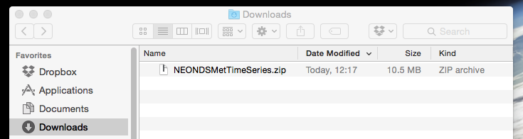
2) Locate .zip file
Second, we need to find the downloaded .zip file. Many browsers default to
downloading to the Downloads directory on your computer.
Note: You may have previously specified a specific directory (folder) for files
downloaded from the internet, if so, the .zip file will download there.
Screenshot of the computer's Downloads folder containing the
new NEONDSMetTimeSeries.zip file. Source: National Ecological
Observatory Network (NEON)
3) Move to data directory
Third, we must move the data files to the location we want to work with them.
We recommend moving the .zip to a dedicated data directory within the
Documents directory on your computer. This data directory can
then be a repository for all data subsets you use for the NEON Data Skills
tutorials. Note: If you chose to store your data in a different directory
(e.g., not in ~/Documents/data), modify the directions below with the
appropriate file path to your data directory.
4) Unzip/uncompress
Fourth, we need to unzip/uncompress the file so that the data files can be
accessed. Use your favorite tool that can unpackage/open .zip files (e.g.,
winzip, Archive Utility, etc). The files will now be accessible in a directory
named NEON-DS-Met-Time-Series containing all the subdirectories and files that
make up the dataset or the subdirectories and files will be unzipped directly
into the data directory. If the latter happens, they need to be moved into a
data/NEON-DS-Met-Time-Series directory.
### Challenge: Download and Unzip Teaching Data Subset
Want to make sure you have these steps down! Prepare the
**Site Layout Shapefiles Teaching Data Subset** so that the files
are accessible and ready to be opened in R.
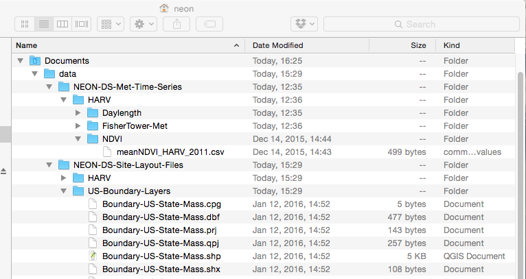
The directory should be the same as in this screenshot (below). Note that
NEON-DS-Site-Lyout-Files directory will only be in your directory if you
completed the challenge above. If you did not, your directory should look the
same but without that directory.
Screenshot of the neon directory with the nested
Documents, data, NEON-DS-Met-Time-Series, and other
directories. Source: National Ecological Observatory Network
(NEON)
Directory vs. Folder
"Directory" and "Folder" both refer to the same thing. Folder makes a lot of
sense when we think of an isolated folder as a "bin" containing many files.
However, the analogy to a physical file folder falters when we start thinking
about the relationship between different folders and how we tell a computer to
find a specific folder. This is why the term directory is often preferred. Any
directory (folder) can hold other directories and/or files. When we set the
working directory, we are telling the computer the location of the directory
(or folder) to start with when looking for other files or directories, or to
save any output to.
Full, Base, and Relative Paths
The data downloaded and unzipped in the previous steps are located within a
nested set of directories:
primary-level/home directory: neon
This directory isn't obvious as we are within this directory once we log
into the computer.
The full path is essentially the complete "directions" for how to find the
desired directory or file. It always starts with the home directory or root
(e.g., /Users/neon/). A full path is the base path when used to set
the working directory to a specific directory. The base path for the
NEON-DS-Met-Time-Series directory would be:
**Data Tip:** File or directory paths and the home
directory will appear slightly different in different operating systems.
Linux will appear as
`/home/neon/`. Windows will be similar to `C:\Documents and Settings\neon\` or
`C:\Users\neon\`. The format varies by Windows version. Make special note of
the direction of the slashes. Mac OS X and Unix format will appear as
`/Users/neon/`. This tutorial will show Mac OS X output unless specifically
noted.
### Challenge: Full File Path
Write out the full path for the `NEON-DS-Site-Layout-Shapefiles` directory. Use
the format of the operating system you are currently using.
Tip: When typing in the Rstudio console or an R script, if you surround your
filepath with quotes you can take advantage of the 'tab-completion' feature.
To use this feature, begin typing your filepath (e.g., "~/" or "C:") and then hit the tab button, which should pop up a list of possible directories and files that you could be pointing to. This method is awesome for avoiding typos in complex or long filepaths!
Bonus Points: Write the path as for one of the other operating systems.
Relative Path
A relative path is a path to a directory or file that starts from the
location determined by the working directory. If our working directory is set
to the data directory,
/Users/neon/Documents/data/
we can then create a relative path for all directories and files within the
data directory.
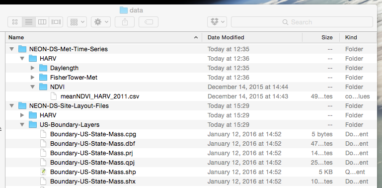
Screenshot of the data directory containing the both NEON Data
Skills Teaching Subsets. Source: National Ecological Observatory Network
(NEON)
The relative path for the meanNDVI_HARV_2011.csv file would be:
### Challenge: Relative File Path
Use the format of your current operating system:
Write out the full path to for the Boundary-US-State-Mass.shp file.
Write out the relative path for the Boundary-US-State-Mass.shp file
assuming that the working directory is set to /Users/neon/Documents/data/.
Bonus: Write the paths as for one of the other operating systems.
The R Working Directory
In R, the working directory is the directory where R starts when looking for
any file to open (as directed by a file path) and where it saves any output.
Without a working directory all R scripts would need the full file path
written any time we wanted to open or save a file. It is more efficient if we
have a base file path set as our working directory and then all file
paths written in our scripts only consist of the file path relative to that base
path (a relative path).
If you are unfamiliar with the term full path, base path, or
relative path, please see the section below on Full, Base, and Relative Paths
for a more detailed explanation before continuing with this tutorial.
Find a Full Path to a File in Unknown Location
If you are unsure of the path to a specific directory or file, you can
find this information for a particular file/directory of interest by looking in
the:
Windows: Properties, General tab (right click on the file/directory) or
in the file path bar at the top of each window (select versions).
Mac OS X: Get Info (right clicking/control+click on the file/directory)
Mac OS X: /Users/neon/Documents/data/NEON-DS-Met-Time-Series
**Data Tip:** File or directory paths and the home
directory will appear slightly different in different operating systems.
Linux will appear as
`/home/neon/`. Windows will be similar to `C:\Documents and Settings\neon\` or
`C:\Users\neon\`. The format varies by Windows version. Make special note of
the direction of the slashes. Mac OS X and Unix format will appear as
`/Users/neon/`. This tutorial will show Mac OSX output unless specifically
noted.
Determine Current Working Directory
Once we are in the R program, we can view the current working directory
using the code getwd().
# view current working directory
getwd()
[1] "/Users/neon"
The working directory is currently set to the home directory /Users/neon.
Remember, your current working directory will have a different user name and may
appear different based on operating system.
This code can be used at any time to determine the current working directory.
Set the Working Directory
To set our current working directory to the location where our data are located,
we can either set the working directory in the R script or use our current GUI
to select the working directory.
**Data Tip:** All NEON Data Skills tutorials are
written assuming the working directory is the parent directory to the downloaded
data (the **data** directory in this tutorial). This allows for multiple data
subsets to be accessed in the tutorial without resetting the working directory.
We want to set our working directory to the data directory.
Set the Working Directory: Base Path in Script
We can set the working directory using the code setwd("PATH") where PATH is
the full path to the desired directory. You can enter "PATH" as a string (as
shown below), or save the file path as a string to a variable (e.g.,
wd <- "~/Documents/data") and then set the working directory based on
that variable (e.g., setwd(wd)).
This latter method is used in many of the NEON Data Skills tutorials because
of the advantages that this method provides. First, this method is extermely
flexible across different compute environments and formats, including personal
computers, Linux-based servers on 'the cloud' (e.g., AWS, CyVerse), and when using
Rmarkdown (.Rmd) documents. Second this method allows the tutorial's
user to set their working directory once as a string and then to reuse that
string as needed to reference input files, or make output files. For example,
some functions must have a full filepath to an input file (such as when reading
in HDF5 files). Third, this method simplifies the process that NEON uses internally
to create and update these tutorials. All in all, saving the working
directory as a string variable makes the code more explicit and determanistic without
relying on working knowledge of relative filepaths, making your code more
producible and easier for an outsider to interpret.
To practice, use these techniques to set your working directory to the directory where
you have the data saved, and check that you set the working directory correctly.
There is no R output from setwd(). If we want to check
that the working directory is correctly set we can use getwd().
Example Windows File Path
Notice the the backslashes used in Windows paths must be changed to slashes in
R.
# set the working directory to `data` folder
wd <- "C:/Users/neon/Documents/data"
setwd(wd)

# check to ensure path is correct
getwd()
[1] "C:/Users/neon/Documents/data"
Example Mac OS X File Path
# set the working directory to `data` folder
wd <- "/Users/neon/Documents/data"
setwd(wd)

# check to ensure path is correct
getwd()
[1] "/Users/neon/Documents/data"
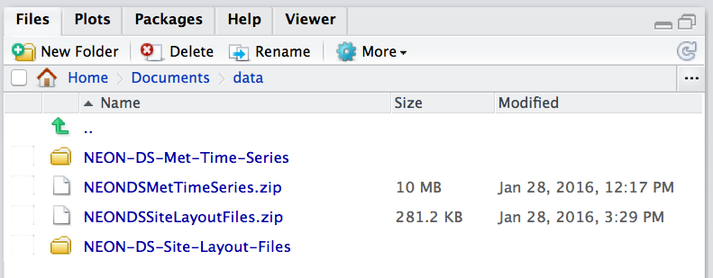
**Data Tip:** If using RStudio, you can view the
contents of the working directory in the Files pane.
The Files pane in RStudio shows the contents of the current
working directory. Source: National Ecological Observatory Network
(NEON)
Set the Working Directory: Using RStudio GUI
You can also set the working directory using the Rstudio and/or R graphical user interface (GUI).
This method is easy for beginners to learn, but it also makes your code less
reproducible because it relies on a person to follow certain instructions, which
is a process that introduces human error. It may also be impossible for an observer
to determine where your input data are stored, which can make troubleshooting
more difficult as well. Use this method when getting started, or when you will
find it helpful to use a graphical user interface to navigate your files.
Note that this method will run a single line setwd() command in the console
when you select your working directory, so you can copy/paste that line into
your script for future use!
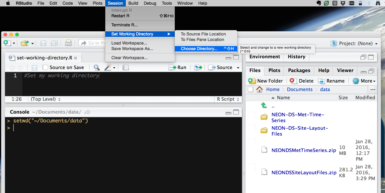
Go to Session in menu bar,
select Select Working Directory,
select Choose Directory,
in the new window that appears, select the appropriate directory.
How to set the working directory using the RStudio GUI.
Source: National Ecological Observatory Network (NEON)
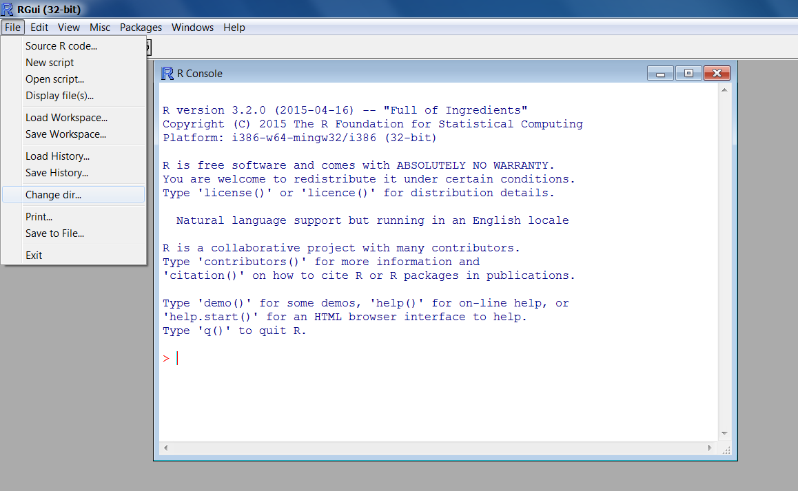
Set the Working Directory: Using R GUI
Windows Operating Systems:
Go to the File menu bar,
select Change dir... or Change Working Directory,
in the new window that appears, select the appropriate directory.
How to set the working directory using the R GUI in Windows.
Source: National Ecological Observatory Network (NEON)
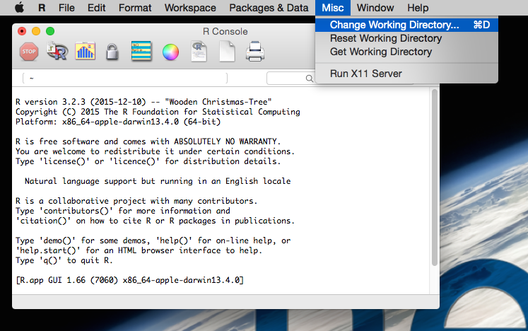
Mac Operating Systems:
Go to the Misc menu,
select Change Working Directory,
in the new window that appears, select the appropriate directory.
How to set the working directory using the R GUI in Mac OS X.
Source: National Ecological Observatory Network (NEON)
This tutorial explains how to crop a raster using the extent of a vector
shapefile. We will also cover how to extract values from a raster that occur
within a set of polygons, or in a buffer (surrounding) region around a set of
points.
Learning Objectives
After completing this tutorial, you will be able to:
Crop a raster to the extent of a vector layer.
Extract values from raster that correspond to a vector file
overlay.
Things You’ll Need To Complete This Tutorial
You will need the most current version of R and, preferably, RStudio loaded
on your computer to complete this tutorial.
R Script & Challenge Code: NEON data lessons often contain challenges that reinforce
learned skills. If available, the code for challenge solutions is found in the
downloadable R script of the entire lesson, available in the footer of each lesson page.
Crop a Raster to Vector Extent
We often work with spatial layers that have different spatial extents.
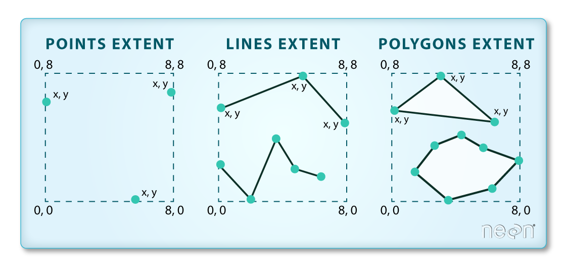
The spatial extent of a shapefile or R spatial object represents
the geographic "edge" or location that is the furthest north, south east and
west. Thus is represents the overall geographic coverage of the spatial
object. Image Source: National Ecological Observatory Network (NEON)
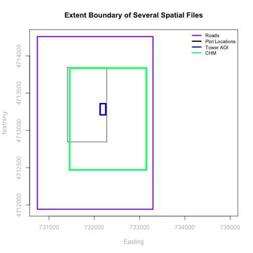
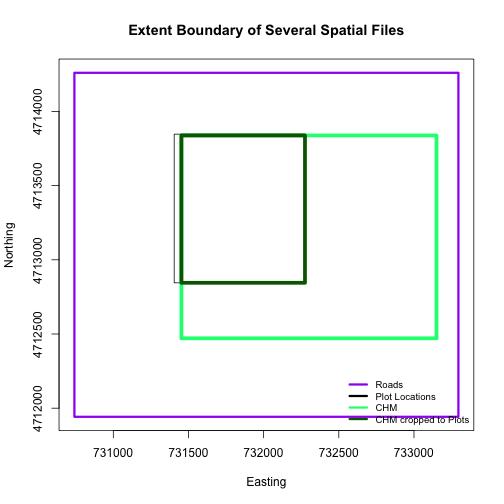
The graphic below illustrates the extent of several of the spatial layers that
we have worked with in this vector data tutorial series:
Area of interest (AOI) -- blue
Roads and trails -- purple
Vegetation plot locations -- black
and a raster file, that we will introduce this tutorial:
A canopy height model (CHM) in GeoTIFF format -- green
Frequent use cases of cropping a raster file include reducing file size and
creating maps.
Sometimes we have a raster file that is much larger than our study area or area
of interest. In this case, it is often most efficient to crop the raster to the extent of our
study area to reduce file sizes as we process our data.
Cropping a raster can also be useful when creating visually appealing maps so that the
raster layer matches the extent of the desired vector layers.
Import Data
We will begin by importing four vector shapefiles (field site boundary,
roads/trails, tower location, and veg study plot locations) and one raster
GeoTIFF file, a Canopy Height Model for the Harvard Forest, Massachusetts.
These data can be used to create maps that characterize our study location.
# load necessary packages
library(rgdal)  # for vector work; sp package should always load with rgdal.
library (raster)

# set working directory to data folder
# setwd("pathToDirHere")

# Imported in Vector 00: Vector Data in R - Open & Plot Data
# shapefile
aoiBoundary_HARV <- readOGR("NEON-DS-Site-Layout-Files/HARV/",
                            "HarClip_UTMZ18")
# Import a line shapefile
lines_HARV <- readOGR( "NEON-DS-Site-Layout-Files/HARV/",
                       "HARV_roads")
# Import a point shapefile
point_HARV <- readOGR("NEON-DS-Site-Layout-Files/HARV/",
                      "HARVtower_UTM18N")

# Imported in  Vector 02: .csv to Shapefile in R
# import raster Canopy Height Model (CHM)
chm_HARV <-
  raster("NEON-DS-Airborne-Remote-Sensing/HARV/CHM/HARV_chmCrop.tif")
Crop a Raster Using Vector Extent
We can use the crop function to crop a raster to the extent of another spatial
object. To do this, we need to specify the raster to be cropped and the spatial
object that will be used to crop the raster. R will use the extent of the
spatial object as the cropping boundary.
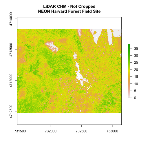
# plot full CHM
plot(chm_HARV,
     main="LiDAR CHM - Not Cropped\nNEON Harvard Forest Field Site")
# crop the chm
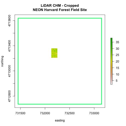
chm_HARV_Crop <- crop(x = chm_HARV, y = aoiBoundary_HARV)
# plot full CHM
plot(extent(chm_HARV),
lwd=4,col="springgreen",
main="LiDAR CHM - Cropped\nNEON Harvard Forest Field Site",
xlab="easting", ylab="northing")
plot(chm_HARV_Crop,
add=TRUE)
We can see from the plot above that the full CHM extent (plotted in green) is
much larger than the resulting cropped raster. Our new cropped CHM now has the
same extent as the aoiBoundary_HARV object that was used as a crop extent
(blue boarder below).
We can look at the extent of all the other objects.
# lets look at the extent of all of our objects
extent(chm_HARV)

## class      : Extent
## xmin       : 731453
## xmax       : 733150
## ymin       : 4712471
## ymax       : 4713838

extent(chm_HARV_Crop)

## class      : Extent
## xmin       : 732128
## xmax       : 732251
## ymin       : 4713209
## ymax       : 4713359

extent(aoiBoundary_HARV)

## class      : Extent
## xmin       : 732128
## xmax       : 732251.1
## ymin       : 4713209
## ymax       : 4713359
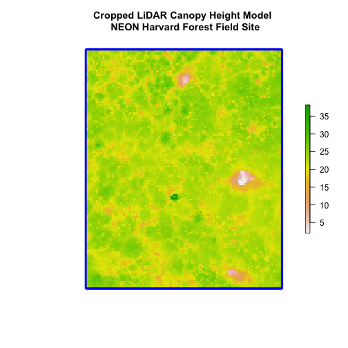
Which object has the largest extent? Our plot location extent is not the
largest but it is larger than the AOI Boundary. It would be nice to see our
vegetation plot locations with the Canopy Height Model information.
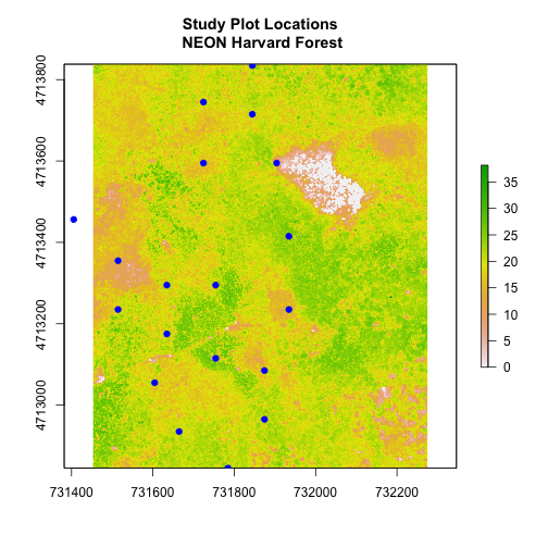
### Challenge: Crop to Vector Points Extent
Crop the Canopy Height Model to the extent of the study plot locations.
Plot the vegetation plot location points on top of the Canopy Height Model.
If you completed the
.csv to Shapefile in R tutorial
you have these plot locations as the spatial R spatial object
plot.locationsSp_HARV. Otherwise, import the locations from the
\HARV\PlotLocations_HARV.shp shapefile in the downloaded data.
In the plot above, created in the challenge, all the vegetation plot locations
(blue) appear on the Canopy Height Model raster layer except for one. One is
situated on the white space. Why?
A modification of the first figure in this tutorial is below, showing the
relative extents of all the spatial objects. Notice that the extent for our
vegetation plot layer (black) extends further west than the extent of our CHM
raster (bright green). The crop function will make a raster extent smaller, it
will not expand the extent in areas where there are no data. Thus, extent of our
vegetation plot layer will still extend further west than the extent of our
(cropped) raster data (dark green).
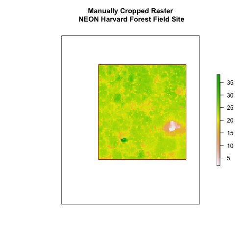
Define an Extent
We can also use an extent() method to define an extent to be used as a cropping
boundary. This creates an object of class extent.
Once we have defined the extent, we can use the crop function to crop our
raster.
# crop raster
CHM_HARV_manualCrop <- crop(x = chm_HARV, y = new.extent)

# plot extent boundary and newly cropped raster
plot(aoiBoundary_HARV,
     main = "Manually Cropped Raster\n NEON Harvard Forest Field Site")
plot(new.extent,
     col="brown",
     lwd=4,
     add = TRUE)
plot(CHM_HARV_manualCrop,
     add = TRUE)
Notice that our manually set new.extent (in red) is smaller than the
aoiBoundary_HARV and that the raster is now the same as the new.extent
object.
See the documentation for the extent() function for more ways
to create an extent object using ??raster::extent
Extract Raster Pixels Values Using Vector Polygons
Often we want to extract values from a raster layer for particular locations -
for example, plot locations that we are sampling on the ground.
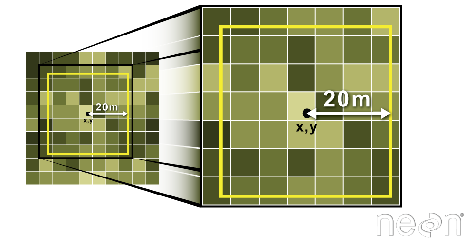
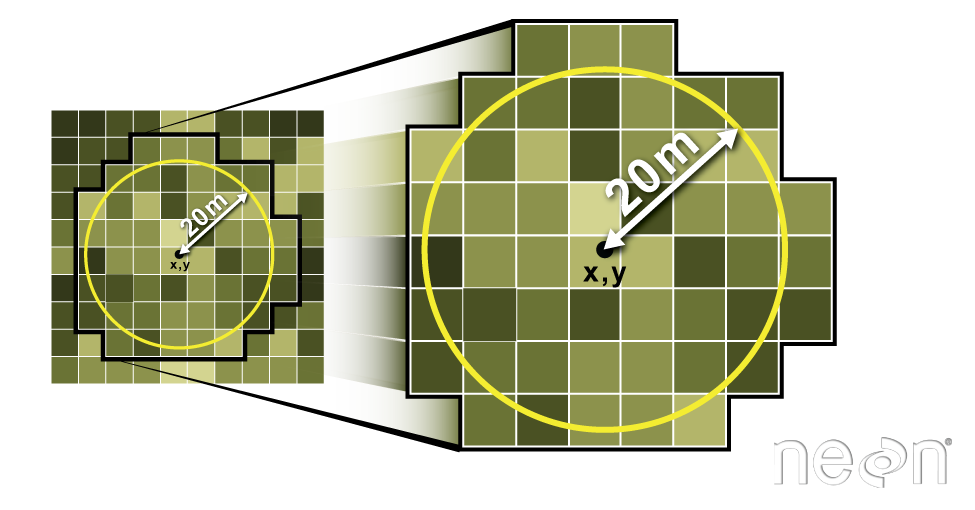
Extract raster information using a polygon boundary. We can
extract all pixel values within 20m of our x,y point of interest. These can
then be summarized into some value of interest (e.g. mean, maximum, total).
Source: National Ecological Observatory Network (NEON).
To do this in R, we use the extract() function. The extract() function
requires:
The raster that we wish to extract values from
The vector layer containing the polygons that we wish to use as a boundary or
boundaries
NOTE: We can tell it to store the output values in a data.frame using
df=TRUE (optional, default is to NOT return a data.frame) .
We will begin by extracting all canopy height pixel values located within our
aoiBoundary polygon which surrounds the tower located at the NEON Harvard
Forest field site.
# extract tree height for AOI
# set df=TRUE to return a data.frame rather than a list of values
tree_height <- raster::extract(x = chm_HARV,
                       y = aoiBoundary_HARV,
                       df = TRUE)

# view the object
head(tree_height)

##   ID HARV_chmCrop
## 1  1        21.20
## 2  1        23.85
## 3  1        23.83
## 4  1        22.36
## 5  1        23.95
## 6  1        23.89

nrow(tree_height)

## [1] 18450
When we use the extract command, R extracts the value for each pixel located
within the boundary of the polygon being used to perform the extraction, in
this case the aoiBoundary object (1 single polygon). Using the aoiBoundary as the boundary polygon, the
function extracted values from 18,450 pixels.
The extract function returns a list of values as default, but you can tell R
to summarize the data in some way or to return the data as a data.frame
(df=TRUE).
We can create a histogram of tree height values within the boundary to better
understand the structure or height distribution of trees. We can also use the
summary() function to view descriptive statistics including min, max and mean
height values to help us better understand vegetation at our field
site.
# view histogram of tree heights in study area
hist(tree_height$HARV_chmCrop,
     main="Histogram of CHM Height Values (m) \nNEON Harvard Forest Field Site",
     col="springgreen",
     xlab="Tree Height", ylab="Frequency of Pixels")
# view summary of values
summary(tree_height$HARV_chmCrop)

##    Min. 1st Qu.  Median    Mean 3rd Qu.    Max.
##    2.03   21.36   22.81   22.43   23.97   38.17
Check out the documentation for the extract() function for more details
(??raster::extract).
Summarize Extracted Raster Values
We often want to extract summary values from a raster. We can tell R the type
of summary statistic we are interested in using the fun= method. Let's extract
a mean height value for our AOI.
# extract the average tree height (calculated using the raster pixels)
# located within the AOI polygon
av_tree_height_AOI <- raster::extract(x = chm_HARV,
                              y = aoiBoundary_HARV,
                              fun=mean,
                              df=TRUE)

# view output
av_tree_height_AOI

##   ID HARV_chmCrop
## 1  1     22.43018
It appears that the mean height value, extracted from our LiDAR data derived
canopy height model is 22.43 meters.
Extract Data using x,y Locations
We can also extract pixel values from a raster by defining a buffer or area
surrounding individual point locations using the extract() function. To do this
we define the summary method (fun=mean) and the buffer distance (buffer=20)
which represents the radius of a circular region around each point.
The units of the buffer are the same units of the data CRS.
Extract raster information using a buffer region. All pixels
that are touched by the buffer region are included in the extract.
Source: National Ecological Observatory Network (NEON).
Let's put this into practice by figuring out the average tree height in the
20m around the tower location.
# what are the units of our buffer
crs(point_HARV)

## CRS arguments:
##  +proj=utm +zone=18 +datum=WGS84 +units=m +no_defs

# extract the average tree height (height is given by the raster pixel value)
# at the tower location
# use a buffer of 20 meters and mean function (fun)
av_tree_height_tower <- raster::extract(x = chm_HARV,
                                y = point_HARV,
                                buffer=20,
                                fun=mean,
                                df=TRUE)

# view data
head(av_tree_height_tower)

##   ID HARV_chmCrop
## 1  1     22.38812

# how many pixels were extracted
nrow(av_tree_height_tower)

## [1] 1
### Challenge: Extract Raster Height Values For Plot Locations
Use the plot location points shapefile HARV/plot.locations_HARV.shp or spatial
object plot.locationsSp_HARV to extract an average tree height value for the
area within 20m of each vegetation plot location in the study area.
Create a simple plot showing the mean tree height of each plot using the plot()
function in base-R.
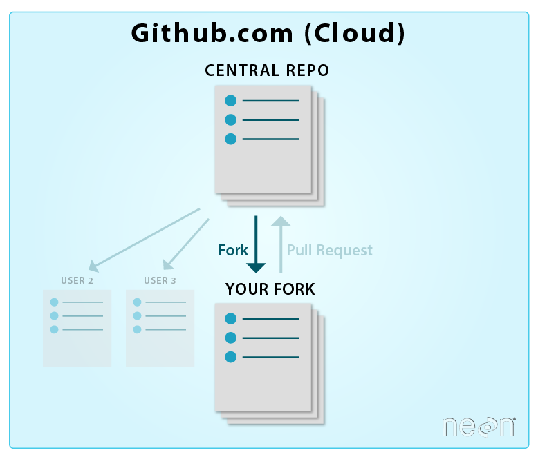
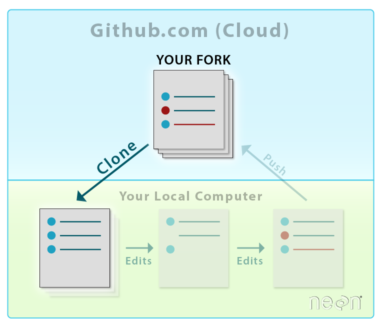
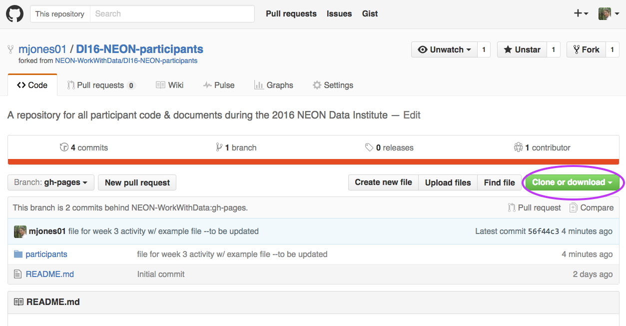
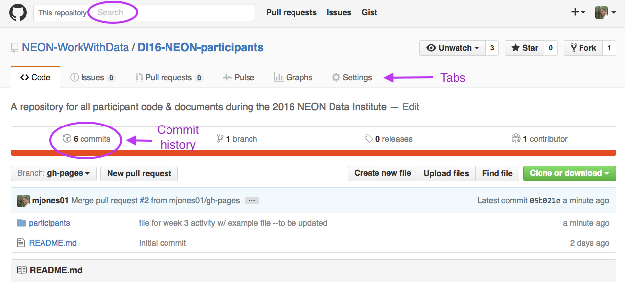
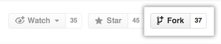
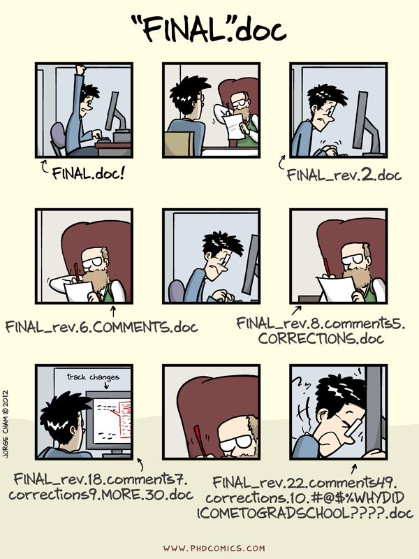


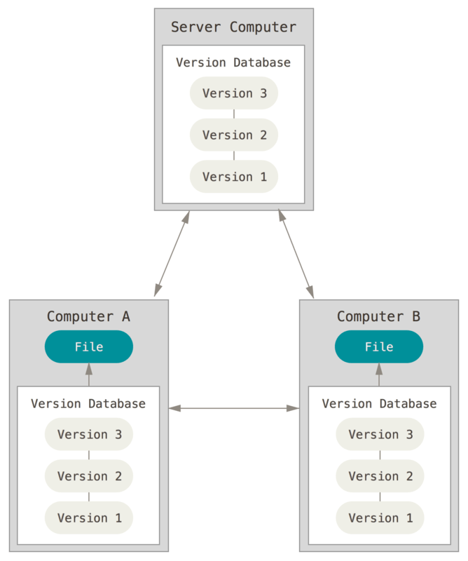
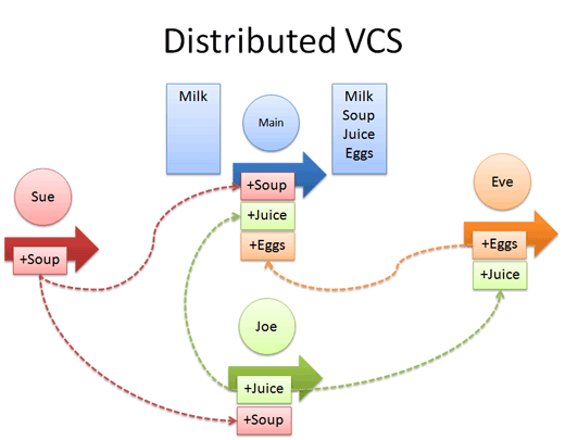
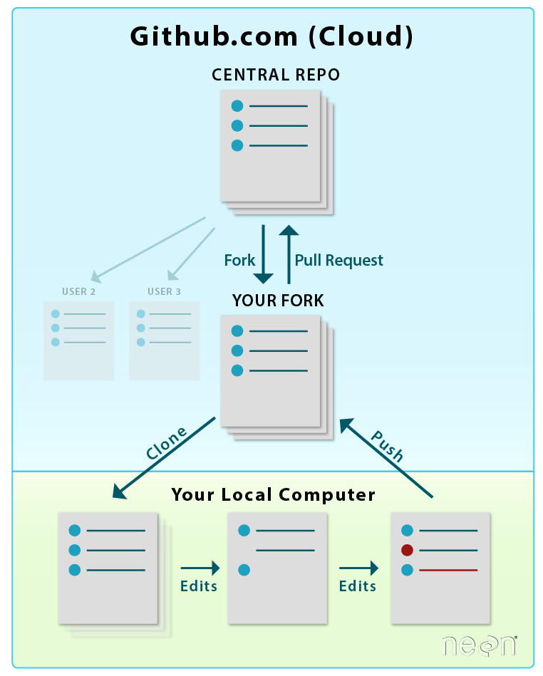
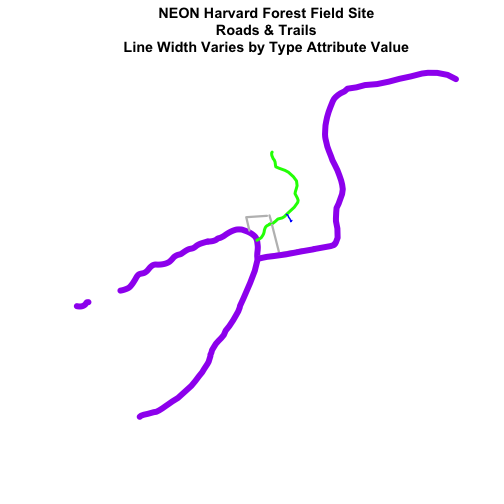
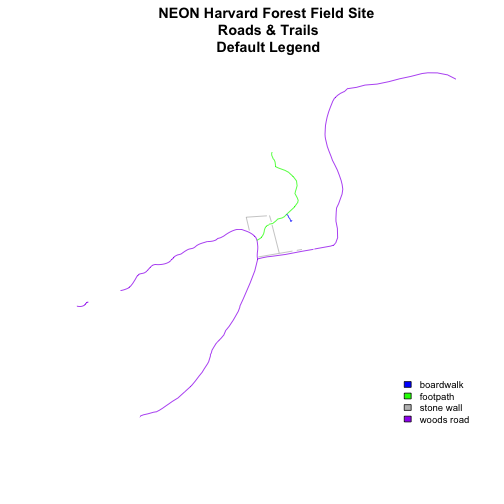
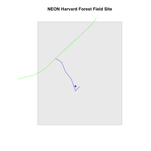
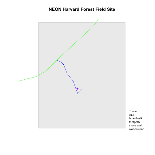
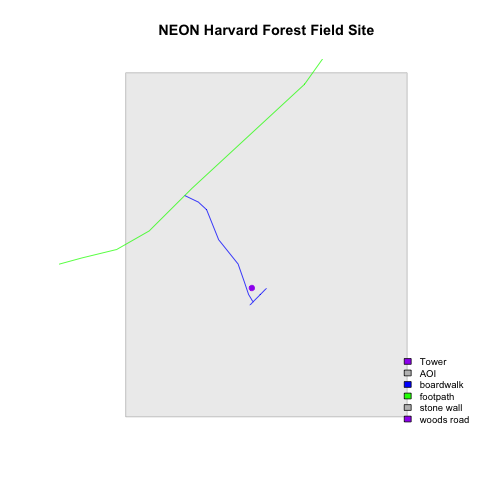
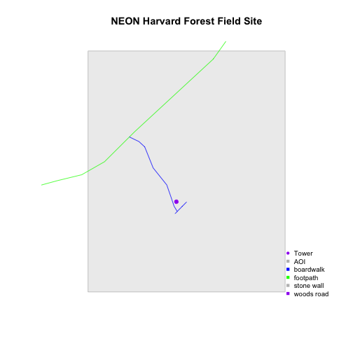
![Roads and tower location at NEON Harvard Forest Field Site with color and a modified legend varied by attribute type; each symbol on the legend corresponds to the shapefile type [i.e., tower = point, roads = lines].](https://raw.githubusercontent.com/NEONScience/NEON-Data-Skills/main/tutorials/R/Geospatial-skills/intro-vector-r/02-plot-multiple-shapefiles-custom-legend/rfigs/refine-legend-1.png)
![Roads and study plots at NEON Harvard Forest Field Site with color and a modified legend varied by attribute type; each symbol on the legend corresponds to the shapefile type [i.e., soil plots = points, roads = lines].](https://raw.githubusercontent.com/NEONScience/NEON-Data-Skills/main/tutorials/R/Geospatial-skills/intro-vector-r/02-plot-multiple-shapefiles-custom-legend/rfigs/challenge-code-plot-color-1.png)
![Roads and study plots at NEON Harvard Forest Field Site with color and a modified legend varied by attribute type; each symbol on the legend corresponds to the shapefile type [i.e., soil plots = points, roads = lines], and study plots symbols vary by soil type.](https://raw.githubusercontent.com/NEONScience/NEON-Data-Skills/main/tutorials/R/Geospatial-skills/intro-vector-r/02-plot-multiple-shapefiles-custom-legend/rfigs/challenge-code-plot-color-2.png)